


A Study in the Visualisation of Music
The question I am asking within this project is: "When attempting to visualise music, to what level do the sounds dictate what the visuals must be? Do they have to interact with each other in a certain way, and adhere to certain norms for us to find them pleasing/interesting to interact with?"
produced by: Oliver N Blake
// Introduction
The Visualisation of Music is a very broad topic. Especially when you start questioning the very definition of the words - What is Music? What is your definition of a Visualisation? Is dance a form of Visualisation, or watching a musician press a key on the Piano or perform a piece? In which case, all live music ever performed has been a way of visualising music. Watching the lights on my Drum Machine’s sequencer light up as they play, is a way of visualising music. Guitar Hero is a way of visualising music. Musical notation itself could be considered visualising music. I would agree that all of the aforementioned are types of visualisation. Dance is the oldest and arguably the most expressive and relatable way of visually representing music. However, in order to focus my project in the Computational arena, and narrow to the lens to asking and addressing direct questions, I’ve had to be quite strict with the definitions I am choosing to use. For the purposes of this project, I will be focussing on “Digital and Electronic representations and interpretations of sounds”. The overarching areas of my topic are tied to Sensors and Sensing Practices, and also Critical Worlding.
// History, Conventions and Techniques
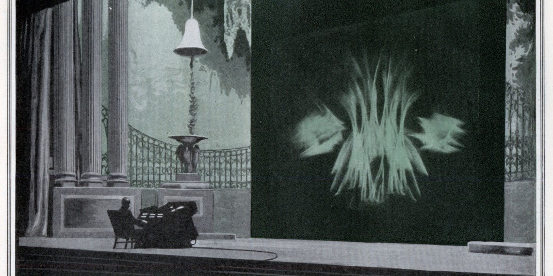
One of the earliest examples I could find of visualising music (as meeting my description stated above) was an instrument called the “Clavilux”. The Clavilux was a mechanical invention by Thomas Wilfred back in 1919, which allowed him to perform “Lumia” — a term he coined for “Light Art”. It’s actually closer to a rudimentary lighting desk but it was thought of at the time as “Visual Music”.
Something else I found was the Atari Video Music. It was designed by Atari as an addition to the Home Hi-Fi back in 1977. Affectionately nicknamed “The Migraine Machine”, it was the earliest commercial electronic music visualiser released. This is the first example of “Audio Reactive Visualiser” I could find - wherein you give it an input, and based on the levels of what it receives, the shapes/scene on screen is modified.
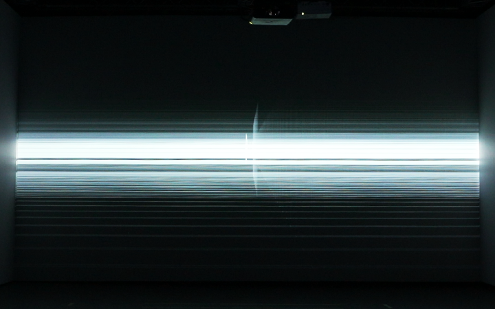
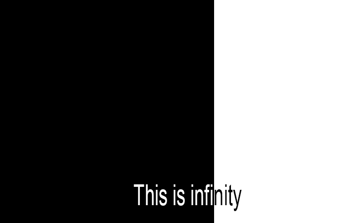
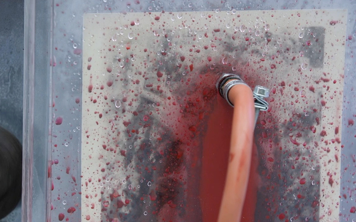
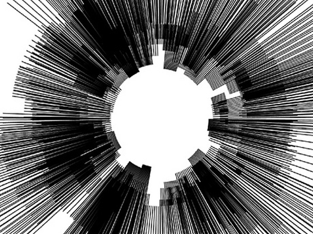
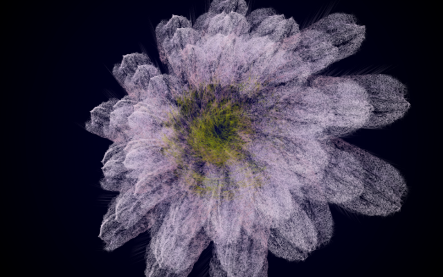
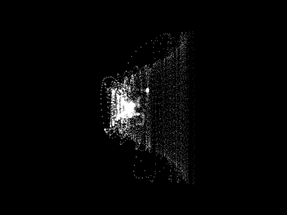
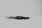
This “Input” received can be observed here as a “Waveform”, which is pictured below.
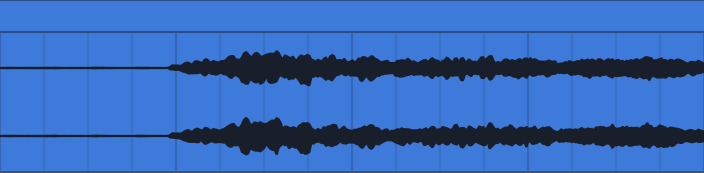
Where this particular waveform starts out (as 2 straight lines) it is at zero values - silence. As the shapes become more complicated, the further it spreads from that zero value horizontal line and the higher the volume it would input to our visualiser, therefore the higher the value our visualiser would receive. So as our visualiser skips and bumps across the waveform, it alters the shapes on screen in accordance with the volume (or values) of that given moment, hence “Audio Reactive” as it reacts to the audio signal.
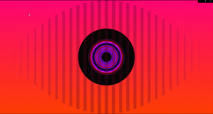
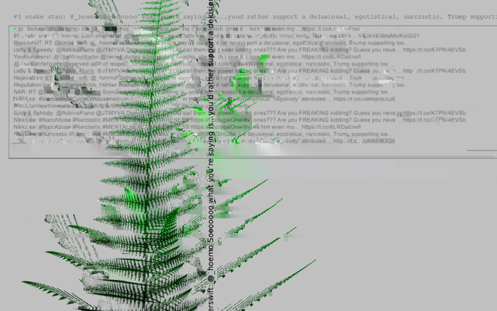
There was a boom in popularity of these audio reactive visualisers when I was in my early teens in the late 90s and early 2000s. During the birth of the mp3 age, music players such as Winamp, iTunes, MilkDrop all coming loaded with mesmerising visuals, that appeared to take whatever you were listening to and reimagine it as hurtling through space. An example of Winamp style visuals is included here. It seems quite a logical progression, given the audio was now being interpreted as an mp3 file - a waveform - the audio player now was spitting out data 44100 times a second, it makes sense to do something with all of that data.
This is how my research project begins to tie into the topic of Sensors and Sensing Technologies. It’s not that this Sensor was new as such - the same technology was being employed in 1977 by Atari - but it was far more clunky. To have to buy the Atari Video Music, feed it an input of whatever you were listening to and link it up to a television so it could output the visuals and display them. Suddenly, all of that technology was in the same place. The audio player was spitting out the data, and our computer screen was the perfect place to deliver to us some visual feedback manipulated with that data.
This type of audio reactive visualiser is what I had initially intended to build for my artefact. However, there is a drawback with type of visualiser. It is quite restricted, in that the input it is receiving is the waveform of the whole track. It can’t isolate specific parts of the song to react to, as it is reacting to the overall volume of the sum of all of it’s parts. It isn’t isolating the bass drum and manipulating one element with that while simultaneously isolating the vocals and manipulating another element with that. This is only possible when constructing a visualiser yourself, with the ability to isolate different parts/ waveforms and send them to control multiple parameters at once. But the Atari Video Music, or any of these 90s Visualisers, that’s not the model they’re built on, and what they are reacting to. It is simply the volume of the song at any one time, because that’s all the data it has. Given the evolution of the Sensors and Sensing Practices over the years, if I was to build a visualiser I would have access to much more data than merely the volume of the song. Through my research however, I was lead to visualisers that react to MIDI information as well.
MIDI stands for “Musical Instrument Digital Interface”. MIDI is a way of sending “event messages” to and from Digital Instruments, including a note’s notation, pitch, velocity, and clock signals. When a musician plays an instrument with MIDI capabilities, all of the key presses, button presses, knob turns and slider changes are converted into MIDI data. Again, this Sensor is not new - it was developed in August of 1983 - however with the advances in Computation and how localised all the elements now are, the capabilities of what we can do with that data are exponentially more than they were then.
So with that in mind, my researched turned to visualisers with MIDI capabilities. What you can do with not only the output volume, but also the pitch and velocity of each specific part or note. I found an article by Simon Rodriguez entitled MIDI Visualisation: A Case Study particularly helpful. He talks through the process of developing a MIDI animated score with moving notes. He then pointed me in the direction of YouTube star Rousseau, who has gained 3.78 Million subscribers playing Classical Piano pieces along with these exact MIDI animated scores. I’ve included a link to Rousseau video playing Beethoven’s “Für Elise” here. It appears this particular mix of relaxing Classical Piano and these types of visuals is quite universally appealing.
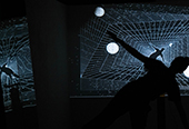
Another work I found which I really loved was entitled “Clavilux 2000” by Jonas Heuer. In his own words:
“For every note played on the keyboard a new visual element appears in form of a stripe, which follows in its dimensions, position and speed the way the particular key was stroke. Colours give the viewer and listener an impression of the harmonic relations: Each key has it's own color scheme and "wrong" notes stand out in contrasting colors.
All stripes stay and overlap each other in an additive way, so at the end a kind of pattern remains – a summary of the music – which will be always unique since the notes of the composition aswell as the interpretation of the piano player are influencing the outcome.”
What I particularly enjoy about this piece is how it recaptures the essence of the original Clavilux - in how the stripes enmesh together resulting in a very similar type of pattern as seen by Thomas Wilfred’s invention - but also the stripes give it a very updated and modern feel. I think the title is simply perfect for what this achieves.
I have found it very interesting to see that what has driven the development of these visualisers in popularity and style has been the access to and localisation of input data. The sensors and sensing practices have apparently been around for a long time, but as our access to and ability to manage the data has grown within computation in the digital age, we are able to manage and utilise it into much more expressive and complex systems.
// Building the Artefact
Having studied the History, Conventions and various Techniques of Music Visualisation, I changed the direction of what I was originally intending to build. I thought a Audio-Reactive "Winamp style" Visualiser was quite limited, and wanted to utilise more data and sensors, more in the style of the Midi Reactive Visualisers I had seen.
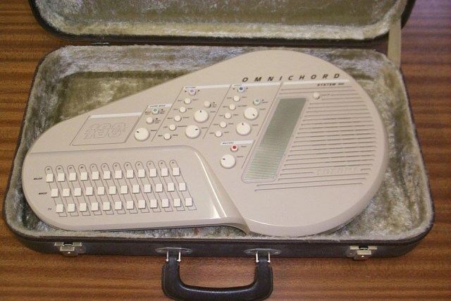
The goal of my research artefact was to create an Audio Visual Instrument that I could use to conduct User testing. My inspiration for this instrument came from the Suzuki Omnichord, an instrument first developed in 1981. It was brought to my attention by a musical comedy duo called Flight of the Conchords, who use it quite often as a basis for their songs. I first noticed it in their song Carol Brown (unfortunately they’re not actually playing Omnichords in this clip, however here you can see Jermaine playing it live at the o2).
The way it works is that you play the buttons on the bottom left, which set the tonality of the chords being played, and on the right there is a Touch Plate (known as “Sonic Strings”) on which you “strum” notes from the chord. It’s like a little electronic Harp. Made of entirely electronic sounds, you can select many different timbres for the Touch Plate Harp sounds (including Strings/Vibraphone/Omnichord etc). Here is a link for a demo of the Omnichord.
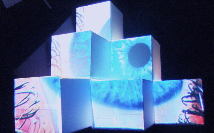
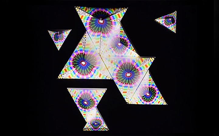
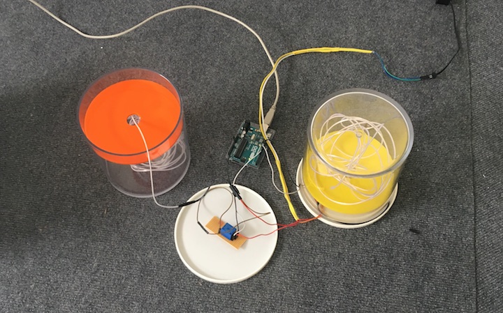
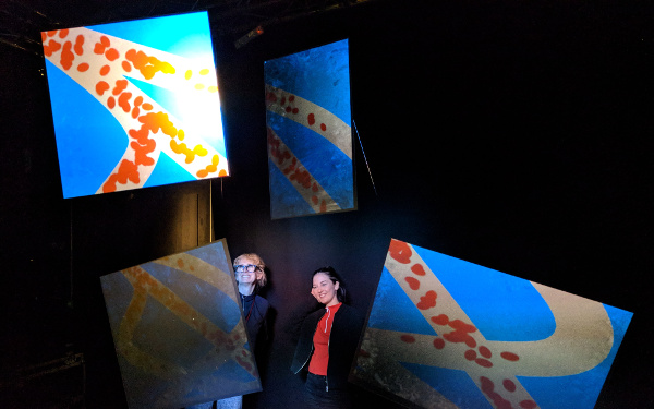
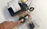
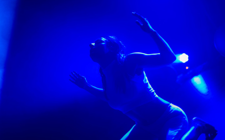
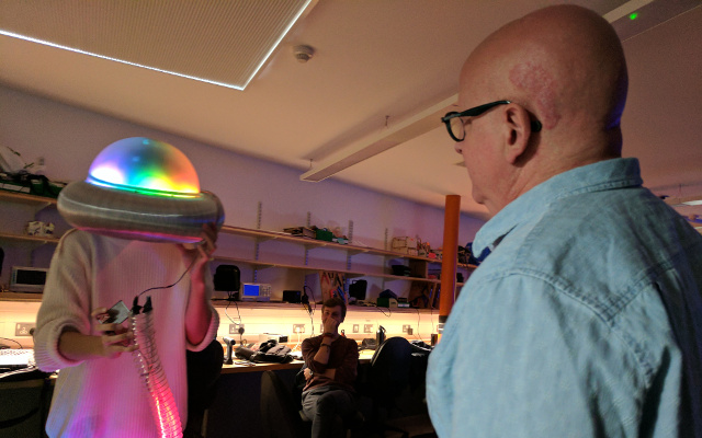
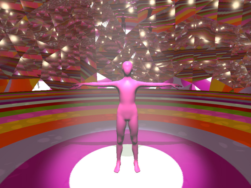
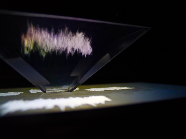
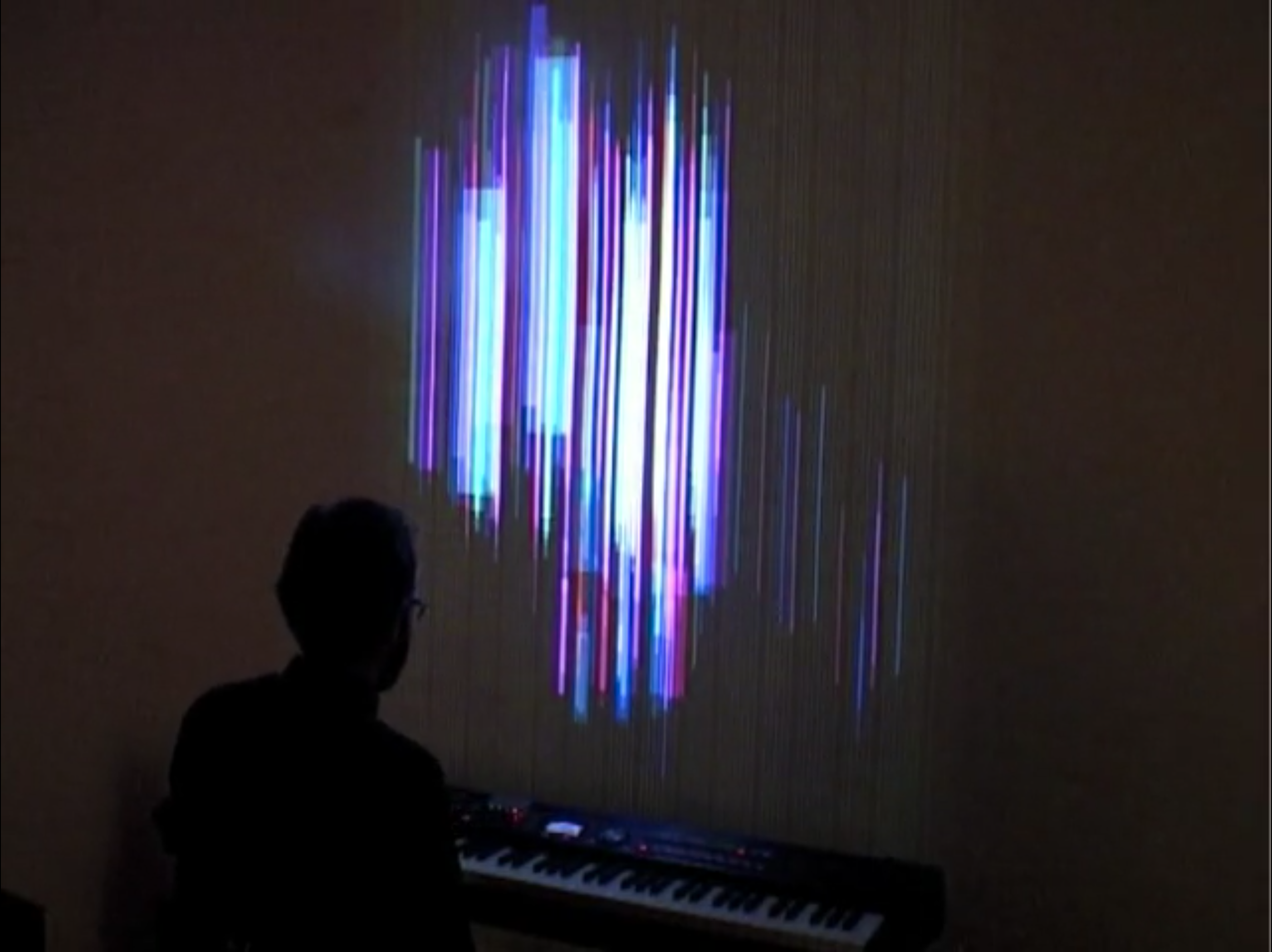
I set about making a Computer Vision/Webcam/Skeleton Tracking version of this instrument, which would also be a Visualiser. In my write up of my project, I describe in detail how this artefact was made, and the various decisions made and why. Here, I have included instead my Walk-Thru video of my research artefact, now entitled "Bubbles & Beams".
Now, with a finished artefact, I could move into the Research Gathering phase of the project by conducting User Testing.
// Conducting User Testing
The User Testing phase is arguably the most important area of my research project, and conducting it correctly as to not skew the results is paramount. My plan for conducting the User Testing is as follows.
My goal for User Testing, is to emulate a “gallery style interaction” as much as possible. Wherein the user would see a piece, and freely interact with it until they naturally finished and wandered off. As I’m using Time Spent Interacting as one of my yard sticks for measuring how pleasing the interaction is, it’s very important that the User doesn’t feel any pressure to perform or interact longer than they would have wanted to naturally. I will ask my Users to imagine they are in a gallery while they are taking part in the Testing, however I will not inform them that I will be measuring Time Spent Interacting, and I feel that will skew the results.
I will instruct the User as to how to navigate through the different modes of the piece (with the buttons 1, 2, 3 and 4 on their keyboard - the instructions are also written on the top of the window of the Program), but I will not mention anything about matched and mismatched modes, or tell them anything in regards to how it was designed. What is key is that they do not know that both Visuals have been solely designed on each of their specific sounds, and then paired or swapped.
After the User naturally comes to the end of their interaction with the piece, I will give them a very short interview of these five questions:
- What was your favourite of the modes, and why?
- What was your least favourite of the modes, and why?
- Did you prefer one of the Sounds over the other?
- Did you prefer one of the Visuals over the other?
- To what extent do you think the Visuals accurately represented the Sounds in each of the 4 modes? Please rate each of the modes from 1 (lowest) to 5 (highest).
I will also be very interested to compare their own thoughts of their interaction with the Screen-Recording and Data of their interaction. Specifically the timings of how long they spent in their favourite and least favourite Modes. This might answer another side- question that my User Testing is bringing to light, which is: Is “Time Spent Interacting” a reliable way of measuring how pleasing the User has found their interaction with the piece? Or does it ignore other more important factors?
As far as what I’m looking for in my Users - as the Instrument has been designed to be played by people of any musical ability, and that has been an important consideration in the design process, it’s very important to me that I get a good cross section of people of various musical ability/knowledge/training.
// Process of User Testing
Testing 1:
My user testing was conducted in 3 separate sessions. In the first session, I had User 1 test the instrument - also as a practice for myself in conducting user testing. I explained how the program worked, and left them alone to test it. However, the message regarding how to change modes was not clear to them, so they spent their entire engagement time in Mode 1. I had to then reiterate how to change modes and leave them alone again. I also noticed (as did the user) there was a stark noise level disparity between the first and second sets of sounds - even though they were the same volume in the program, because of the harsher nature of the second sounds they felt louder.
After Testing session 1 I decided that it is best for me to say nothing to the user prior to them entering the space, and to have the instructions written down on a piece of paper as they would be in a gallery setting, which is what I am trying to emulate anyway. That way there is more uniformity in what information they are given prior to their interaction as
well.
Testing 2:
In my second user testing session, I had Users 2 and 3 test the instrument. A lot emerged from this testing session, and it was very helpful in the process.
I wrote the instructions on a piece of paper for the Users to read, but some feedback I received from User 2 was that they, as a person with no musical training or background, were intimidated by the concept of “Chords” and “Notes”.
In this environment (the “Summer House” at the end of my garden) the “light mode” (with the Bubbles) was too subtle in daylight - the unfilled Bubbles were hard to be seen, so there appeared to be a lot more happening in the “dark mode” visuals. This is an area where I did not want difference - I’d like for both modes to feel as if they have as much going on as each other.
Something I noticed when analysing the footage of the interview process, was that there was confusion around how I was using the words “Visuals” and “Sounds”. There was lots of difference as to what the Users thought I meant. Something I have taken away from this is that I need to explain and illustrate that “Sounds” is referring to “the Overall Sound Palette” and the “Visuals” is referring to “the Overall Visual Theme”. Also that it’s important that once the initial testing interaction is over, that the User understands how the Modes are constructed from the two overall sound palettes paired with the two overall visual themes, so they have clarity when answering the questions.
There was still a noticeable noise disparity between the two sets of sounds, so I addressed this further. I am now confident in the levels.
Testing 3:
In my third testing session, I had users 4, 5 and 6 test the instrument. Having ironed out some issues in the first two sessions and having practiced my testing system, I felt most confident entering this session. Having removed the concepts of “Chords” and “Notes” from my instructions as to not intimidate Users from non-musical backgrounds, so I revised my instructions sheet.
That being said, something I found was that the users didn’t know where to stand in order to get the most control. As the tracking was being done by PoseNet, which is a “Skeleton Tracking” model, it is constantly looking for a whole body. You get the best results when standing a few feet back, and the model can see as much of you as possible. In the future I would love to develop this instrument using Hand Tracking, to be able to get more finite control. PoseNet is tracking the wrists of the user, and most users went to play the strings with a single finger, so it feels like that is the most intuitive way to make the instrument. User 5 suggested making a mark on the floor if I was intending to use this for an installation, or putting something on the instructions. Both suggestions make sense to me, and I would definitely do that moving forward.
Having conducted the User testing sessions, let us examine the results.
// Results of User Testing
The results have really surprised me. Here I have provided an overview.
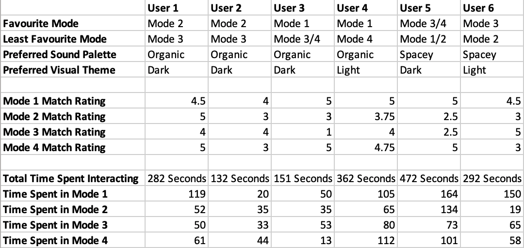
What I was expecting to see was a uniform correlation between the Users favourite mode and their most favoured “Match rating” but that is not simply the case. We do find that with Users 1, 3, 4 and 6 - however User 2’s favourite mode received their lowest match rating, and User 5’s favourite was tied between the 2 modes that contained their favourite sounds - both of which modes received drastically different match ratings.
Where we do find uniform results across the board is the correlation between the Users favourite mode, and their preferred Sound Palette. We mostly find this with their preferred over Visual Theme, with only a few outliers - User 3 and User 5 (who’s favourite mode was tied between both, which again received drastically different match ratings).
Another interesting side question I raised was in regard to using “Time Spent Interacting” as a yard stick for measuring how pleasing Users were finding each of the modes. Something that I have found which throws this off is not properly taking into account the time spent learning how to interact with the instrument, so I feel that does skew most of the results. That being said, we actually see that no Users spent the most time in their favourite modes, which is really a surprise and tells us it’s not a good measurement for what Users find pleasurable. However, we do see that Users 1, 3, 5 and 6 spent their shortest amount of time in their least favourite modes - which tells us it may actually be an important measurement is displeasure.
The finding that the majority of Users (1, 2, 5 and 6) all chose mismatch modes as their favourites, has really surprised me. If we examine their reasoning below:
User 1: “Mode 2. Because it’s the softer chords, which I like, but the stronger graphics. I like strong graphics and soft chords. Harsh sound doesn’t appeal to my ears.”
User 3: “Mode 2 was my favourite. I like the spinning triangles more, I thought it was more fun.”
User 5: “Split between 3 and 4. More Sci-fi-y. More distinction between the notes.”
User 6: “Mode 3. More 80s synth, but I preferred the visuals of 1 and 3.”
Generally, the reasoning I’ve been seeing for choosing a favourite mode, is it being a combination of the user’s favourite sounds and their favourite graphics. There is very little talk of the graphics beings a good representation of the sounds.
Some other interesting points emerged as well. One of the Users pointed out that they preferred the Dark mode, because they could see less of themselves in the visualisation, therefore could get lost in it a bit more. Another pointed out the similarity of the Bubbles graphics to a Social Media live stream where people are doing live “reacts” and they float up and dissipate - so maybe this made her subconsciously feel more comfortable seeing something more familiar.
The user testing process really has been fascinating, and a steep learning curve for myself. It has given me results I really could not have predicted.
// Conclusion
To reiterate, the core question I have asked within this project, A Study of the Visualisation of Music, is "When attempting to visualise music, to what level do the sounds dictate what the visuals must be? Do they have to interact with each other in a certain way, and adhere to certain norms for us to find them pleasing/interesting to interact with?”.
What I have found is actually, the sounds really don’t dictate at all what the visuals must be. They dictate something to the maker, and you follow your vision to create what you feel that sound “looks like” - but to a User, something created for a totally different sound can be just as good of a visual representation.
In terms of how the visuals and sounds must interact with each other, I have found that the one thing that really ties it together is that the visual representation occurs at the same time as the sound, making it clear that the two are linked. This has been a constant throughout my testing, and one that was clear had to be in place during the making process. However, the visuals apparently do not have to adhere to certain norms (tested with the shapes/colours/theme) for us to find them pleasing or interesting to interact with. We dictate a scene, or a World to our Users, that behaves and acts a certain way, and how well it resonates and touches the user is almost entirely down to personal preference.
I really am shocked to have found this - having made Bubble type sounds which are then represented as Bubbles, and then Laser Beam type sounds which are then represented as Beams, the idea that one visual could represent the other sound in such a pleasing way when they are to me so clearly opposite, is fascinating. When I created the mismatch modes, I truly was surprised at how much I enjoyed the mix - it was quite disheartening at the time, but overall very liberating. These results open up a lot of freedom when attempting to visualise music, and actually will lead to me personally feeling a lot less mentally restricted when designing visuals and graphics in the future, a lot less caught up with any sorts of notions of “right and wrong” in this arena.
// Bibliography
HISTORY
Thomas Wilfred - Master of Light https://youtu.be/gbs3NQ2mf4c
CDM watch the Clavilux https://cdm.link/2015/08/watch-clavilux-ethereal-light-organ-100-years-ago/
Birth of Music Visualisation http://blog.modernmechanix.com/birth-of-music-visualization/
Visualizing Musical Performance https://towardsdatascience.com/visualizing-musical-performance-5da28b96957a
Landr - Sound and Vision: Music Visualization Lets You See Your Sounds
https://blog.landr.com/music-visualization/
Ethan Hein Blog - Visualizing Music http://www.ethanhein.com/wp/2011/visualizing-music/
Conserving Thomas Wilfred’s Lumia http://www.getty.edu/publications/keepitmoving/case-studies/4-snow/
“Colour organ” https://en.wikipedia.org/wiki/Color_organ
Mary Ellen Bute http://greatwomenanimators.com/mary-ellen-bute-2/
WAVEFORM REACTIVE VISUALISERS
Atari Video Music Demonstration https://www.youtube.com/watch?v=BX1LVBLUYNs
Old Winamp Visualisation https://www.youtube.com/watch?v=4kd6ES-TaoU
MIDI VISUALISERS
Clavilux 2000 - Visual inspiration: https://vimeo.com/8012159
MIDI Controlled Music Visualser - Callil Capuozzo https://vimeo.com/37253640
MIDI Visualization, a case study - Simon Rodriguez http://blog.simonrodriguez.fr/articles/28-12-2016_midi_visualization_a_case_study.html
Ethan Hein Blog - Visualizing Music http://www.ethanhein.com/wp/2011/visualizing-music/
James Jamerson - For Once In My Life Visualiser https://www.youtube.com/watch?v=At3OP5CvIRY
MIDI Keyboard Visualizer [experimental] - Fader https://vimeo.com/12537719
Rousseau - Fur Elise https://www.youtube.com/watch?v=wfF0zHeU3Zs
Rousseau Youtube Channel https://www.youtube.com/channel/UCtU4TuP7MgsNbfOLriUq9fg/featured
ARTEFACT
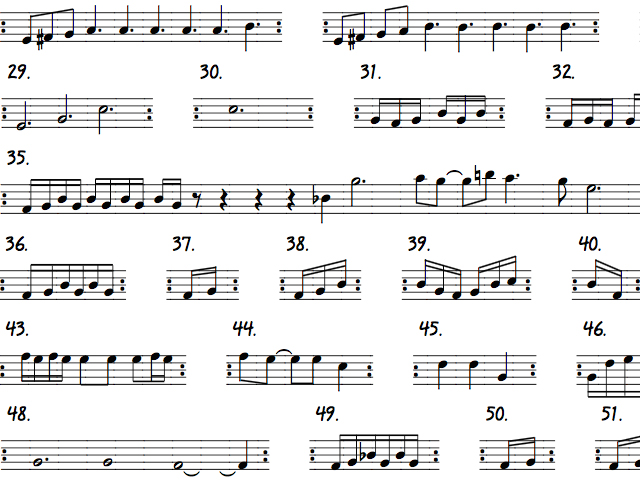
Zach Danziger Video Breakdowns https://www.youtube.com/watch?v=7B-g-l-13o8 https://www.youtube.com/watch?v=tKRdEM6YgNM
Flight of the Conchords Carol Brown Live at the o2: https://www.youtube.com/watch?v=AI-gXnA1ZIo
Flight of the Conchords Carol Brown: https://www.youtube.com/watch?v=1cGoDns8wTA
Omnichord Demo: https://www.youtube.com/watch?v=XYIUwlMVS8E
Omnichord wikipedia https://en.wikipedia.org/wiki/Omnichord
I don’t really Mind - YouTube Link https://www.youtube.com/watch?v=crEsha0qOYI
Kevin Parker Lonerism Synth Sounds https://ligger.wordpress.com/2013/01/07/my-top-3-studio-gadgets-tame-impalas-kevin-parker/