Anna Mirkin
FUTURE MONUMENTS
Personal Biography
Anna Mirkin (Moscow 1983) is a visual artist working in a wide range of media, based in Berlin since 2018. She studied at the Fashion Design Department of Shenkar College in Ramat-Gan and received several awards for her work. In recent years, her work has focused on connecting the digital and physical worlds. Working in a variety of media, including installation, textiles, drawing, new media and murals, as well as participatory and collaborative projects. She integrates ready-made materials into spatial and virtual assemblages, creating new narratives and perspectives on familiar situations. Mirkin’s work explores the connections between personal identity, memory and the collective subconscious, using pop aesthetics to reflect on the cultural symbols and power structures that underpin them.
Mirkin’s work has been exhibited in several museums, institutions, and galleries, including the Haifa Museum of Art and Helena Rubinstein Pavilion for Contemporary Art at the Tel-Aviv Museum of Art.
In 2021, she was selected for the LABA Berlin artist fellowship. Her recent projects include the interactive installation ‘UX’ at the Neun Kelche Gallery, the international project ‘A Lying Sun’ at the im Turm Gallery in Berlin (2022), and the Almacen Gallery in Jaffa (2023).
Project
Anna Mirkins’ project integrates archival materials, such as letters and testimonials, with AI generative models and robotic paintings to reflect on personal histories from the Soviet era. The project uses AI image generation to give visual form to stories that were undocumented with photography. The robotic painting adds another layer of conceptual and emotional depth through the transformation of the AI images into physical drawings. Programmed to mimic the artist’s handwriting, this challenges the viewer’s perception of the boundaries between human and artificial creation. The drawings are then used in a 3-dimensional immersive installation. This ‘floating monument’ evokes personal memories of the Soviet era and offers personal perspectives on the monolithic narratives of history. The project examines the intersection of collective memory and technology, rethinking commemoration in the age of artificial intelligence. It raises critical questions about how new digital media can shape and create reality. ‘Future Monuments’ presents an innovative application of AI in a social project, utilizing archival texts as prompts.
The project emphasizes the importance of small moments, memories, and perspectives that make up our reality. This approach stands in contrast to the present-day prevalence of AI-generated misinformation and the historic unifying narratives of Soviet propaganda. The project aims to promote a nuanced and multi-layered understanding of history. It re-imagines the role of monuments as a collective creation that encapsulates a multitude of personal experiences beyond nationalism and reflects our diverse histories.
This project raises questions about how robotics can assist in creating monuments collaboratively. How can the visual collective subconsciousness database of AI image generators be mobilized to create impactful social art projects? And how are public narratives shaped in digital public spaces?
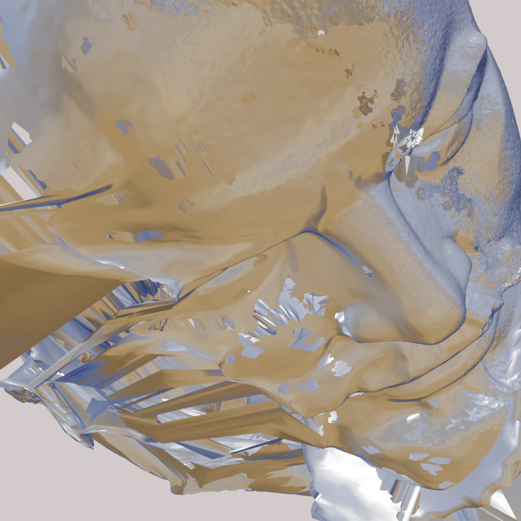
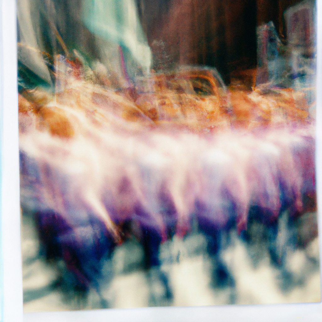
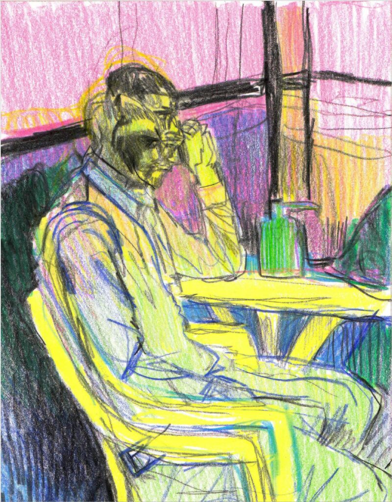
Research – reading Women’s experiences of repression in the soviet union and eastern europe by Kelly Hignett, Melanie Ilic, Dalia Leinarte and Corina Snitar.
- Collecting material for visualization.
- Collecting passages that have a personal perspective – situation described by a specific person, with a quote long enough to describe the environment and the situation itself.
- Currently the information is sufficient to create test images but for the final project I would like to have the full story of each woman to be presented next to the drawing, as well as a more detailed description of the situation – precise location / season of the year / age of people involved ect.
Proposed format for text in installation:
- Name, place and date of birth.
- Paragraph on larger story – Reason and location of arrest / family arrest , consequences with dates and locations, and what happened after – release / return to society / reparations / permanent loss of property. With dates and location details.
- Paragraph containing the quote used to create the image.
- Questions that arise:
- Some of the stories are so violent and brutal that I cannot handle creating images of the situation andI also wonder about the impact and necessity of such images. Question being – how to address these violent situations without being graphic? Or what situation to pick that would still be an accurate representation of the stories?
- In a gallery situation the viewers have a limited attention span, how many stories can I incorporate in the installation without losing the viewers attention?
- Initial thoughts on the text – Beyond the expected narratives what I find surprising and interesting is the difference to the male stories.
- The solidarity and mutual care as a survival strategy: forming care systems of mutual support, caring for others as a motivation for survival, addressing each other’s mental health as well as physical.
- Loss of femininity as a form of torture: the lack of general hygiene and lack of hygienic products for menstruation is often addressed, lack of privacy in bathroom and showers being watched by male guards, preforming physical labour unsuitable for females (duties of women in a cultural and historic context), loss of feminine appearance while wearing prison uniform.
Sample of procedure
Quote from test:
Locating detainees
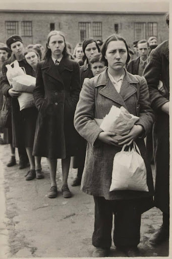
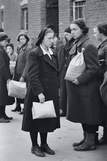
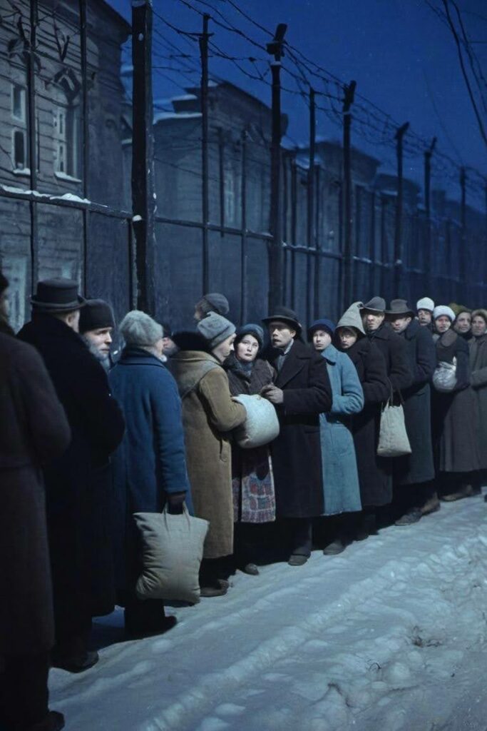
Following an arrest and especially in the larger metropolitan centers, it was not always possible for the family members remaining at liberty to locate where their relative had been taken, as Akhmatova’s testimony illustrates. Wives and mothers, sisters and children queued, seemingly endlessly and in all weathers, outside central police stations, NKVD offices, information bureaux (in Moscow noted as at the address Kuznetskii, 24) and nearby transit prisons (such as Lefor- tovo in Moscow) in the hope that a name could be identified on local lists, money could be handed over and their carefully packed parcels could be delivered. Each family would have to wait for their turn to be seen at the small window where enquiries could be made. Tatiana Ivarovna Smilga (b. 1919) noted that, “At the age of 16, I remember going round all the prisons’.” Gertruda Fedorovna Tegleva noted that queues built up overnight depending on the date of the arrest and by the alphabetical order of surnames. Maya Rudolfovna Levi- tina recalled delivering parcels with her mother to the Kresty prison, where those arrested were detained in Leningrad before being executed or sent to the camps.
Page 25
Tests of prompts (negative prompts were adjusted according to results)
a black and white photo from 1937, a long queue outside Kresty prison, focus on 16 year old girl with her mother, holding parcels
a colored photo from 1937, a queue outside Kresty prison in Leningrad, people holding parcels and bags , look worried, night time,
Resulting images:
First visit to Konstanz laboratory , working with Michel Stroh
What rules can be taken from my drawing style that can be applied to an automated procedure? Decisions that are normally made by me in an intuitive manner when viewing and interpreting a reference photo need to be turned into code:
Note – mostly regarding linework – The style we are referencing is drawing with pencils, but we are using brushes and ink to imitate it, this already creates a big difference in appearance but also provides new possibilities. When creating a drawing I mostly use one line to create a surface or an image – this allows me to be in a state of flow, I use an image reference glancing at it while drawing without leaving the paper. This creates interesting deformations in the image that can be attributed to what makes my personal style. But this technique cannot be applied to ink drawing or acrylic paintings as I would need to stop my line frequently to dip the brush in the paint. After several tries I came to the conclusion that these stops create a brake in my flow of work that does not allow me to achieve the same quality of image that I associate with my style. Therefore a robotic painting that cannot lose its flow as it has been pre programmed can be an interesting experiment in this context, opening possibilities of techniques that are unattainable to me.
- How to divide the image into color surfaces and linework?
We decide to start with creating the color blocks as the background and deal with the linework separately.
- What level of abstraction keeps enough detail for the viewer to read the situation depicted but doesn’t provide too much detail? I notice that I usually use a few colors for the background in abstract color blocks, some of the background is exposed paper/ textile, preferably there is an unequal division between the colors, with some colors used as accents.
We tested different amounts of detail VS abstraction percentage on a few images to find middle ground – same percentage that can be used for all images and produce a good result. Combining with division to different amounts of colors.
Problems that arise – Some divisions create too many iterations meaning the painting process will take too long.
Conclusion – The image will be divided to 4 shades of grays, those will later on be assigned colors by me. Out of the 4 just 2 colors will be painted, deleting the lightest gray and the mid light gray seems to create interesting compositions and leaving the right surfaces to be able to make sense of the image.
*We also noticed that BW images work better in this method, also AI images that were produced by AI in BW tend to be better than color, I`m assuming that it is because the data photos AI is referring to when generating the images are also BW.
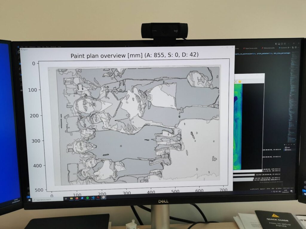
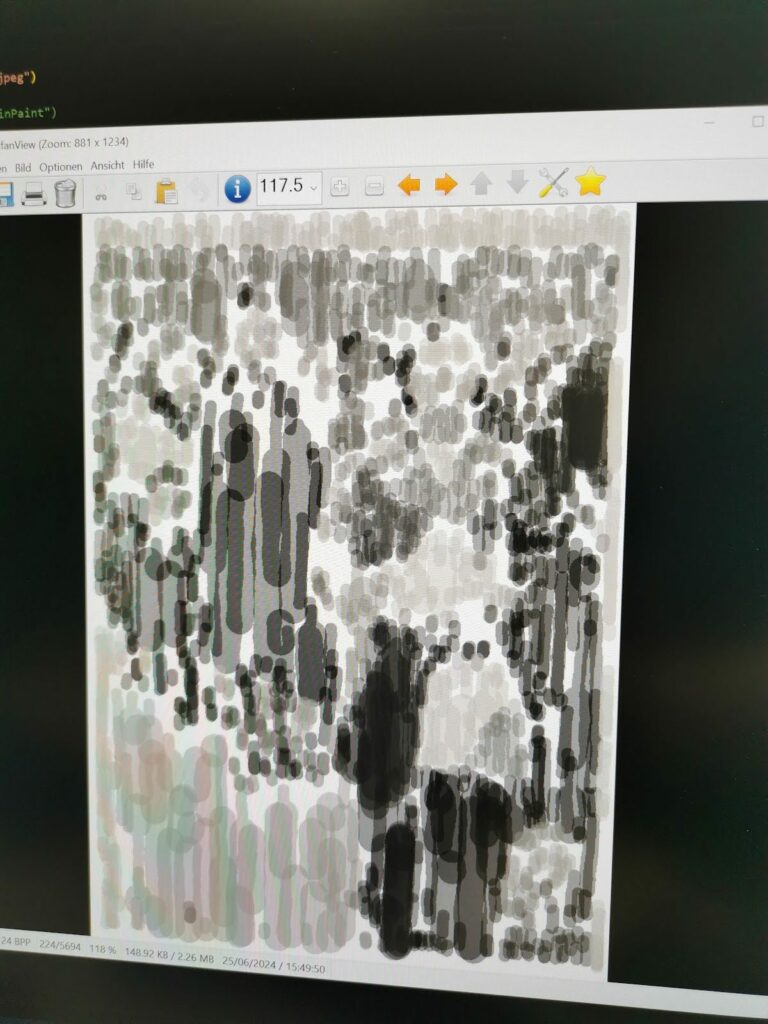
3. How does my hand move? I use a zigzag motion of vertical lines with slight curvature and irregularity – the lines don’t fill each surface from top to bottom but instead create smaller horizontal surfaces within each surface. How can that be translated to robotic gestures when the division to smaller surfaces does not exist in the original reference image but is created intuitively and by limitation of my hand movement? As I usually paint very fast, the division to smaller surfaces allows me to create rhythm and structure within the texture without losing speed and flow.
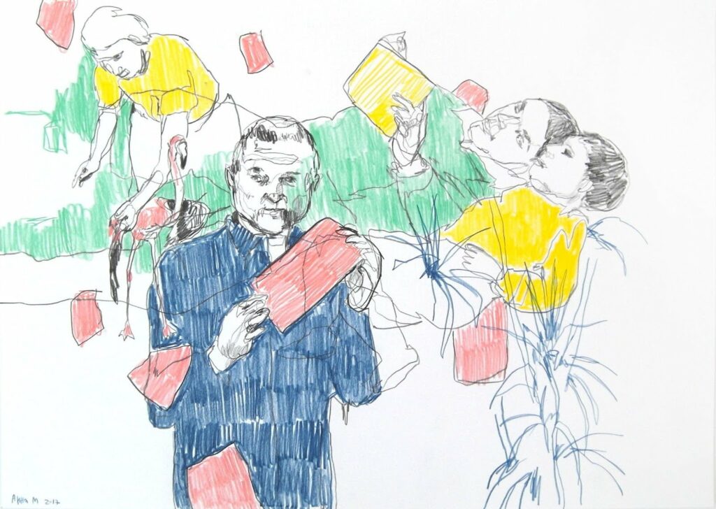
Conclusions:
- Create the surfaces from vertical lines.
- Add a percentage of random diagonal angles to the lines.
- Limit the length of the lines giving a max and min length.
This creates an interesting texture of random short lines – not the same as my drawings but a robotic variation that I could not do myself because of speed and patience limitations. Thus creating a hybrid of styles that makes use of robotic abilities while working around technical limitations of image reading.
Brush pressure also plays a crucial part in the appearance – the brush pressure selected is 40-60%.
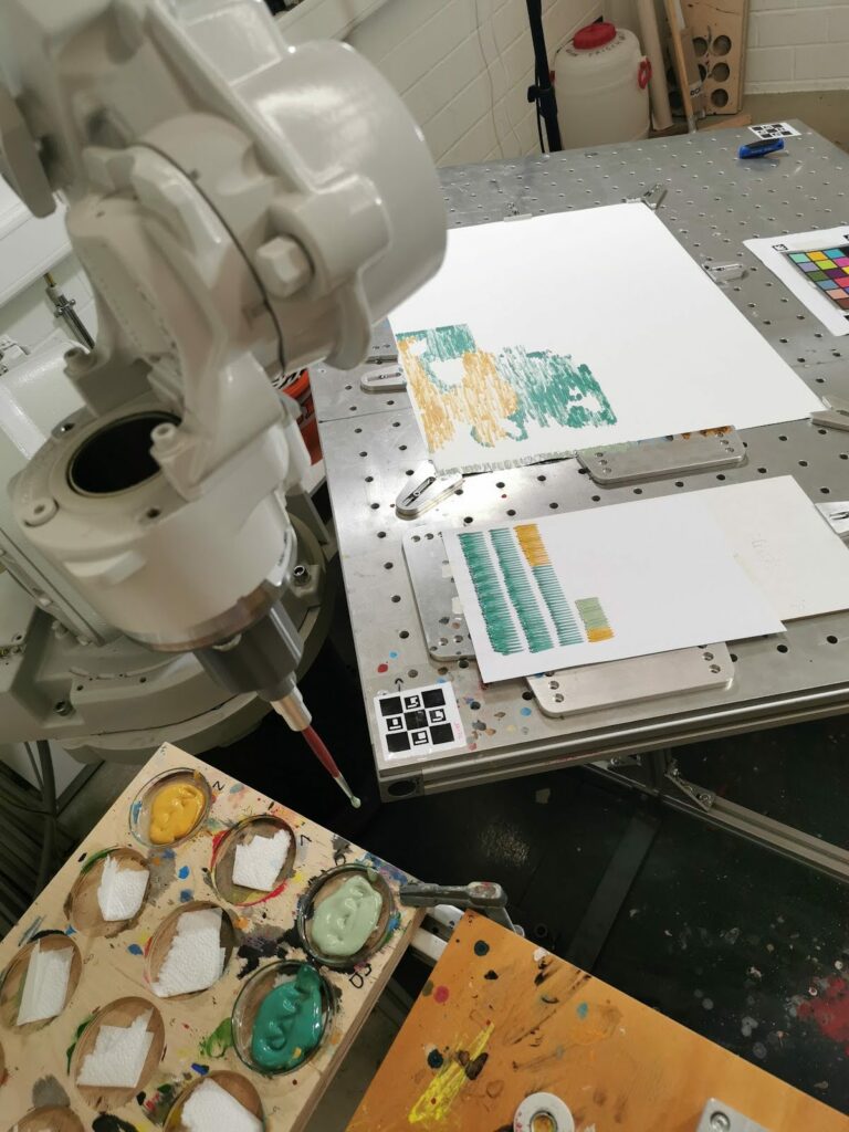
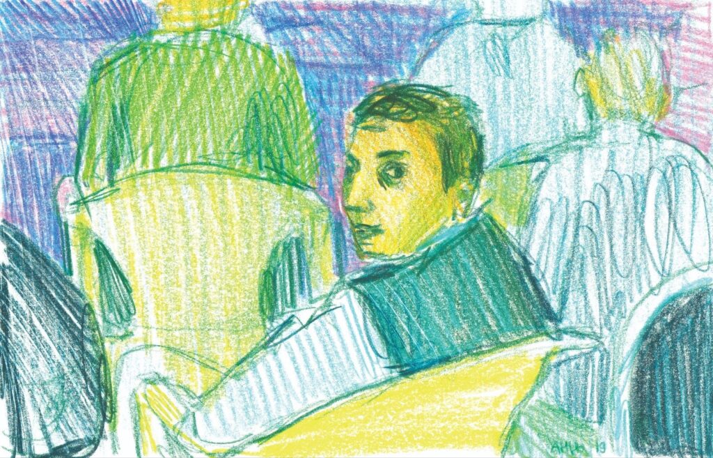
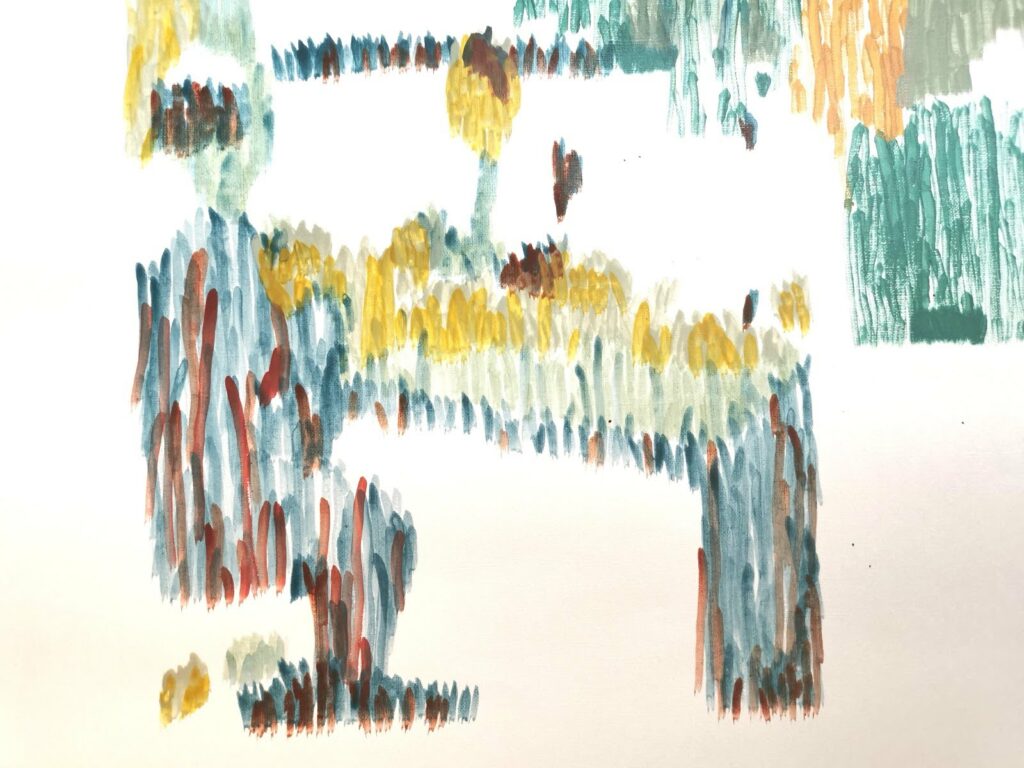
After the first try I notice that the colors feel flat – and I look back at my drawings to understand what adds depth to the color blocks. As we have established, the division to smaller parts is not possible because there is no shape reference in the original image. I notice that I sometimes use 2 or more colors to create one colorblock adding a depth and movement to the composition. But the second and third colors are only partially covering the main layer of color.
We tested what happens if the second layer of color can be created at random – using the same space coordinates but only filling it 20% – 40% instead of 90% – 85% that was used for the first layer. This creates an interesting result – instead of creating a closed shape or a stain on top of the first layer the robot creates the lines randomly. This does not imitate my logic when drawing, as it does not take composition in consideration, but it does give an interesting result, and makes it in a method that is new to me, therefore again creating a hybrid of human and machine creation.
Things to try next
- assigning different diagonal directions to different blocks.
- Using a bigger brush on a bigger surface.
- Testing different acrylics and different brushes.
Material research
What material should the final installation be made off? I would like to use sustainable and non toxic natural materials.
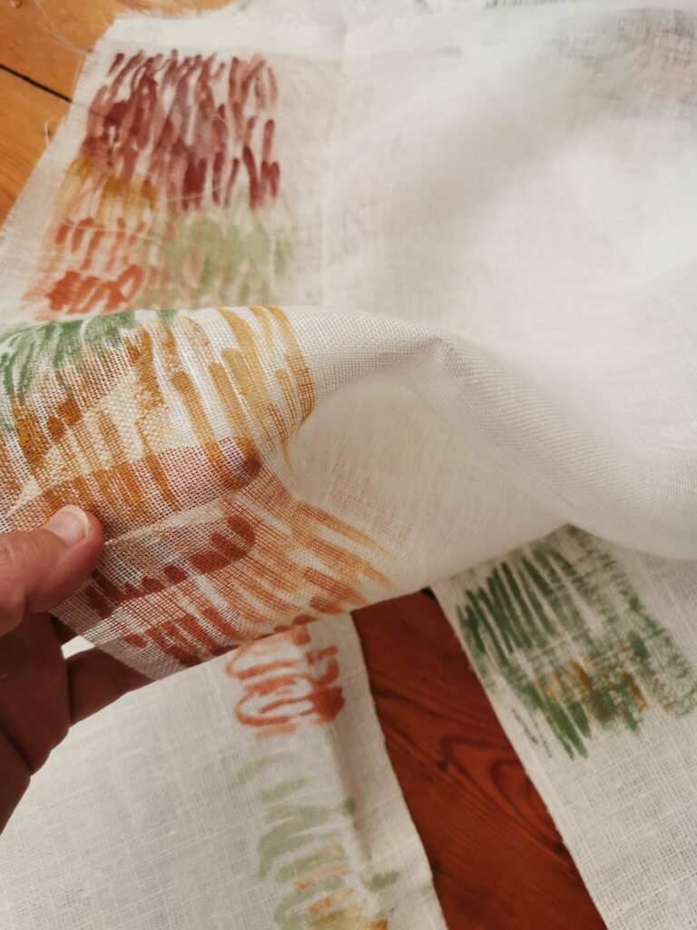
Linen seems to come up in the historic research text in the context of prison uniforms. This natural and versatile material is currently mostly associated with leisure wear or luxury products, as a fine and softened textile with a high thread count (thin yarn). But in the text it is described as itchy, and rough, as this material can be when undergoing minimal processing.
This resonates with the theme of loss of femininity. As the women who were perceiving themselves as delicate and gentle were suddenly faced with disastrous circumstances that forced them to become rough in order to survive.
Linen fabric is chosen for now as the primary option of material for the installation.
I tested several fabrics for acrylic ink painting with and without coating. The thicker fabrics that anyway have no draping or movement don’t change their appearance when treated with a primer coat, and they react better to ironing. But the thin and transparent fabrics change their appearance and texture to an unrecognizable degree. Therefore the thin fabrics are to be used without coating.
Preparing for working om linework with Daniel Berio
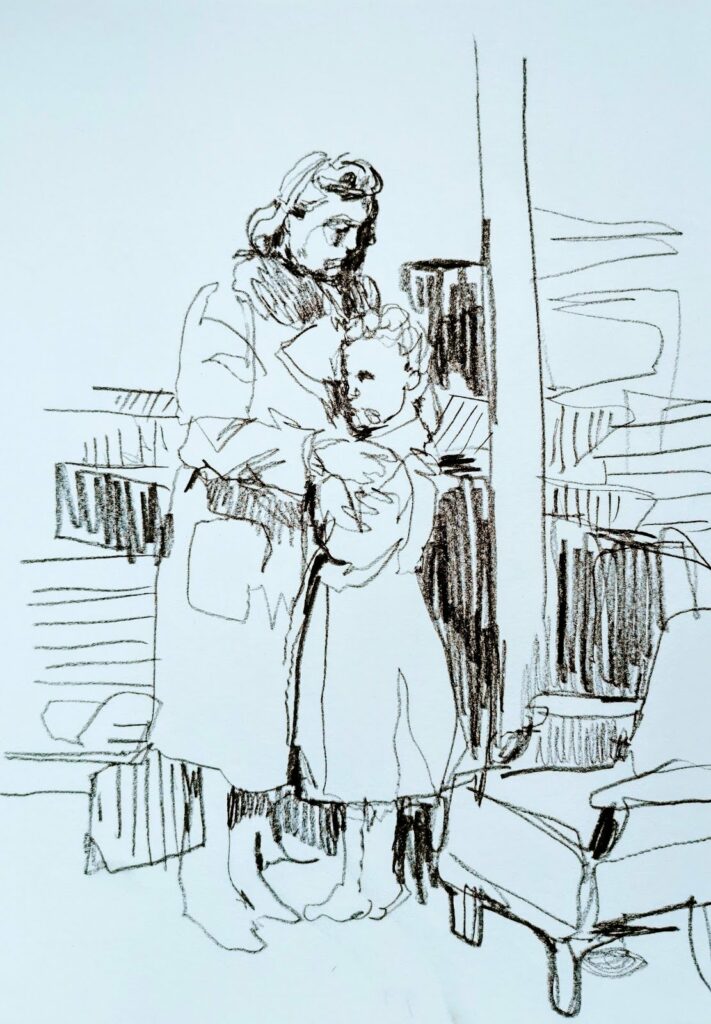
Following Daniels suggestion I created some hand made drawings from the AI references to have some idea of how these images should or could look.
Links
Instagram: @anna_mirkin
Website: www.annamirkin.com