


Data Visualisation & Exploration of Human Perception Extension
by Yi Liao, Siyuan Wu
For some extend, our knowledge of the world comes into being through the multimodal cues and styles chosen to ‘arrange’ data and present information – that is, through design, or, we often rely on visualised data’s ‘appearance’ to understand their ‘substance’.(Aiello, 2007)
Thus, it brings us the questions: How do data influence the way we understand the world and how that formed our consciousness? Also, how can we progress the data visualisation into art practice, and is there any connection with human perception?
Visual Perception
The effectiveness of visualisations depends on the effective use of the capabilities of the human visual system to perceive visual structures. (DASTANI, 2002)
Although the perception is the something that difficult to describe intuitively, in many cases that we were touched because of the connection in our perception.
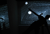
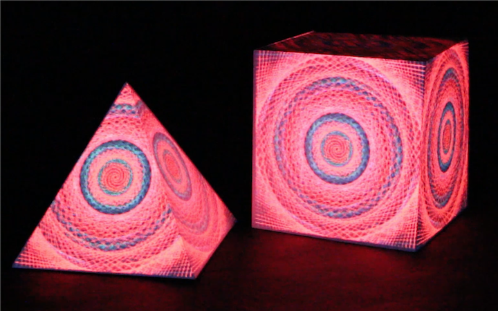
We are aware of a connection in the type of artwork from Ryoji Ikeda, Refik Anadol, which may be the memory or cognition, or the curiosity about the human experience that technology can extend. At the same time, we want to collect some experience that is perceived, or experience that is not easy to experience, and reappear and be perceived again in a new way.
The privilege
We found that it is normally hard to guarantee the objectivity of data visualisation, mainly due to the following two points: visualisation conventions and visualiser’s special privilege. A convention is a symbolic or social practice that is shared, readily understood and widely accepted by members of a cultural group(Kennedy, Hill, Aiello and Allen, 2016).
The visualiser’s special privilege, on the other hand, is describing that visualisers have a privilege to incorporate their own perspectives or preferences during the generate of visualisation, thereby, it will finally affect the presenting and the viewer’s understanding or cognition of the original data. While we certainly concerned this as an issue, we also believe that as a creator, we perform the same visualiser task, but could work beyond the use of technology itself. ‘From the research on the cortex of the brain(Chong, Familiar and Shim, 2015), our visual system regularly fills in extensive details to create enriched representations of visual objects. However, the raw sensory data are often partial and impoverished, so it is contrary to our seamless and unobstructed perception of visual objects.’ The same rule applies to the creation of artworks, where our final perception also benefits from the filling of our own imagination.
Visual Presentation
Through some research shows that attention to the single element affects the responses of neurons with receptive fields throughout the visual field(Boynton, 2005). However, from the whole visual space, the details changes from global vision are normally ignored. So we want to do the practice that to influence the overall visual effect by focusing on the local feature-based attention mainly and considering the relationship between the attention and stimulus establishment. Also, from the artefact, the lead of the way to view could give the discovery of receiving information.
It should be mentioned that the perception is regarded as a two-way process: The hypothesis about what a stimulus may be interact with what the stimulus actually is in determining what the stimulus is finally perceived to be. (Navon, 1977)
Therefore, while exploring the research of psychology, or cognitive science, and establish the different layers of vision and spatial construction. It is also essential to understand the receiving and the viewer’s perspectives.
Artefact
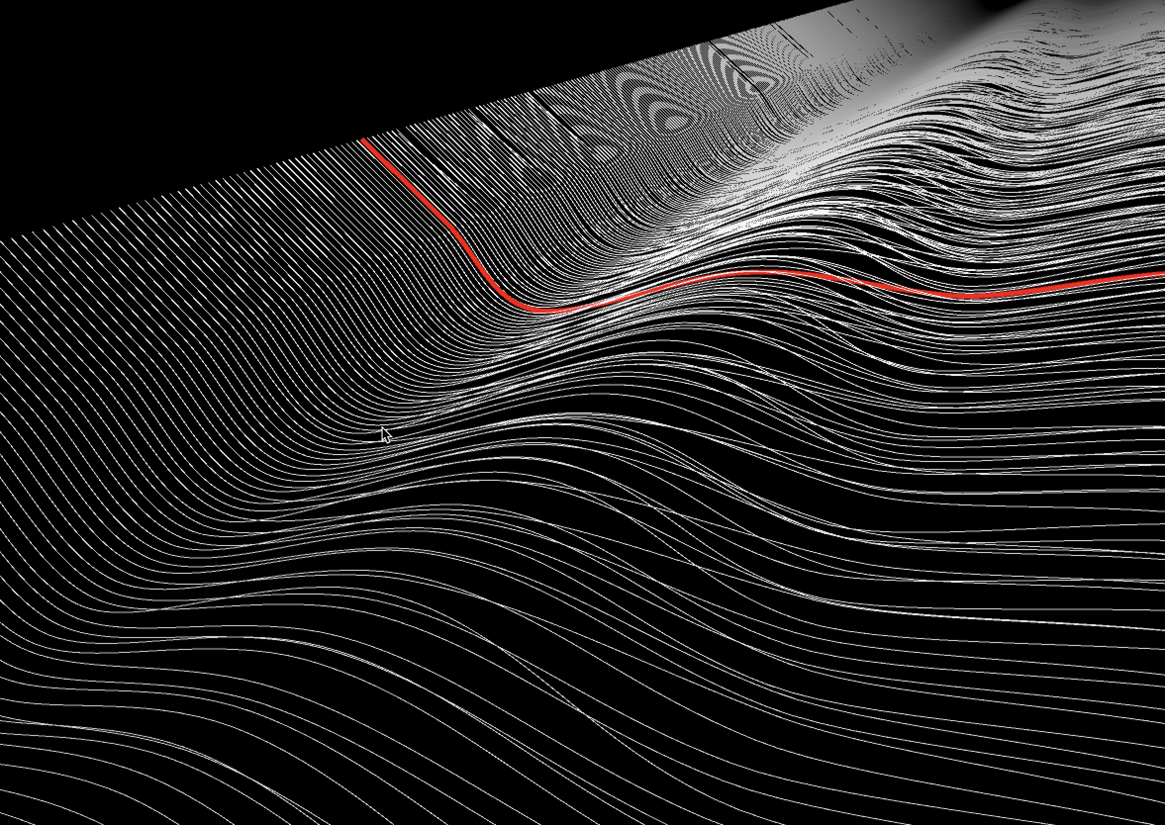
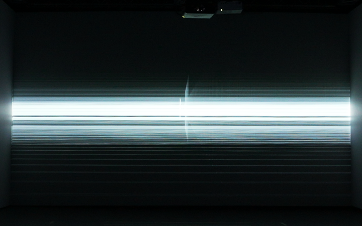
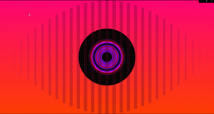
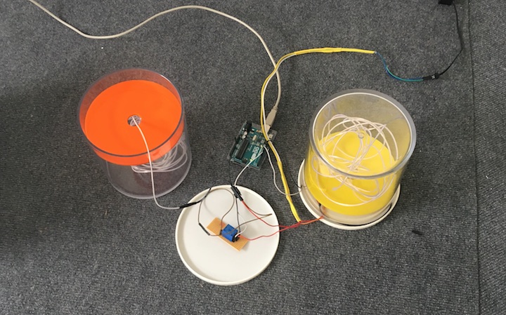
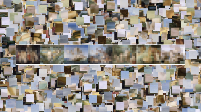
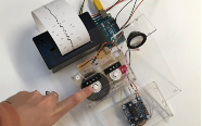
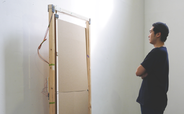
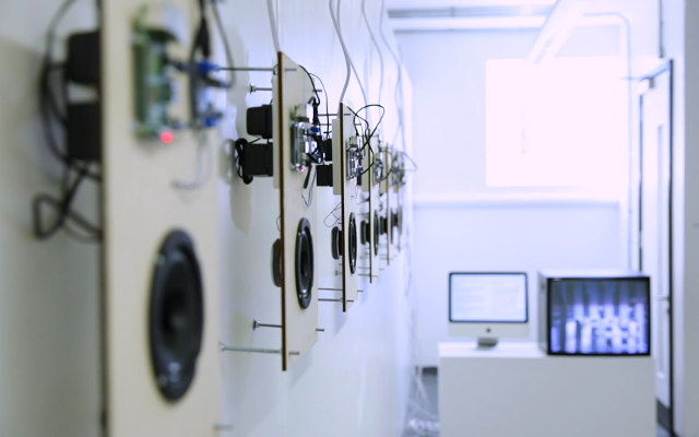
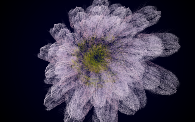
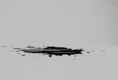
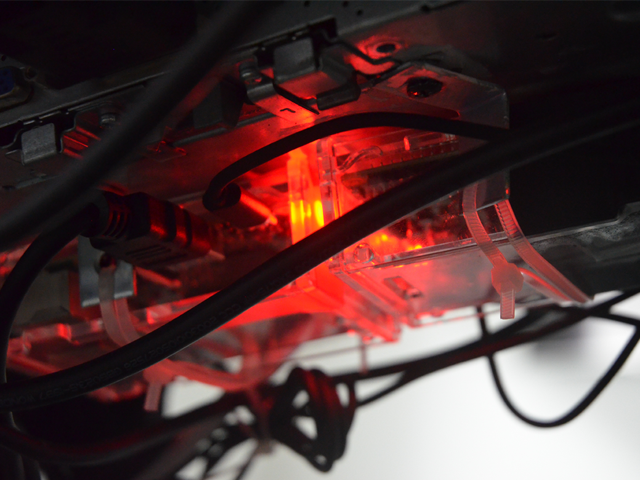
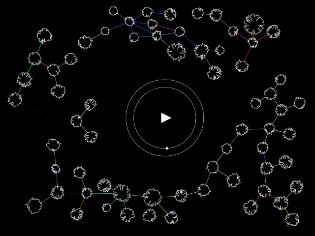
We made a visualisation of sleeping data as our artefact, which is a river that recurs the sleeping status during the whole night and leads the viewers through it with an animation. With this subject, we tried to highlight how data visualisation could take advantage of data to record and reproduce an event, and help the audience to re-experience the event by visualisation.
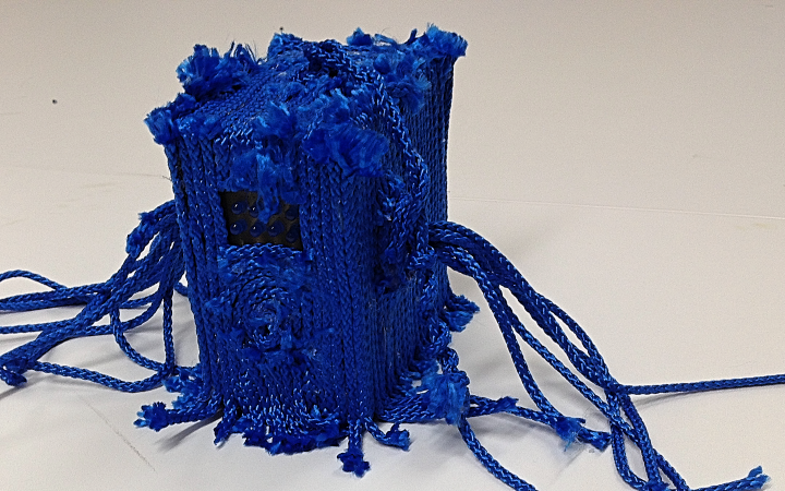
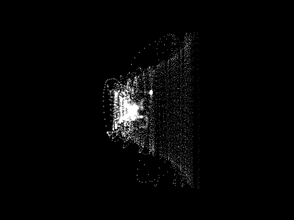
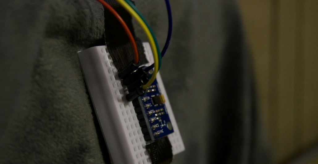
To collect the sleeping data, we stuck an MPU sensor on the bed (which is a sensor that contains an accelerometer, a gyroscope and a compass). Each of these three functions of the sensor works in three dimensions, so it produces tons of data to describe sleeping states. We then store all of these data to a text document, to build a read-able database(read-able for machines), from where we generated the visualisation of this river of sleeping data.
‘When attention was directed away towards a fixation task, the response to the pair of stimuli fell between that to the preferred and that to the anti-preferred stimuli when they had been presented in isolation.’ (Boynton, 2005). We also want to build a visual centre to grab the viewers’ attention, to help them focus on the core layers of tanglesome visualisation.
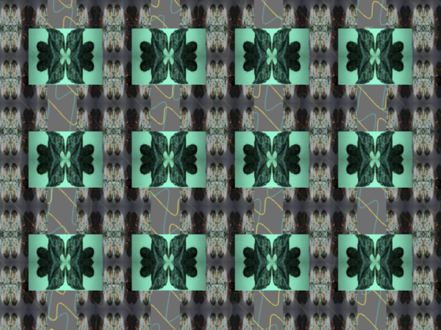
So we made a red curve to lead the visual perception of the viewers to go through the whole sleeping river, and lead them to re-experience the sleep. The idea is to give the viewers a standing point in this river of this massive amount of data, and we included it as the local feature-based attention for the preferred stimulus, so the change around the centre of the red part serves as visual local feature-based attention to guide the audience’s attention, as a form of exploring the relationship between the visual perception and data.
Taking a macroscopical look at the river, the irregular jitter which occasionally appears in the river shows that the user was moving his body. So every time the jitters happens, it will make the river a little bit different from it was before, which represent how much body posture changes the user has made since the moment they fall asleep. On the other hand, the red curve is like a boat sailing in the river that represent this moment of sleep that the viewer is browsing, and allow them to look back and forth in their field of view, to see what has happened and what is going to happen, so that they can be aware that how does the shape of the river change.
Conclusion
By combining the meaning of data and the reprocessing of visualiser, data visualisation can help people to have more experience beyond OUR regular life. Therefore, visual is the things that could build stimulate directly on people and could give a strong impact and connection with human perception.
Meanwhile, although we work under the guidance of the original data, it also needs the support from the variable of generated vision itself, to work on the viewers own understanding from those computer-generated. That could let the viewers further perceive the abstract but vivid experience brought by generated vision.
Podcast
REFERENCES
Aiello, G. (2007). The appearance of diversity: Visual design and the public communication of EU identity. In J. Bain & M. Holland (Eds.), European Union identity: Perceptions from Asia and Europe (pp. 147–181). Baden-Baden: Nomos.
Kennedy, H., Hill, R., Aiello, G. and Allen, W., 2016. The work that visualisation conventions do. Information, Communication & Society, 19(6), pp.715-735.
DASTANI, M., 2002. The Role of Visual Perception in Data Visualization. Journal of Visual Languages & Computing, 13(6), pp.601-622.
Boynton, G., 2005. Attention and visual perception. Current Opinion in Neurobiology, 15(4), pp.465-469.
Navon, D., 1977. Forest before trees: The precedence of global features in visual perception. Cognitive Psychology, 9(3), pp.353-383.