


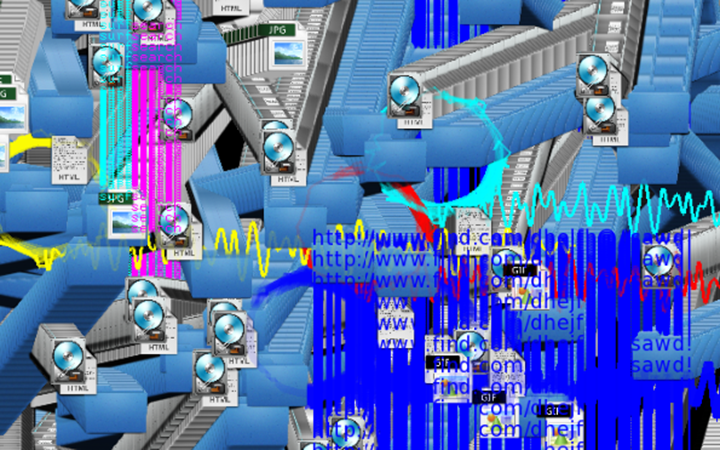
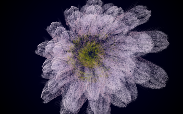


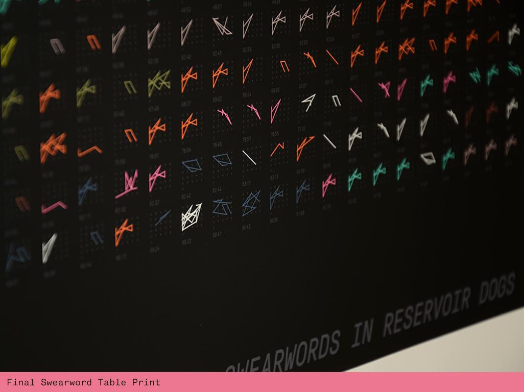
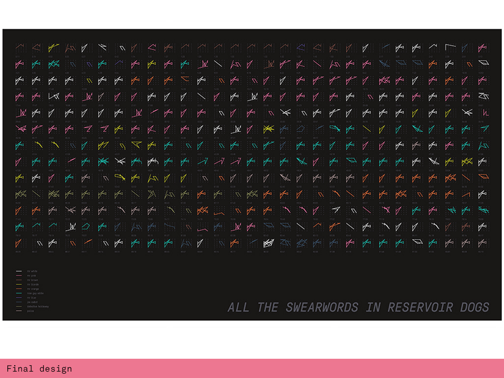
The Reservoir Dogs Swearword Table
A data visualisation of all the swearwords in Reservoir Dogs drawn on individual alphabetic grids. Mapped with their character and timecode these swearwords are arranged in sequential order as a new symbol language and visual navigation tool to narrate the film.
produced by: Panja Göbel
Introduction
We are living in times where we are surrounded by data. Air pollution, weather, health, transport, our personal stats are always at our finger tips subtly shaping our experience. However when we are watching a film we don’t really view it through a data lens - sometimes surely we need to switch off from all this? Yet what if the data revealed a different visual story in its own right, another expressive layer that won’t destroy our connection with a film but create a separate entity driven by some of the film's core ingredients?
Concept and background research
The computational art pioneer Manfred Mohr would call this "programmed expressionism", the idea that algorithms would connect lines in rational ways whilst also creating compelling visual narratives as a result. His work is equally reductionist and dynamic, arrangements of simple elements, communicating different expressions through different configurations. I found plenty of inspiration in Mohr's iterative work. From the outset I had a vague idea that I wanted to visualise a timeline of some sort to allow the viewer to connect to particular scenes through the illustrative qualities of the swearwords.
Technical
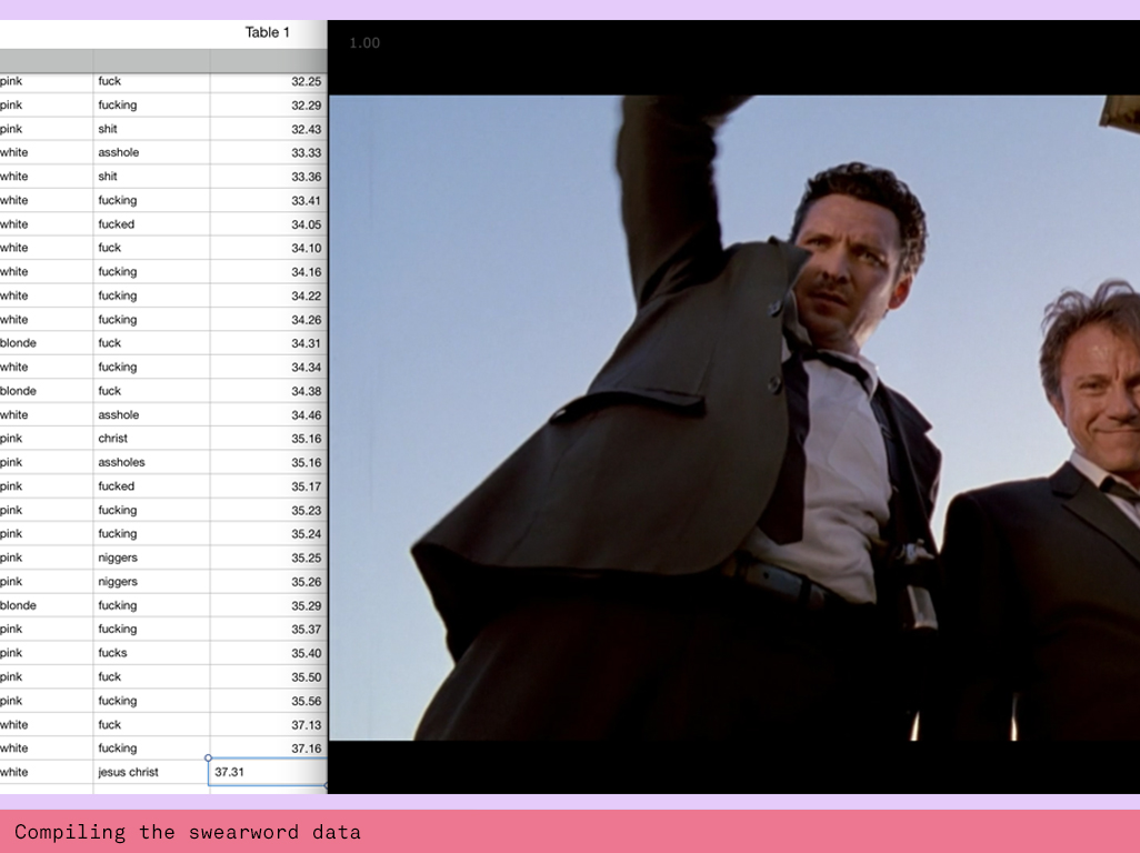
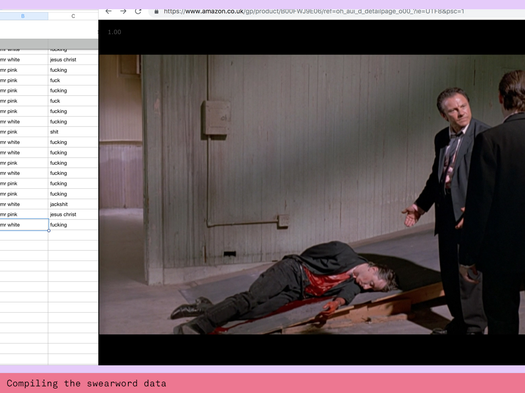
There were 3 aspects to this project: the data gathering, the coding and the visual design. Previously I had found a dataset for all the swearwords in Tarantino films. This data set kicked off my journey and got me excited about creating a data visualisation. Unfortunately it lacked the character names associated to the swearword. So I set about creating my own dataset by watching the film again and recording every swear word along with the character and the time code. This involved rewinding many times and friends asked me: why don’t you just download the transcript? Sure this would have been a lot faster, but I took inspiration from the slow food movement here and applied it to data. “Slow data” gets you closer to the data. Through watching, rewinding and auditing every swearword in an analogue way I familiarised myself with the visual context of every swearword and also had a different engagement with the subject matter. Additionally I also noticed discrepancies with the original dataset I found. There were many sections in the movie I rewound several times and came to different results. Whilst I’m guessing that my data set is most likely not perfect, I also know there are mistakes in the previous dataset I used. Later I also found Reservoir Dogs on BoB, an academic learning on screen resource, but found that the transcript was duplicating sometimes triplicating the swearwords and therefor building up a very different dataset.
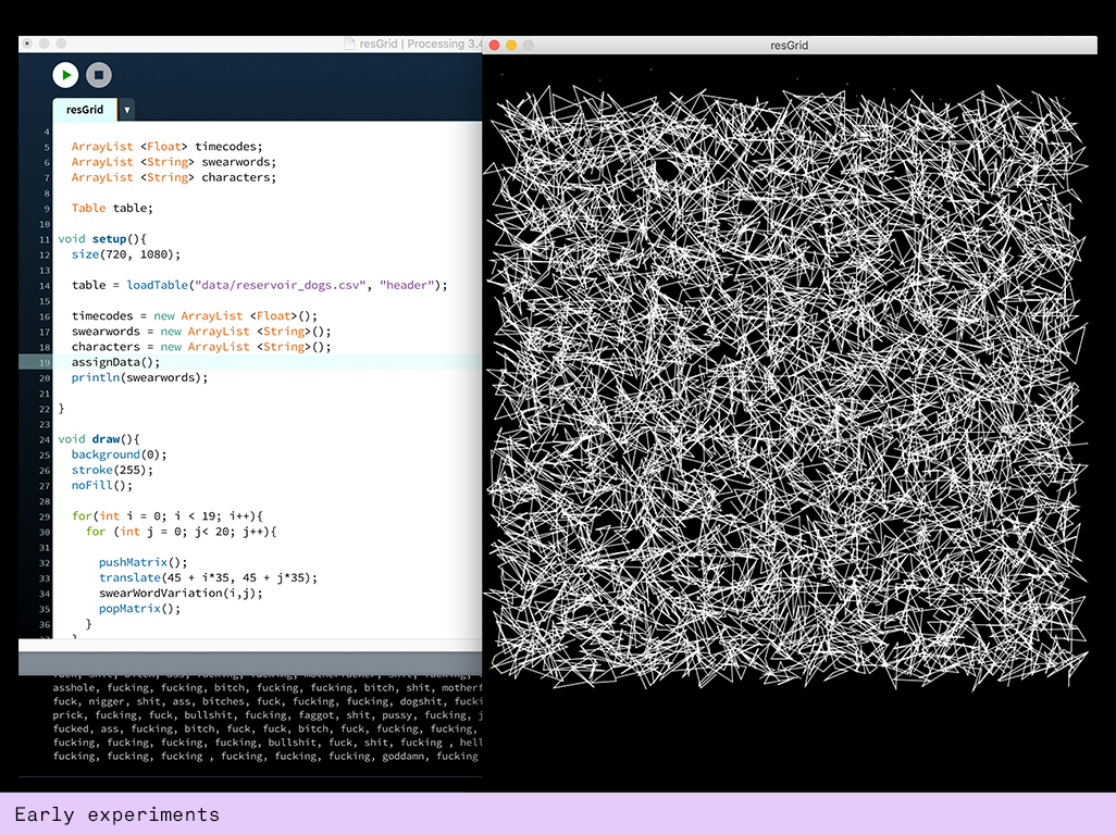
When I completed my spreadsheet I started bringing the data into processing. For this I watched several tutorials about addressing columns in csv files. First I used the loadTable function to do this but later I found the loadStrings function more adequate to use, mainly due to the fact that I had mainly strings rather than numbers in my spreadsheet.
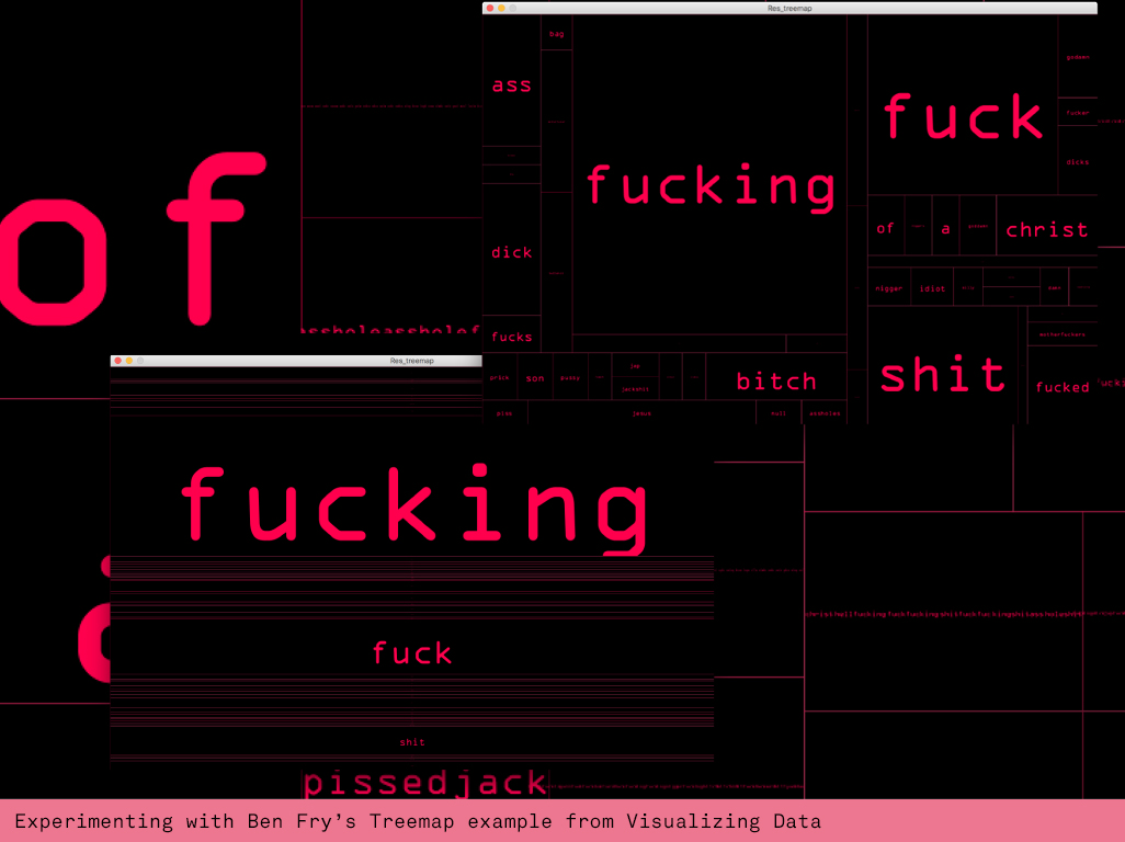
I was finally ready explore the creative potential of the data and started by using Lior's CoolThingsGrid example but noticed that my lack of strategy just made a big pile of visual hay. It was important for me to create a visual story around the swearwords and for this I needed to experience their typographic power and truth. So I used an example from Generative Design that used Ben Fry's Treemap library. This allowed me to quickly see the most used word in different typographic layouts. Whilst these looked very dynamic they didn't give me the connection with the movie's timeline.
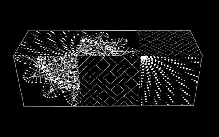
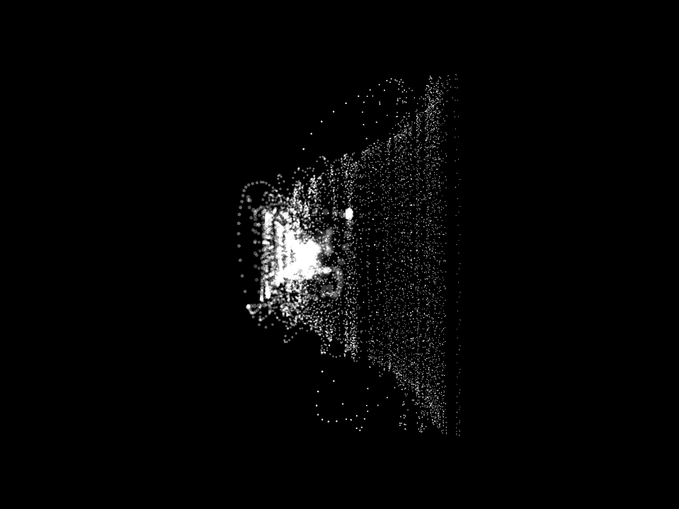
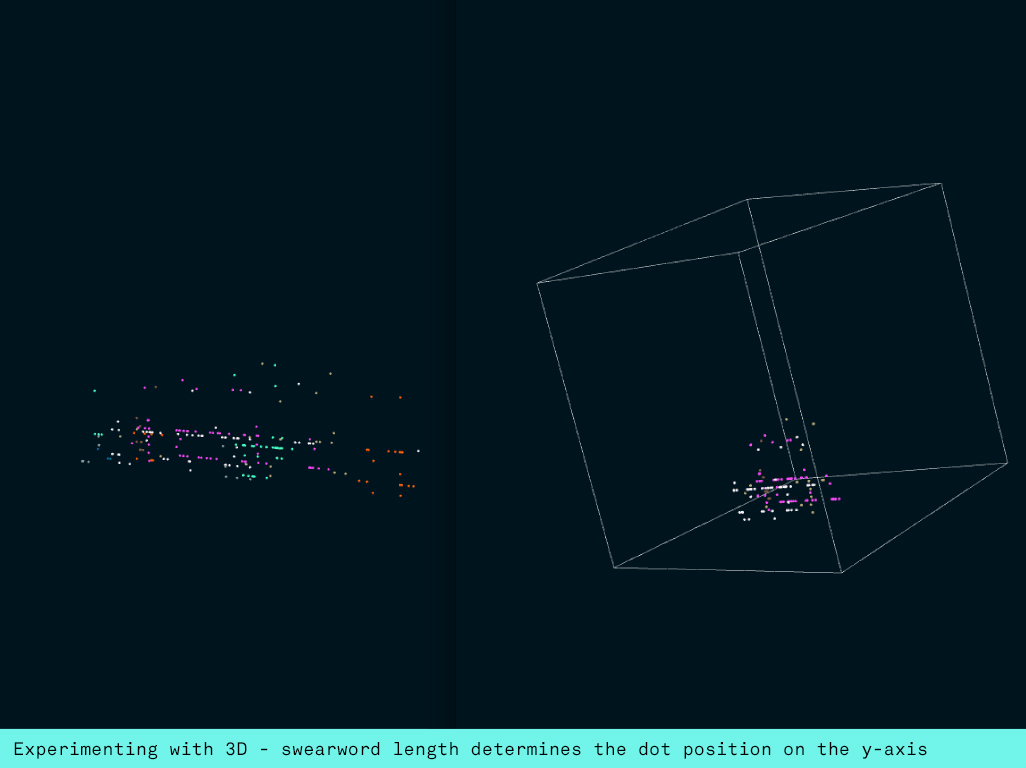
Next I experimented with bringing the data into 3D, mapping the length of the sweaword to the Y axis. I layered the characters in a grid using the x and z axis for character and time and got some interesting results. Crucially though I wasn't able to convey noticeable differences between same amount letter words (ie. "dick" and "fuck") and this was a problem.
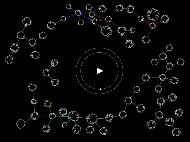
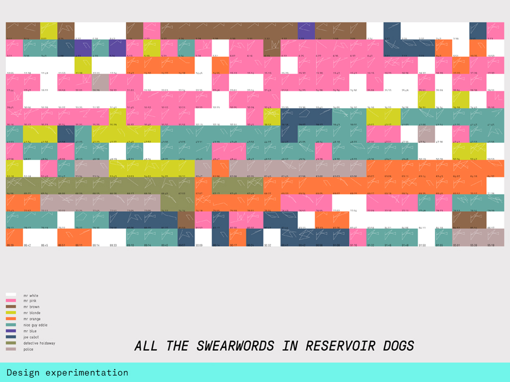
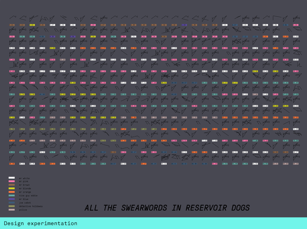
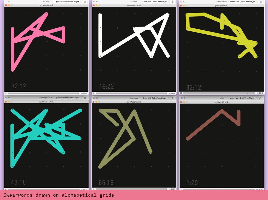
So I took a step back and reminded myself what I actually wanted to do. I wanted to create a symbol alphabet that could be analysed and understood. Additionally I wanted to visualise a timeline of some sort to allow the viewer to connect to particular scenes through the illustrative qualities of the swearwords. I started by drawing the alphabet on a little 5x6 grid and drawing a single swearword that I loaded as a string array.
I created a swearmoment class that would consist of everything the class would need to express the different columns in the datasheet: the character, the actual swearword and the timecode. In this class I created the alphabetic grids and a PVector that would remember the character locations. Then I wrote a generic bit of code that would loop through a swearword array to plot the position of each character and then draw it with beginShape. I also created a colour mapping function that would assign different colours to different characters. My main file performed all the string operations, splitting the data in the spreadsheet and assigning the columns to the strings I assigned as passby values in the class. An arraylist would hold all the swearmoments so that they could be easily distributed across the page.
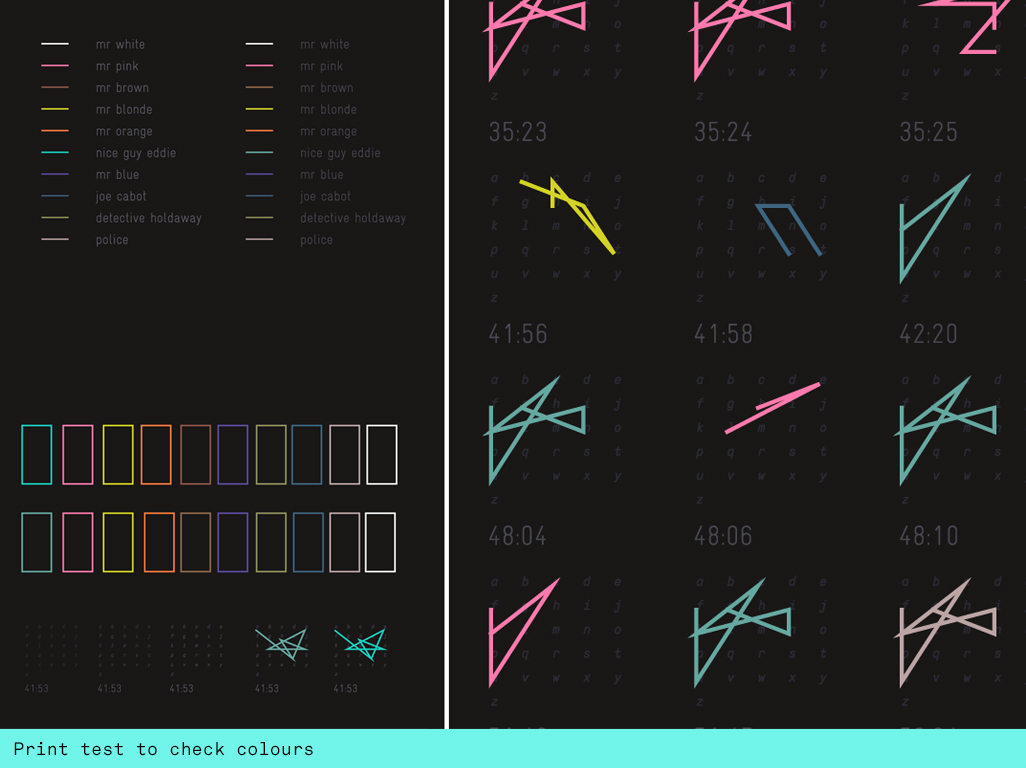
The fine tuning of the colours was the hardest job. I needed 10 colours to visually look harmonious with each other whilst also acting as signifiers for the characters in the film. I literally spend several days finetuning this. The challenge was to create the visual impact of a poster that draws the audience in but is also readable as s story and can provide deeper engagement without being visually overpowering. The alphabetic grids needed to be just about visible without being visually competing with the swearwords. A print test helped me to get this right.
Future development
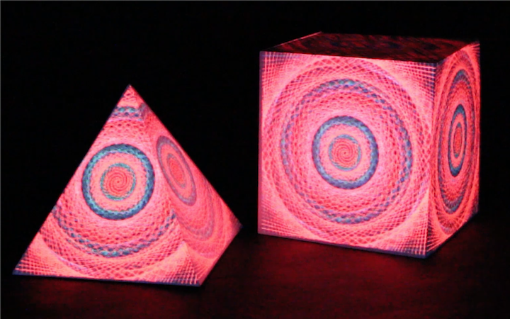
In future I would love to create 3D data representations of the characters in the fim. What type of physical shapes would distinguish Mr Pink from Nice Guy Eddie? I would love to use the work of Norman Leto or Quayola as a starting point here to build some physical representations of language used throughout the film. Maybe the alphabet could be positioned on a slice in a 3D cube with time forming the Y axis? How would these shapes apply to ourselves and our own swearword useage? How will algorithms allow us to see each other in future?
Self evaluation
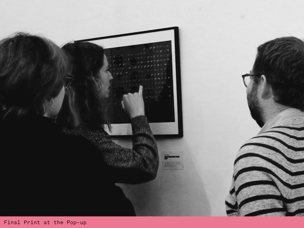
I'm really happy with this project. The print from Digital Arte came out really well despite my initial worry about it's size. A2 is just about legible though, so I would probably go for a bigger A1 or even A0 next time. Stripping back the colour to thin lines came at a cost of the impact from further away. If I had the money I would foil print the 10 colours to create a stronger impact from far away whilst still creating creating engagement closeup. However I was surprised by the magnetic power it seemed to have despite just looking like a black rectangle from afar.
References
Manfred Mohr https://www.emohr.com/paris-1971/catalog/ManfredMohrComputerGraphics1971.pdf
https://fivethirtyeight.com/features/complete-catalog-curses-deaths-quentin-tarantino-films/
Matt Eppler Data tutorials https://vimeo.com/87533847
Nature of Code: PVectors https://natureofcode.com/book/chapter-1-vectors/
Nature of Code: Polymorphism https://natureofcode.com/book/chapter-4-particle-systems/
Shiffman explaining Polymorphism https://www.youtube.com/watch?v=qqYOYIVrso0