
Selekt Project
The Right Item from the Right Brand
produced by: Mirko Febbo
Introduction
I am developing an augmented reality tool that allows consumers to assess the environmental, social, and economic credentials of a company by placing the company's logo over your phone or augmented reality glasses.
With the help of machine learning the consumer will be able to check, not only who owns the company, but also support them to make a decision about purchasing from the company based on how the company responds to environmental, social, and economic issues. The application trawls the internet, other databases, and indexes to rate the company's performance on the three issues.
Importantly, the app will be open source, allowing other developers to make it more efficient over time, increasing both the available information pool on each company as well as the public's trust in it's rating system.
Concept and background research
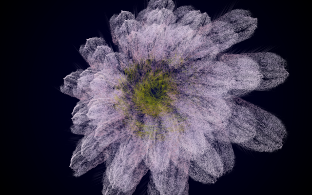
I thought about that shape for a while now. I think since 2015-16 I am obsessed with it. I drew it, painted it, sculptured it, and I also have it as a tattoo. Now, since this semester I took the programming for artist and designer and explore it as data. The firsts instances, of the virtual variant, were related to the UK GDP from 1970 - 2024. I experimented with the overall shape, and he: sections, arcs, radius, and how they related to the given data. I started with the GDP as it was more accessible for what I could achieve in a week. Now for 4 weeks, I could explore my shape further.
Except for that, I am also fascinated by geopolitics and how the world goes around money and power. We can also see that there's a change drastic change in paradigm where the GAFAM are taking over our life. And are fighting for our attention and money. More than ever, knowledge is accessible to anyone willing to take it, and yet we spend most of our time looking at cat videos. Which makes sense considering the amount of time the average human works, who would want to get bumped out with how much our new iPhone are destroying the earth landscape one toxic mine at the time? Or how Nike employ children to work for next to nothing so we can have 10 affordable pair of shoes? Or how the government promotes corporate greed over its population wellbeing? No, we want entertainment, free and fast. But, if it's free, you're the product... Endless ads tailored for you, base on your conversations and researches. Basically what I would like to do is to tip the balance a bit, by offering the information you need to make conscious choices without having to think too much about it.
I want to turn their weapon against them.
Technical
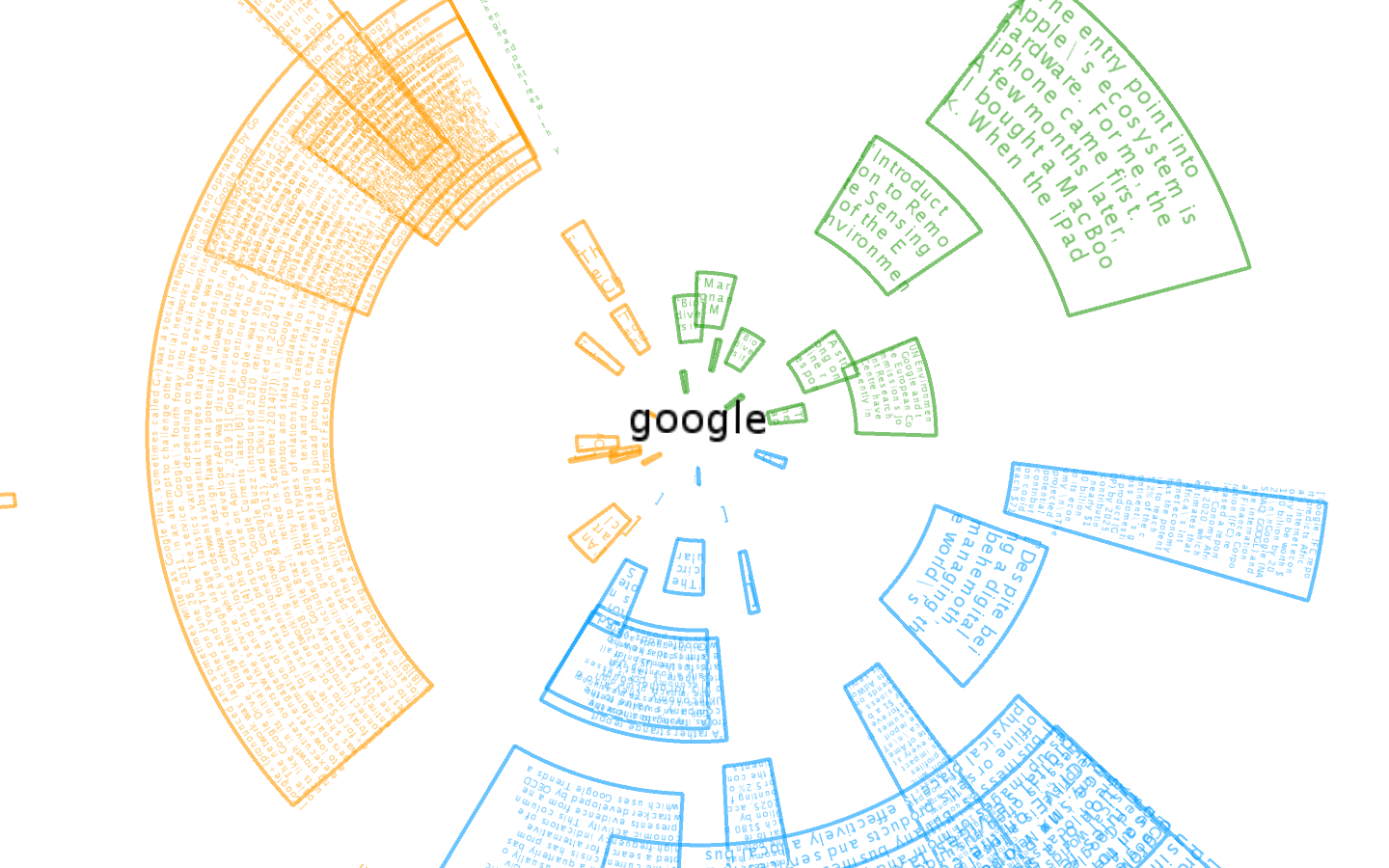
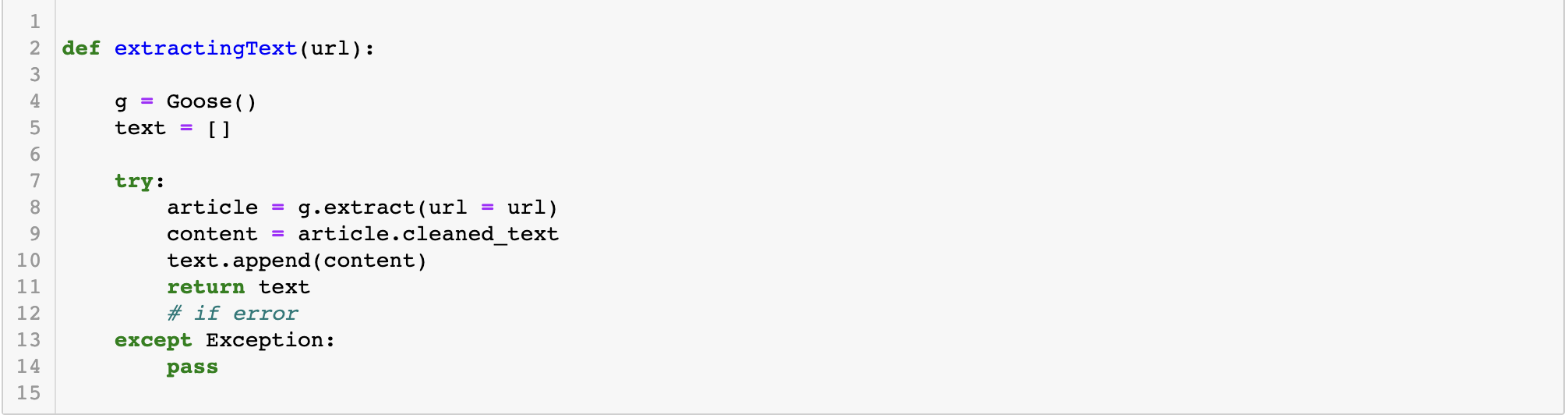
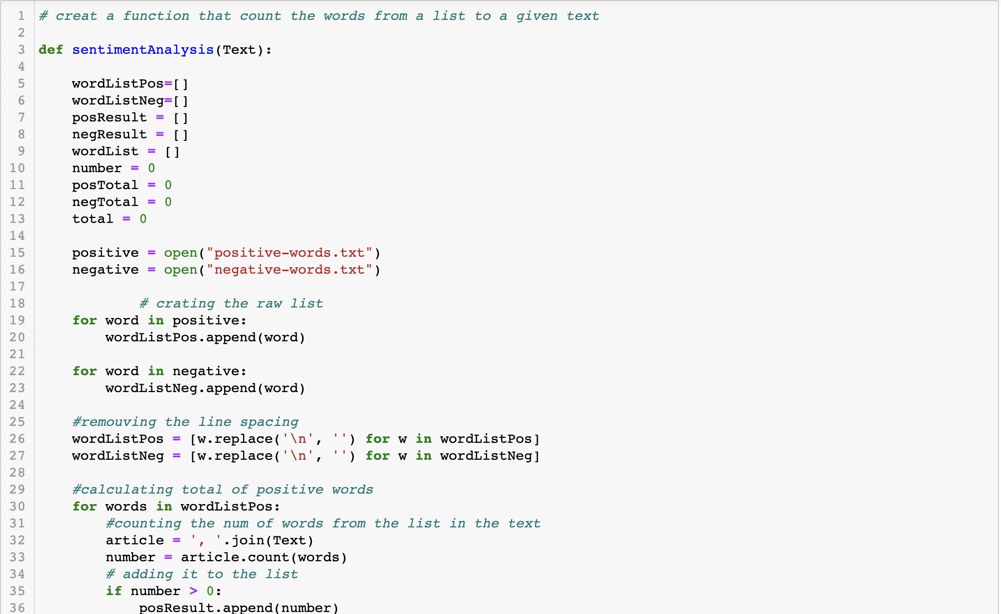
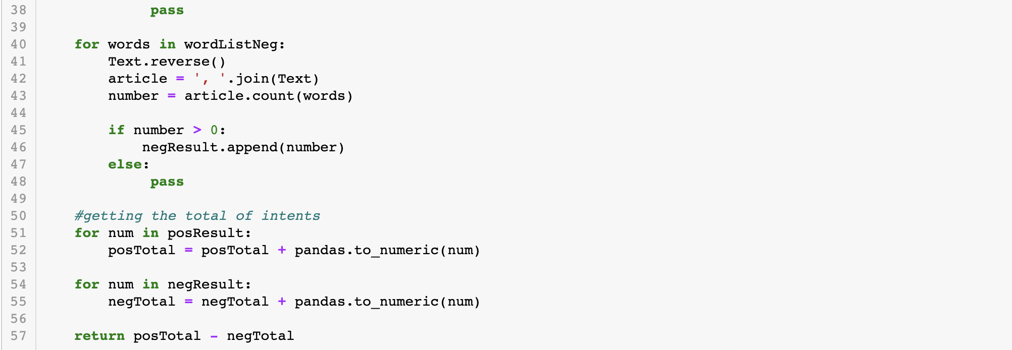
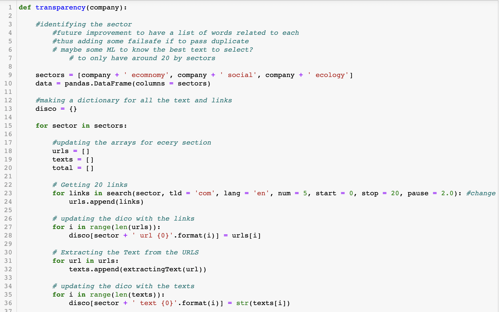
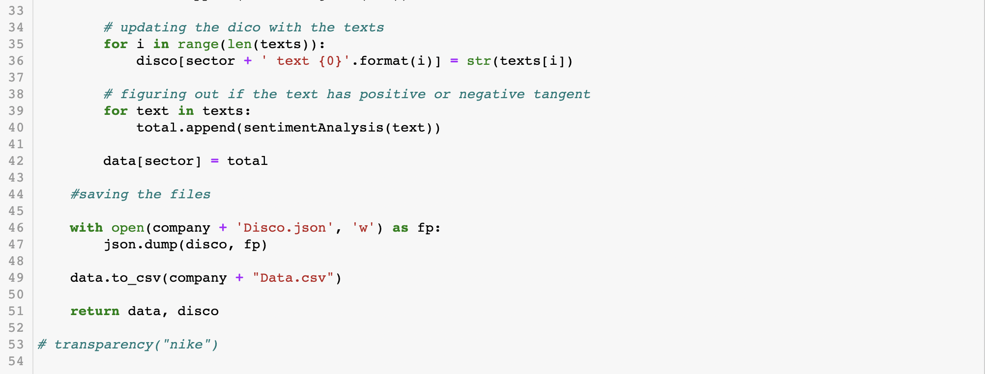
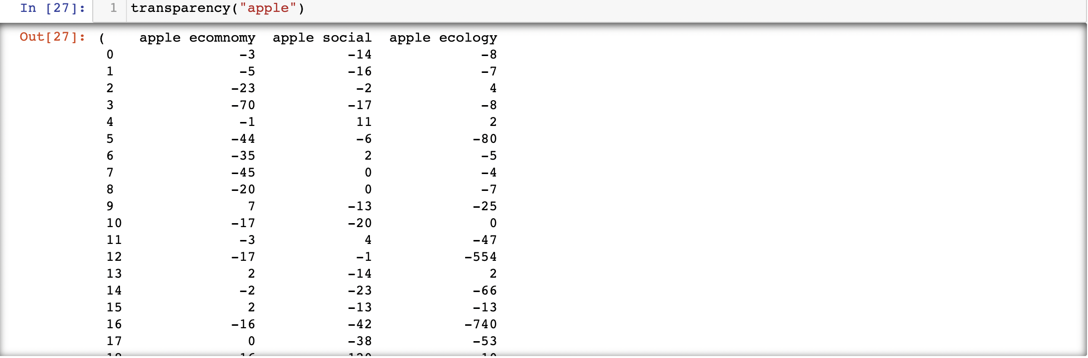
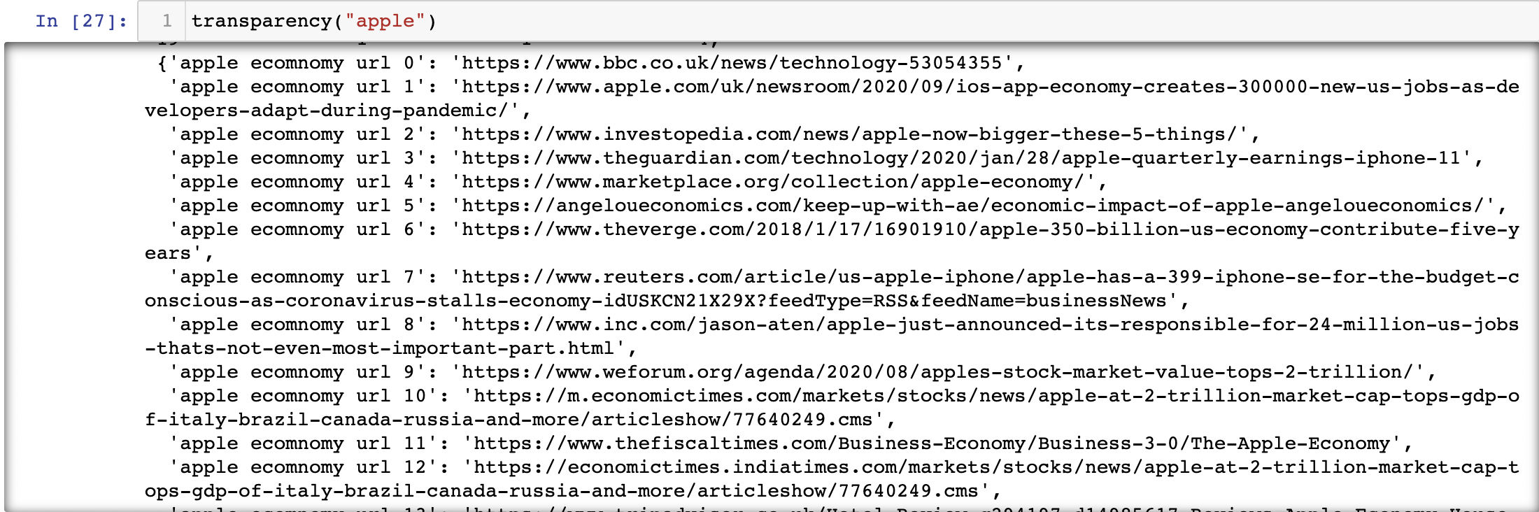
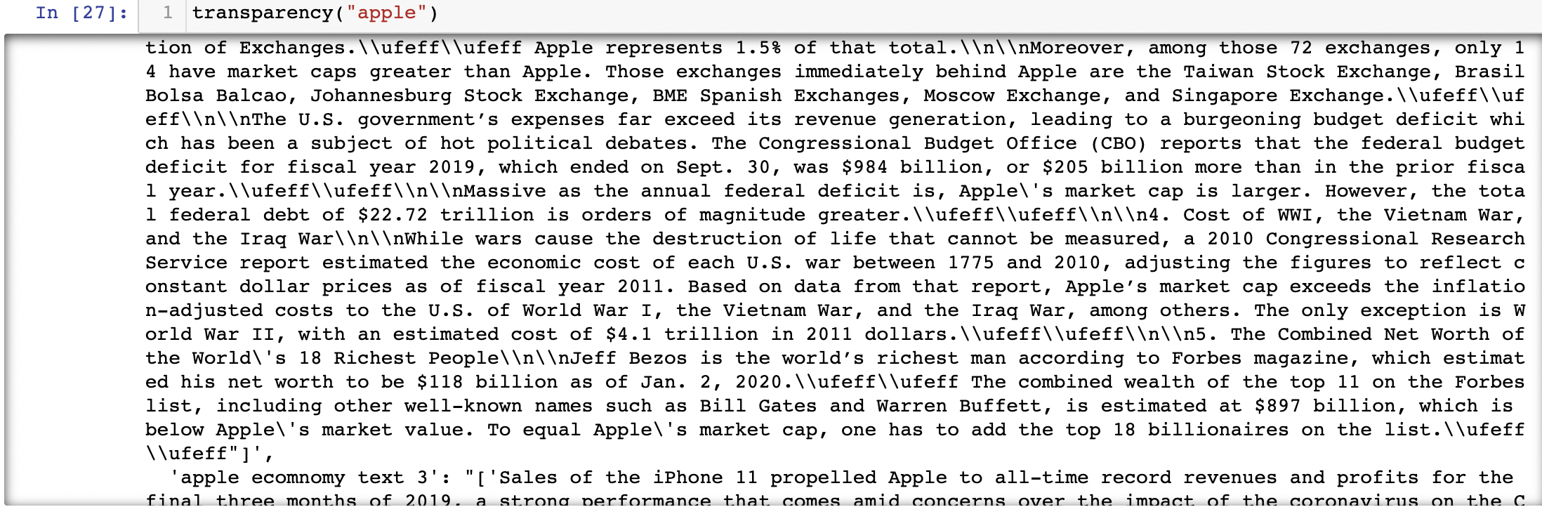
For now, I made the foundation for the project. As the visual and the python pilar are done. I did tho attempted to utilize NLP and AI algorithms to give more precision to the project. But due to my level in python and AI, I was a bit lost. Thus, armed with StackOverflow, a googled my wat out by appending small snippets here and there. I made a python code in Jupyther Notebook that for any given company, make 3 Google with the name: ecology, sociology, and environement. For each section, it extracts 20 URL, where it "read" the text and, with the help of 2 lists of words, determine if the test is positive or negative. After which it creat a data file containing the scores and one with the URL and texts.
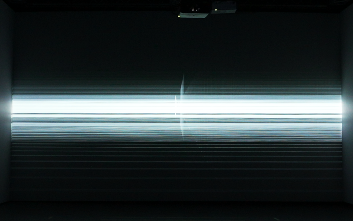
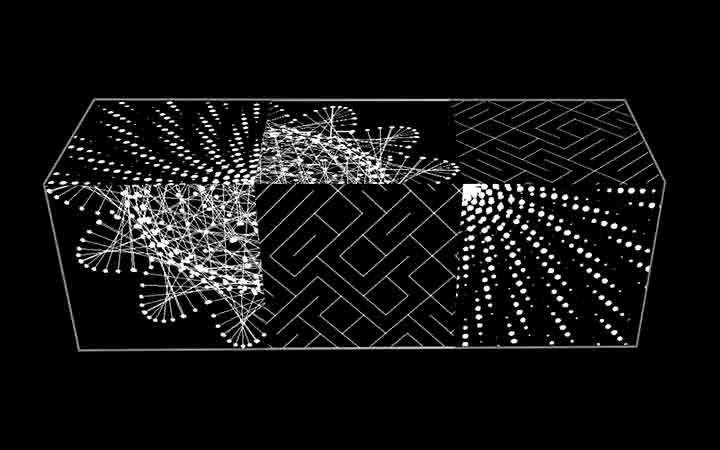
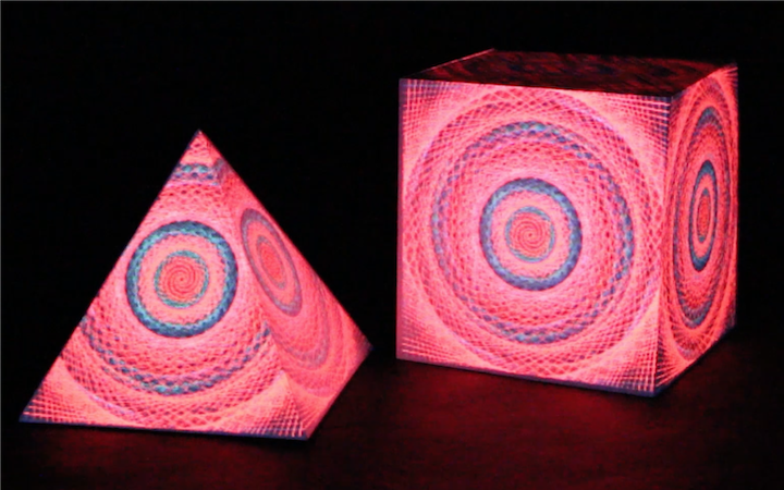
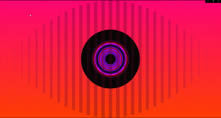
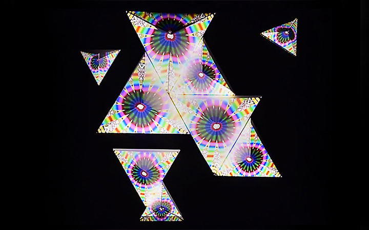
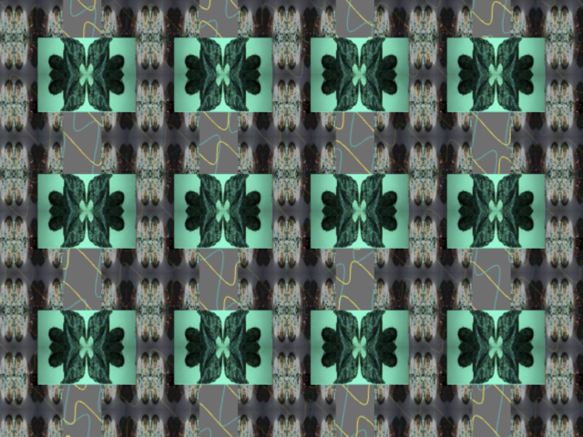
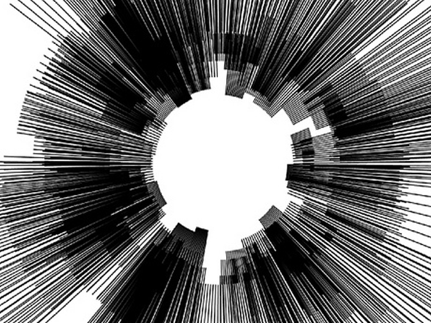
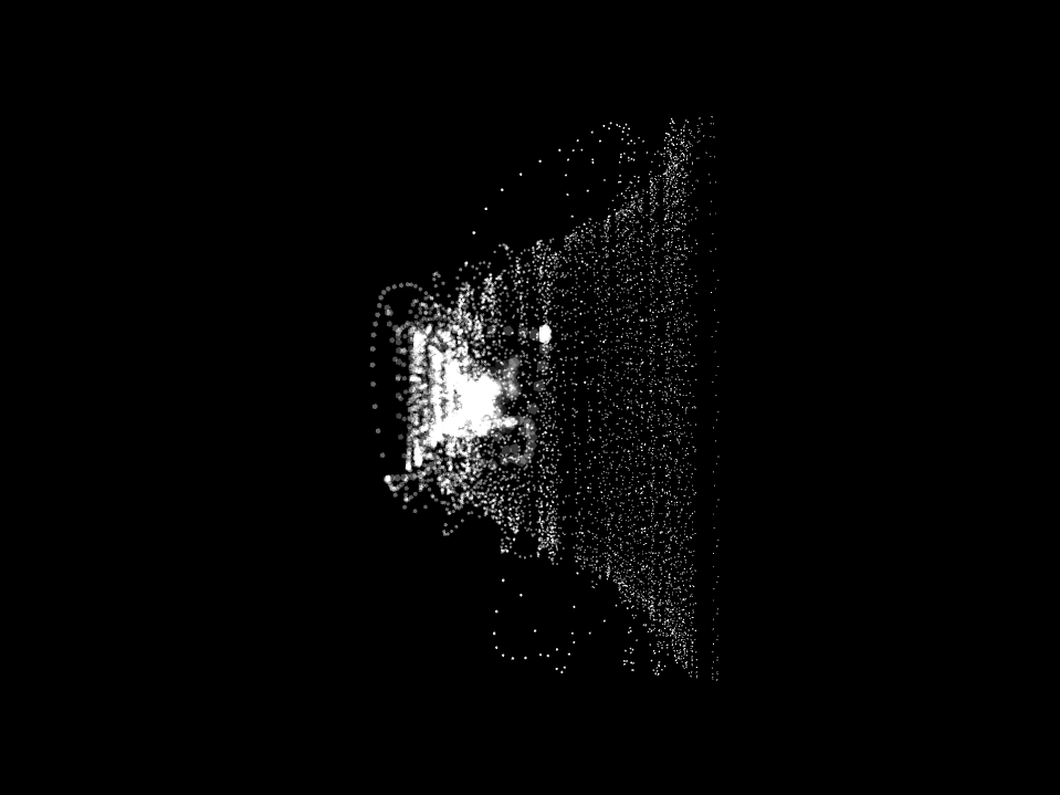
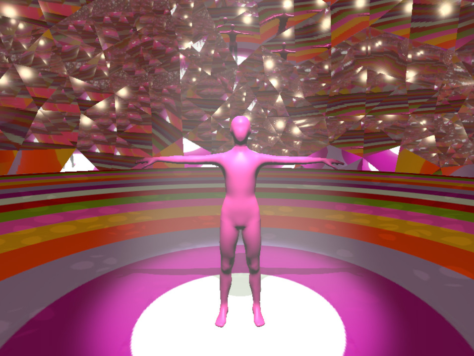
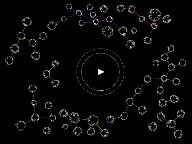
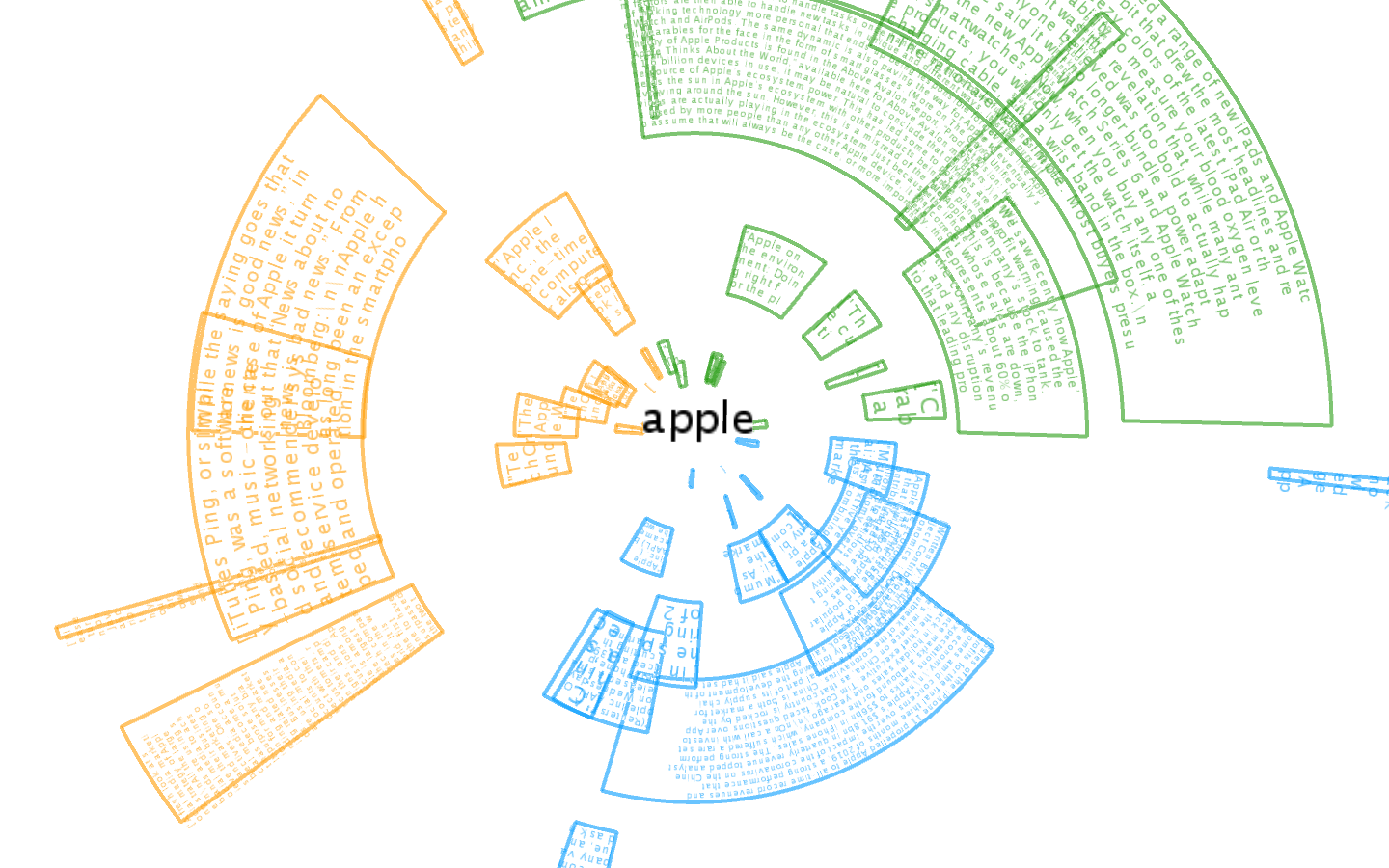
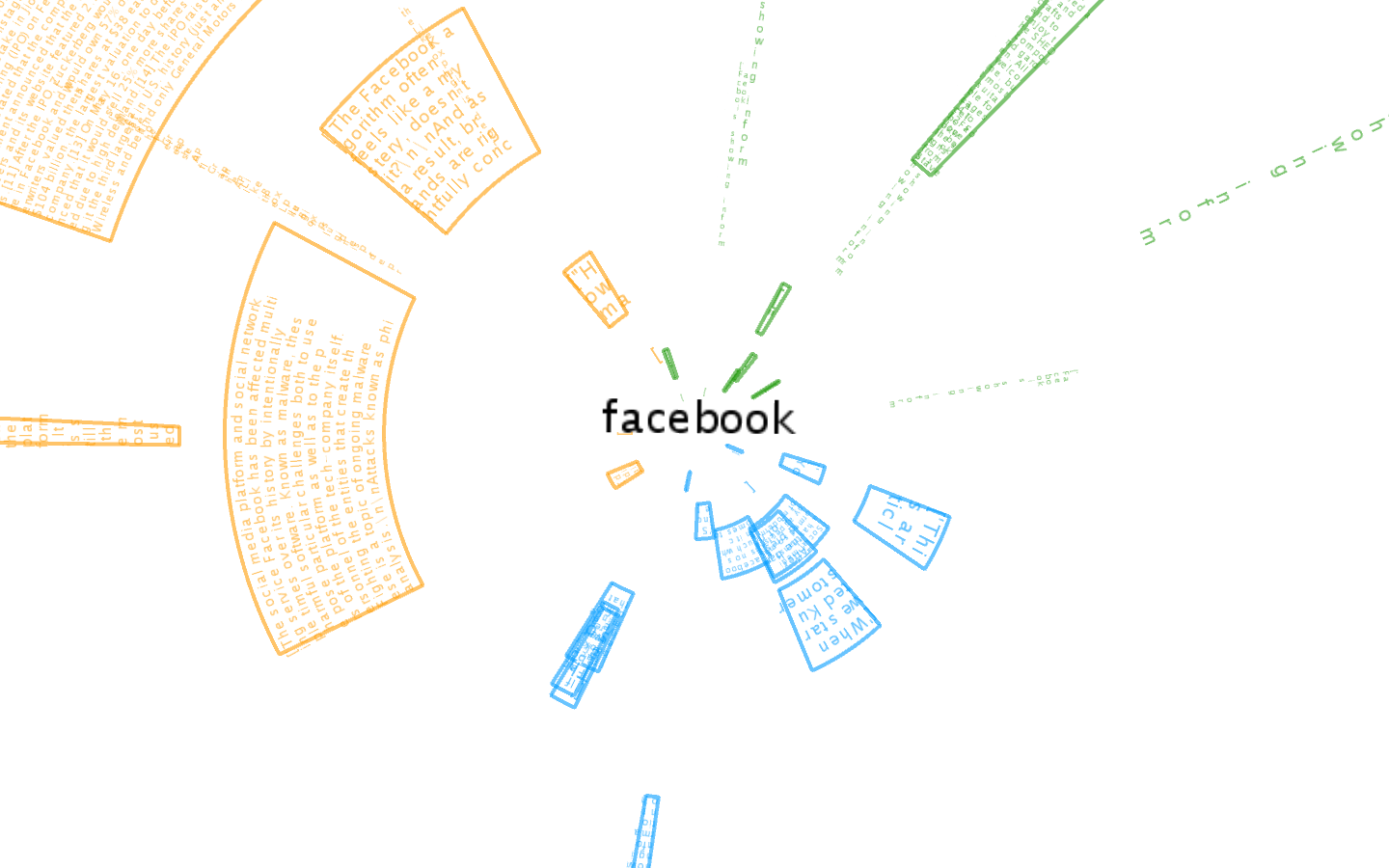
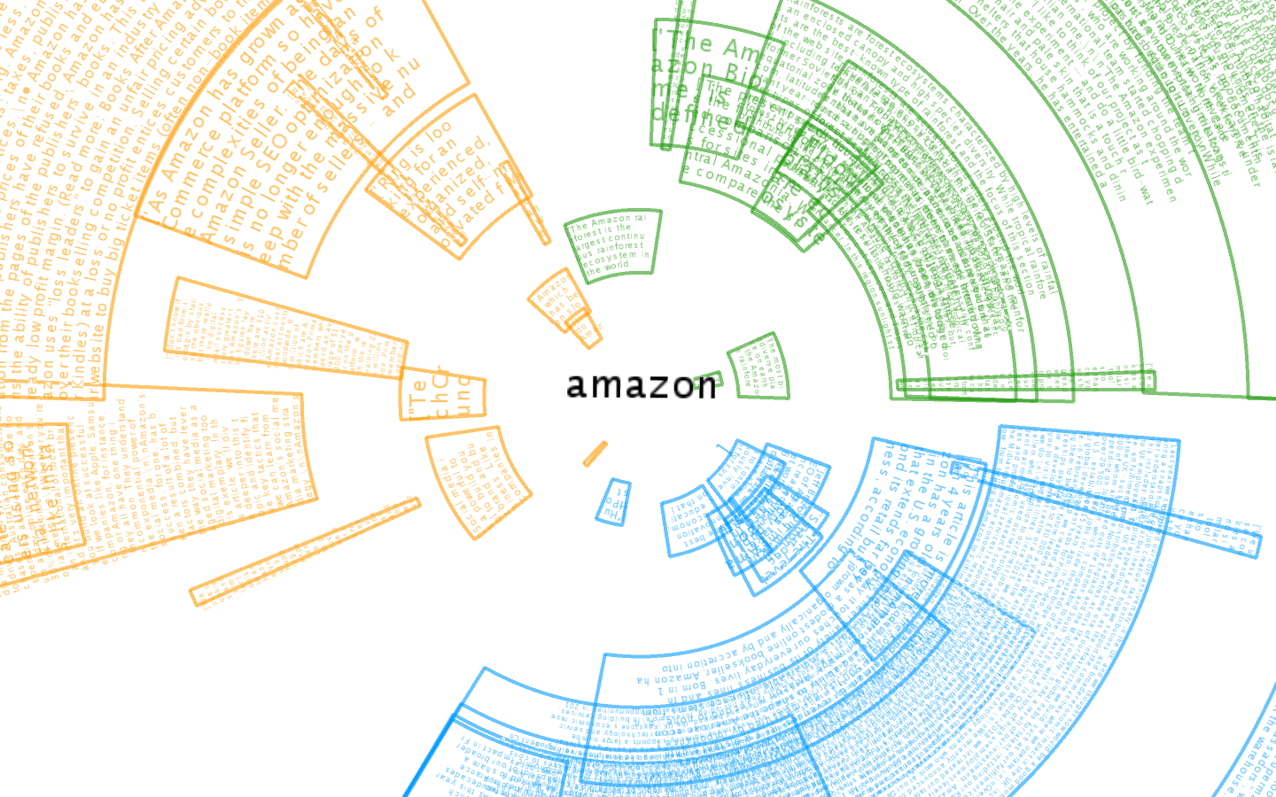
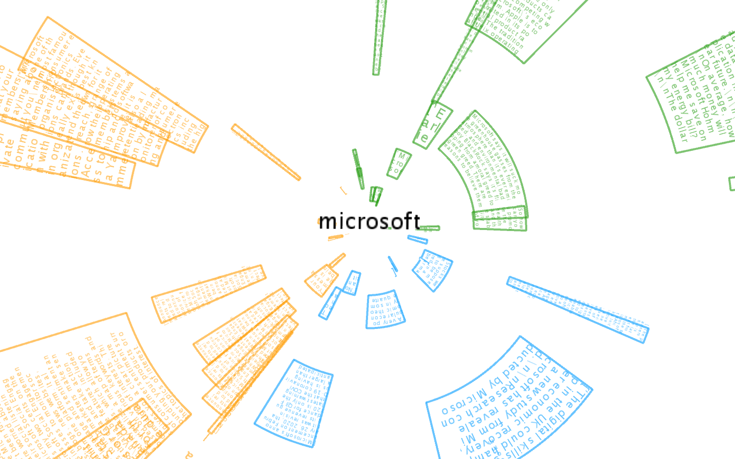
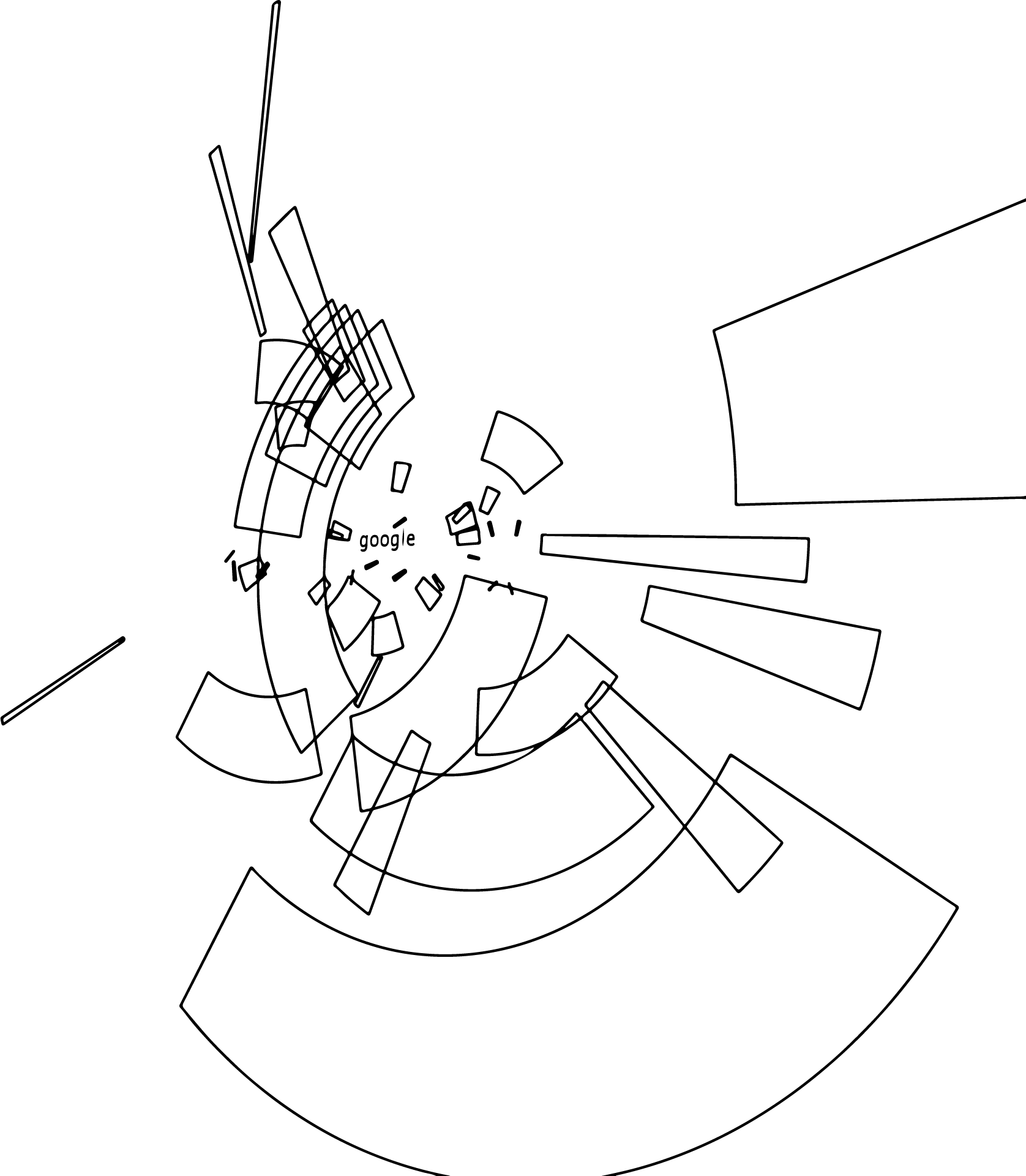
Then we pass to the visuals. In Processing, I made a function that takes the company name, loads the appropriate files (one has to do the python one first), and creates a semi generative visual with it. For each section, we have a color and 20 links or curves. Because every text has its own arc, the general size and position are all determined by how well the text did. Is it positive? is it negative? How positive? How negative? The more negative the text the smaller the radius and closer to the center. As to give a hint that this company is probably self-centered. As for the length of the arc, it's linked to the score size. The larger the count of words the longer the curve. Of course, all within it's 120 degrees boundary. The visual is also in 3D as the Z-axis provides the order in which the texts were extracted from Google. The function also provides the user with the text that helps build this assessment as it flows with the curve.
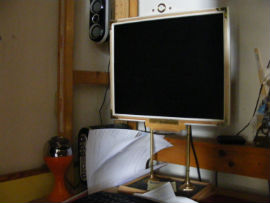
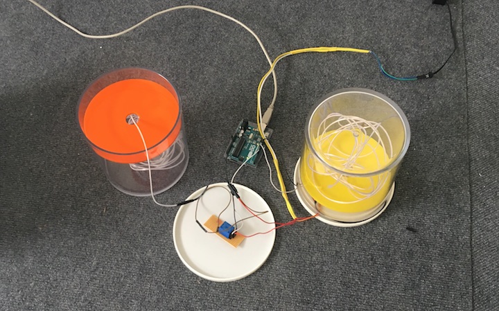
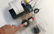
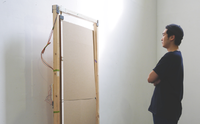
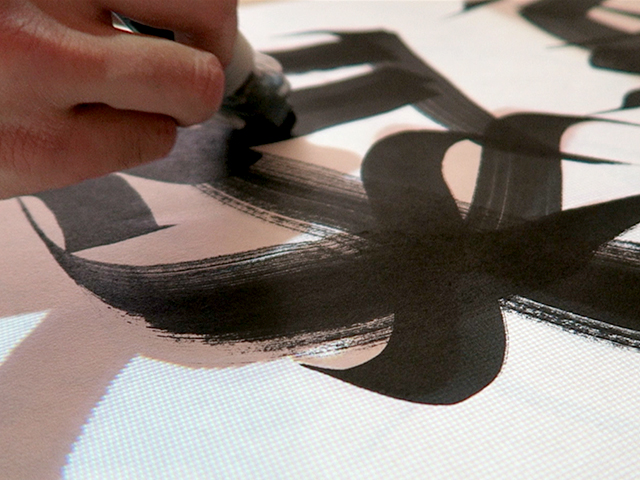
For this project, we also have to make a print. Thus I went ahead and build my own printer. It's an X Y ploter fixed on the wall operating with two stepper motors. From all the tutorials I chose this one for its simplicity, size, and price. This particular machine is super simple as it only uses two stepper motors and gravity to draw. The best part about this robot is the size. As it is only two motors fixed to the wall your canvas can be as large as you want. If you can withstand the noise that is. Then comes the price, I think this project cost overall 60 pounds... And of course, everything is open source, the tutorial is well documented and the owner even took the time during the break to answer my request! The code he made makes it possible to draw lines or pixels and even have different colors. Thus, I made my Processing code in a way where you can toggle between showing the various sections, texts, and colors, to then vectorizing and sending it to be printed.
I would have now been exploring making this shape by data and robot.
Future development
As mentioned, this is just a start. I would like to improve the information selected and shown with AI, make the application functional on its own, and down the line, have it in AR. Including AI would be to improve on the text selection, instead of looking for the first 20 links we could look at the first 2second worth of links and select the more suitable one. It would be awesome if it could learn and get better over time, but that might take a while. Also, could we have the AI generate a synopsis of whatever text it's reading? Thus giving even less work to the user? Or would a simple tag suffice? As for the application itself, obviously, in the long run, it cannot use both python and processing to operate. Then we can have it as a somewhat reliable abstract marking system instead of a glorified search engine.
Self-evaluation
Overall I think I could have work more on each part individually deeper instead of spreading the project into 3. Ether work more on the text analysis algorithm and make it more informative. Or work on a better visual than doesn't rely on generative position to avoid agglomeration and sturation. As well, I could have work on an experimental series of the sketch to see witch one respond the best to the drawing machine. And perhaps not do a drawing machine since it has been overdone! That being said I think this work lay some good ground for the semester to come as I have a Machine Learning and a data visualization class. Thus I will be able to build my application to more reliable and pretty. While also being able to print whatever work I make for cheap 😉
References
The Python code:
http://localhost:8888/notebooks/Documents/TransparencyProject/GoogleSearch.ipynb
The obsession for the shape:
https://www.mirkofebbo.com/wondering-star
The Drawing Machine:
https://www.instructables.com/Polargraph-Drawing-Machine/