
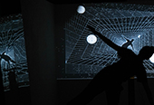


The Tree Seeking Homeostasis & The flag of data(2017)
data
produced by: Yeoul Son
Introduction
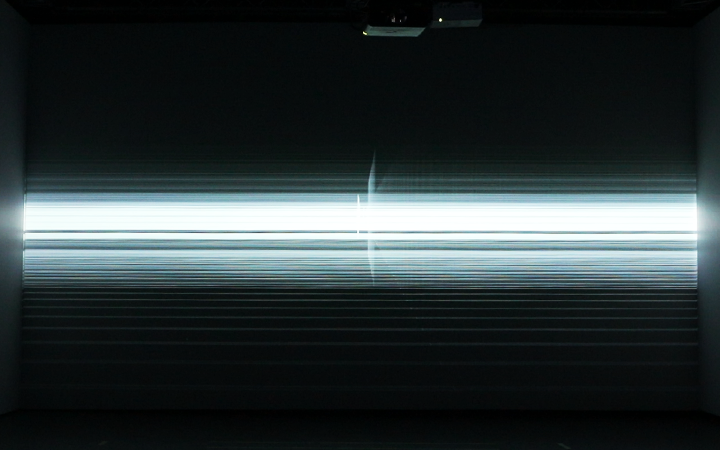
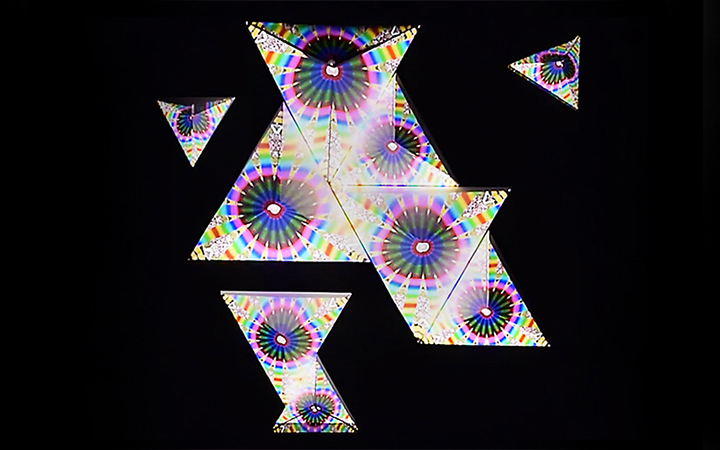
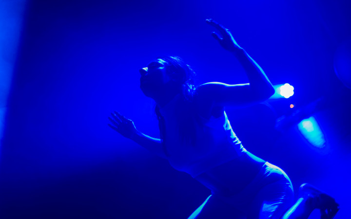
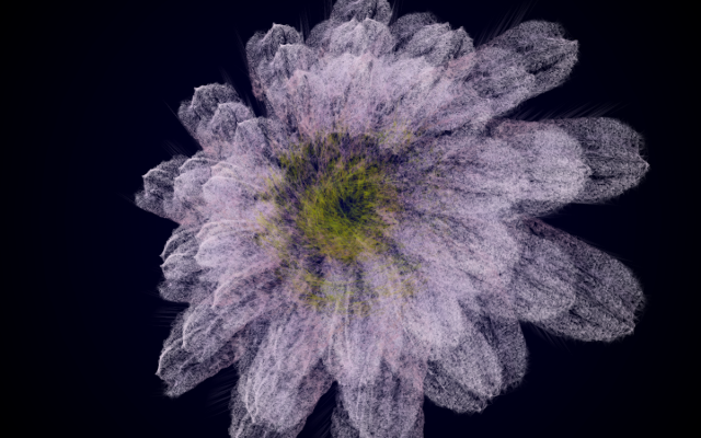
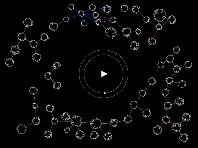
The Tree Seeking Homeostasis is a work that creates its shape by processing data, adjusting the value of each dataset according to maintain a state of balance. Bringing together the mathematics of the Golden Mean with eastern philosophy and the virtue of the middle way, the work explores the scientific principle of homeostasis. The installation collects water tanks and screens to depicting a series of living trees each shaped according to a unique genetic code formed by incoming API data. A school of fish help to keep the tree’s homeostasis in such a way that the branches are not weighted toward one direction. The Flag of Data (2017) is an installation that works with the ambiguity of data. The visualized movement of a flag changes according to the ambiguity of and differences between data-sets. The comparison made in the installation is that of the differences between compared data sets of CO2-emissions per country made by different agencies.
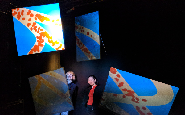
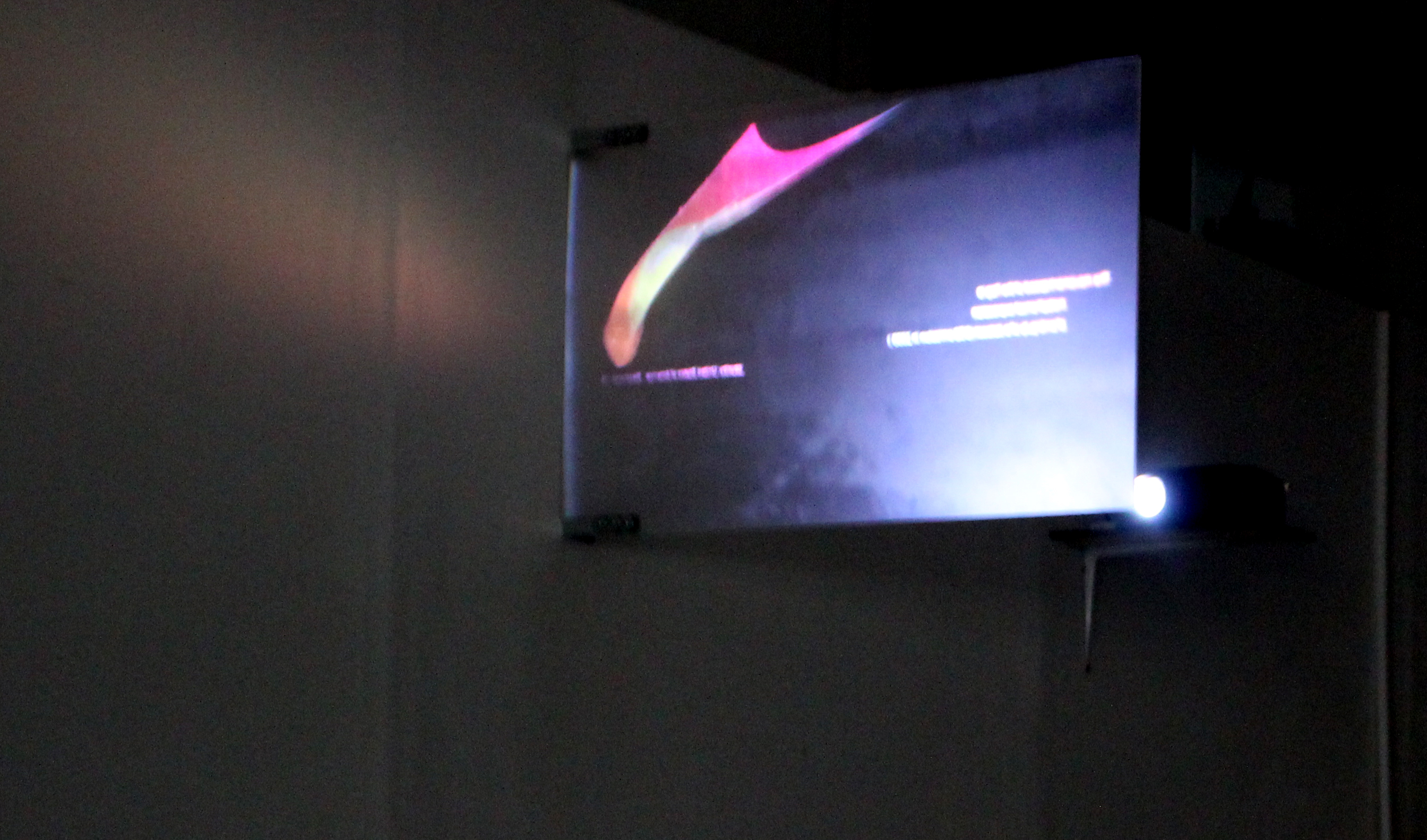
The Flag of Data makes the inexactness of these datasets visible. The installation is presented together with a video that shows news about the inaccuracies. The Flag of Data let you rethink the accuracy of data in a time when data is easily manipulated, whereas there is an irrational belief that science can solve all our problems. The Flag of Data is a call to a more sensible understanding of the use of data. The work explores contemporary discourses about both big data and the “Anthropocene”, the geo-philosophical concept at the center of issues surrounding global climate change under the high-tech logic of late capitalism. Based on these discussions, the work expresses the relationship between competing sets of data in a way that is fluid, poetic, and open to the diverse possibilities so often overlooked when quantifying phenomena through data.
Concept and background research
The geological name of the era of the Anthropocene, which refers to the present era, is mentioned in 2016, and discusses how human beings have affected nature and the earth. The most talked about are environmental issues including global warming and high-tech under the logic of advanced capitalism. And it is in the center of this discussion that it is a problem in the process of dataizing any phenomenon. “The Anthropocene and the Destruction of the Image of the Globe” Latour Bruno said that The unconditional belief and illusions that science can solve everything with technology also have backed to belief that the information of the Earth and digitizing the earth can read the all kind of phenomenon on the earth and can predict the future, so that, outputs that relied on science and technology, such as data scientists and intellectuals, have identified and determined important issues for the future, even though these data sometimes lead to misjudgment by concurring with capital and politics. Also Prof. Bruno Latour says that the role of artists and intellectuals in expressing phenomena as data is important.
Based on these discussions, Tree Seeking Homeostasis start at how we can express data. I am looking for a way of expressing the relationship between data, fluid and metaphorical but open to possibilities and diversity rather than quantifying phenomena through data. I would like to work visually in relation to data interpretation and expression that can be more related to the surrounding environment on the basis of the aforementioned biological principles and oriental philosophy.
The flag of Data is based on a study of the ambiguity of the data. CO2 emission data is closely related to Anthropocene such as global warming and the measure and plan of a country’s economic development. So the CO2 emission dataset symbolize a lot of things. When I compared the datasets of CO2 emission by counties in 2006 which are made by different researchers, there are differences between the datasets. When came to the values of CO2 emission in China, there are differences between them. This is 1501300(thousand tons) gap between lowest value measured and highest value measured. This quantity of gap is more than Germany’s average CO2 emission. Moreover, despite some of those datasets are made by an institution but a difference between them can be seen in different researches. Therefore, this is a research that we rethink the accuracy of the data.
Technical
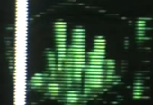
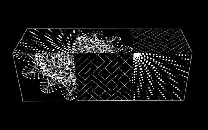
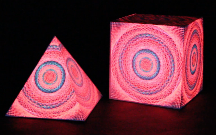
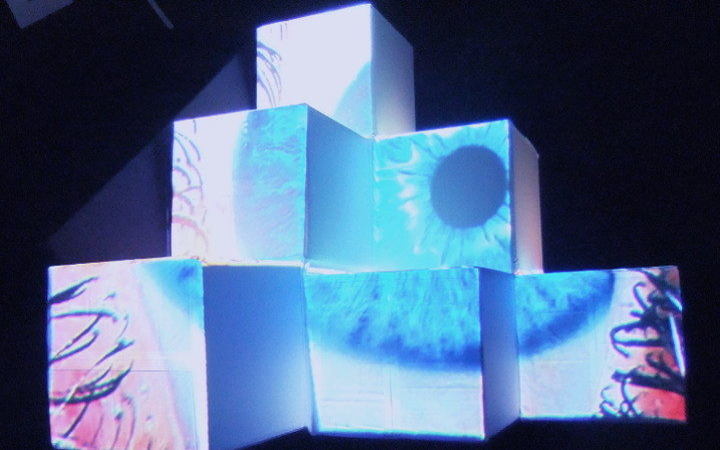
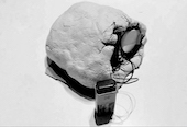
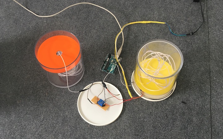
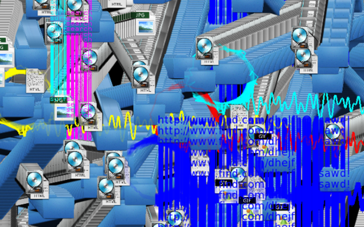
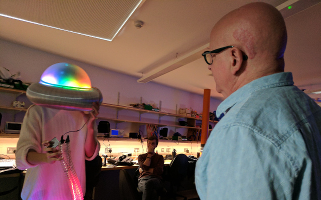
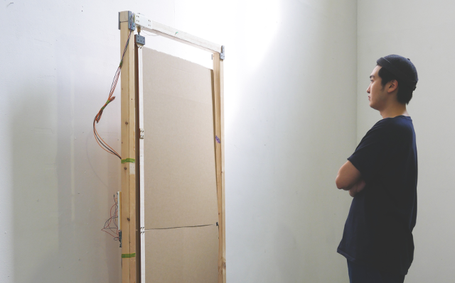
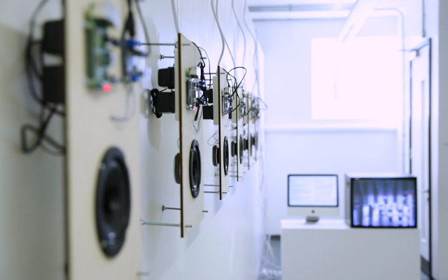
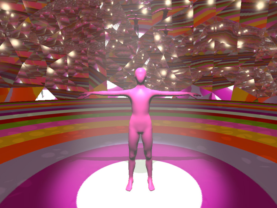
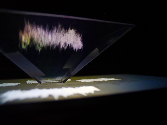
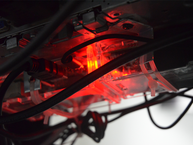
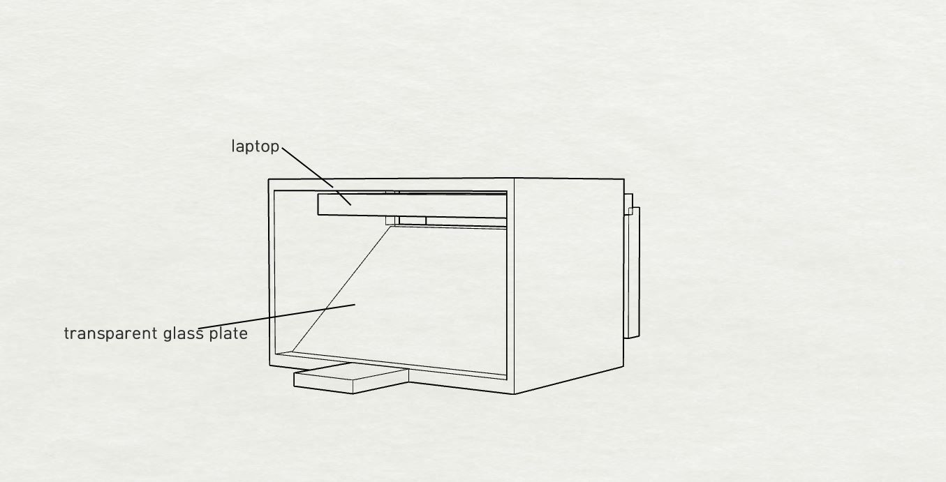
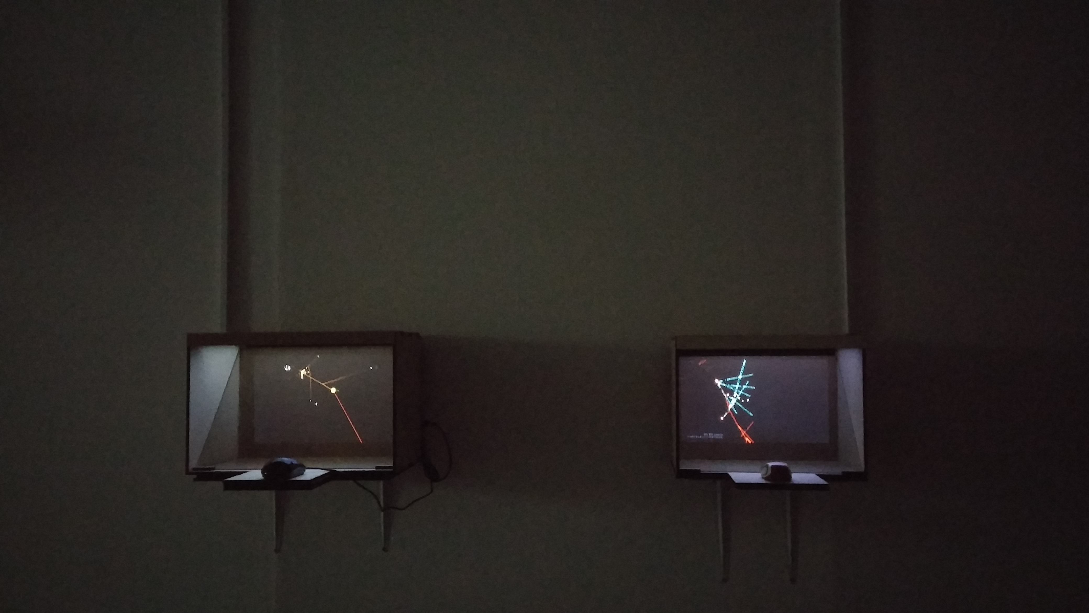
Tree Seeking Homeostasis, By embodying the shape of these trees in 3D graphics, the audience can he more immersed in the three-dimensional trees which look like micro nerve cells. Also people can use the mouse to look at the tree on the screen from the different angles.The both (Tree Seeking Homeostasis and the flag of data) shown as holograms were based on Java language of processing. In the exhibition, the two trees seeking homeostasis using CO2 emission dataset and meat consumption data set were displayed on each screen. This is possible because one upper(big) algorithm was designed and coded to apply carious datasets. The upper algorithm can be applied to any dataset by simply changing a few elements and functions in sub-algorithms. This upper algorithm is composed of several sub-algorithms as mentioned above. Each sub-algorithm is as follows. One algorithm to read dataset from a file, L-system algorithm that create a tree by making the branches which look like neurons according to the value of the data (the leaves are located according to data values and the set a shape of the tree creating branches), the algorithms to find and balance the largest and smallest value of data based on the principle of homeostasis, the other to fish according to the value of datasets like hormone, etc. These sub-algorithms are classified in each class and these classes form a single large algorithm to try to use various datasets with some numerical or functional changes. There are modes of “making a balance” and “reading the data” to show the data. In the “reading the data” mode, selected country data from 1993 to 2016 are shown. After showing all the data until 2016, it changes to “making a balance” mode and then shows the calculated data values for the balance of the branches.
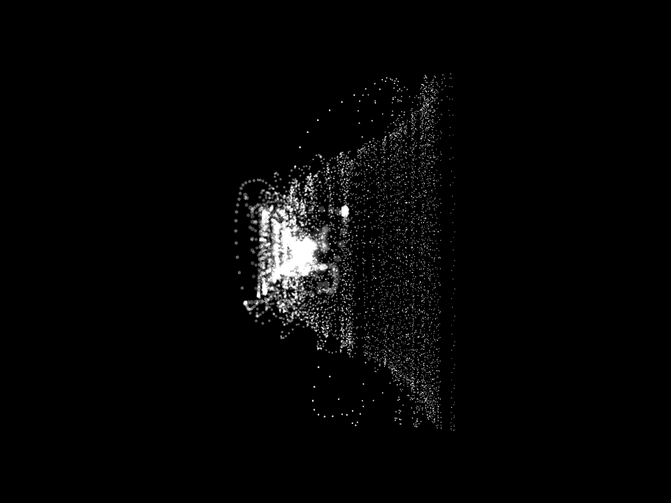
When it comes to the flag of the data, the work used the physics engine. Using the physics engine, I applied the ambiguity of the data to the intensity of the wind and flag have the wave in the wind according to the intensity of the wind.
The Design & Interaction
Tree Seeking Homeostasis : By embodying the shape of these trees in 3D graphics, the audience can he more immersed in the three-dimensional trees which look like micro nerve cells. Also people can use the mouse to look at the tree on the screen from the different angles.
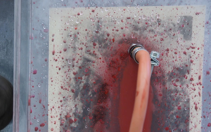
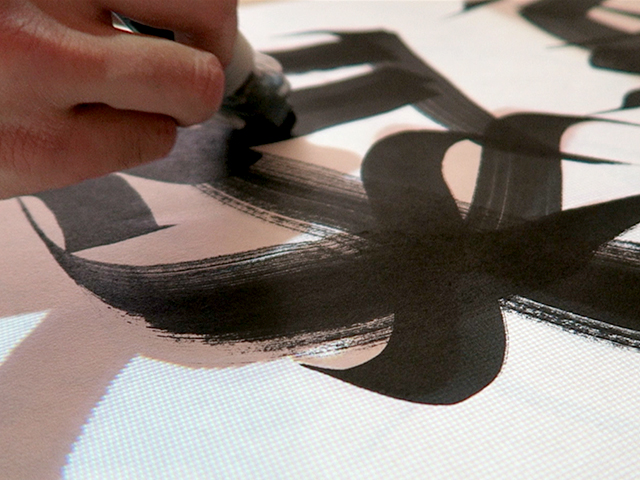
The flag of the data(2017): by using a forst spray, people can see moving image on both side of a screen. (no interction)
References
http://edgar.jrc.ec.europa.eu/overview.php?v=CO2ts1990-2015 http://edgar.jrc.ec.europa.eu/news_docs/jrc-2016-trends-in-global-co2-emissions-2016-report-103425.pdf
http://www.globalcarbonatlas.org/en/CO2-emissions
https://www.theguardian.com/environment/datablog/2012/jun/21/world-carbon-emissions-league-table-country#data
http://data.worldbank.org/indicator/EN.ATM.CO2E.PC/
https://ourworldindata.org/co2-and-other-greenhouse-gas-emissions/#annual-co2-emissions
https://wttww.youtube.com/watch?v=4-l6FQN4P1c
https://www.youtube.com/channel/UCvjgXvBlbQiydffZU7m1_aw https://processing.org/
Shaders in Processing 2.0 – Part 1
https://thebookofshaders.com/05/?lan=kr https://github.com/processing/processing-docs/tree/master/content/examples/Topics/Shaders