


COVID-19 Data Visualization
The information of COVID-19 bombed around each corner of the world, how would you experience the pandemic without merely checking the ever increasing numbers?
produced by: Weiying Qian
Concept / Visual
In my initial project proposal, there’re three parts of the entire project; the first is the COVID-19 animation, the second is the data visualisation concerning key data of the COVID-19, the third is the tweet visualization of the key remarks in the crisis. During the tutorial and the peergrade section, I was recommended to focus only one part as otherwise the project would be too complex and it might be weird to stitch these three parts together. I believe the data visualization part would be more interesting, as with the enormous amount of reports, data, data analysis circling around the internet, people became numb to the increasing numbers.Sources including worldometers, uk government websites and information is beautiful demonstrate the pandemic in the form of sheets, charts and diagrams ,but people seems to still ignorant of the severeness despite the numbers of cases rise.Inspired by a virus simulation of the the news article Why outbreaks like coronavirus spread exponentially, and how to “flatten the curve” from Washington post, which effectively explains why quarantine and social distancing are crucial to curb the virus, I decided to use the similar simulation to demonstrate how astonishing it would be when people experience the explosure of cases rather then merely numbers. The newly numbers of cases, deaths and recovered of UK were initially chosen for the visualization, but UK lack the data of “recovered” , so instead the data of Italy, a country which experienced the most severe scenarios in Europe was chose for the project.
Technical / Self-evaluation
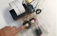
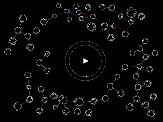
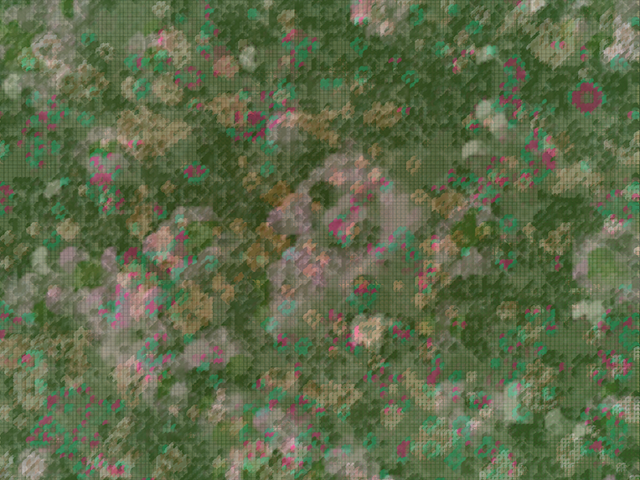
The data visualisation was created by openframeworks / c++.The codes starts from a virus simulation from the creative coding lab examples virtualPetriDish. I built a Json File, parsing data of daily cases, daily death cases and daily recovered cases of Italy from Feb,15 to April 30,2020. Inspired by the jsonExamples of openframeworks, I parsed the Json file in the setup module and parsed each line of data using algorithms. The main structure remains similar with the code example with ball, ball system and the main classes, but differ in the interaction with participants. As the project brief calls for no use of mouse or keyboard, the project retrieves data from Json file each two seconds. The yellow dots popping up the screen stands for newly cases while the white dots simulating the cases which successfully recovered, and if unfortunately turning into death, the dots just disappear from the screen. Also, as the numbers increase dramatically as time passes, it’s impossible to use a dot to represent one case, otherwise the screen will be packed with dots. Eventually the radius of the dot represents the numbers of cases.The entire interaction seems simple but requires me lots of time and energy thinking the proper algorithm. If I have more time, I might add more interaction into the project and use more visualisation effect rather than just dots.
Future development
For future development, I might add more interaction to the data visualisation, like using gestures to manipulate the effect if possible and design more detailed animation like if the case recovered, instead of the colour suddenly turning from yellow into white, it might be flickering for a seconds before changing colour. Also, apart from dots, more shapes can designed to simulate the compelling effect when great amounts of cases explode. Meanwhile, I need to enhance my coding ability to complete more fascinating effect.
References
http://marcinignac.com/
https://www.rcsb.org/news?year=2020&article=5e74d55d2d410731e9944f52&feature=true
https://openframeworks.cc/ofBook/chapters/openGL.html
https://openframeworks.cc/ofBook/chapters/OOPs!.html
https://natureofcode.com/book/chapter-6-autonomous-agents/