


Data is (not) Information
This paper explores the hidden ontological fallacies targeting our perception of objectivity that the visualisation of information often subtly introduces to us - sometime on purpose, sometimes not.
produced by: Valerio Viperino
For a more pleasing reading experience a pdf version of this research is available here: https://vvzen.github.io/assets/research/data-is-not-information.pdf
Introduction : nature of this paper and aims
My personal aim with this research project is to slightly lift “the Veil of Maya” often covering modern approaches to Data Visualisation - a new discipline whom informative possibilities I believe still need to be adequately explored. My hope is to wipe the shimmering glitter overlaying data visualisation in order to identify when a digital realism is possible and when instead visualisations obfuscate and reinterpret reality, instead of clarifying it. I do hope Schopenhauer will forgive my attempts in this direction, because sometimes there won’t be much to see once this veil will be removed - which may not be exactly what he planned for.
As a personal inclination, I will also avoid as much as possible the use of unnecessary academic jargon, as a matter of fact I do believe that precision and clarity of language should go always together, and that language is inherently complex and ambiguous by itself so that we don’t need to further tangle up things.
Somebody once said that “the limits of my language mean the limits of my world” (1) - and he turned out to be a pretty good philosopher - so I would love to define every single word that I will utilise so that I could share a common world with the reader, but given the extent of the task I will do my best to just disclose one concept at a time.
The main philosophical framework that I will rely upon in this exploration is the one set forth by Luciano Floridi (2), from which I have drawn the key concepts that follow, with the short premise that this research is not a inherently philosophical one - since I’m neither a proper philosopher nor I will ever be as good as Floridi in explaining philosophy; nonetheless, I think that a proper investigation of the forementioned issues can only be possible thanks to the analytical blade that philosophers have been sharpening for us for so many centuries.
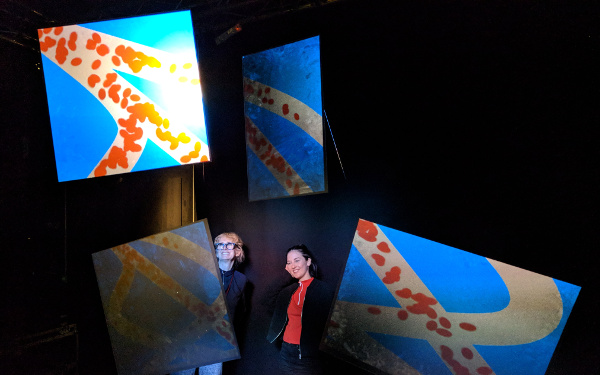
Finally, if you’re still undecided on which pair of glasses to wear in order to read through this paper, I suggest reaching for the ones with the label “art” - not because this is an artwork that will leave you utterly astounded, but because the “art” label is the one which will allow us to play with and investigate different enquiries without requiring an extended and specialised understanding in the field, and will help us navigating diagonally through different points of view.
Think of this research as going to a museum without knowing much of the paintings/painters that will be hosted there, but still being able to watch the paints and come out with some vivid (and possibly positive) impressions about what you saw.
Conceptual preparation for handling digital data
There’s no data visualisation without data, and no gathering of data without some kind of privacy concerns: today’s digital privacy is defined by the data we choose or choose not to share, a large amount of it constantly flowing through our smartphones. Since privacy is such an important issue in order to understand when a digital realism is possible, in this chapter I will briefly expose the concepts of hyper-history and transdiegetic in order to prepare the ground for the analysis of data and privacy in the digital age.
When analysing our relationship with information-communication technologies (which include also the forementioned smartphones), Floridi envisages three stages of how we humans live: pre-history, history, hyper-history.
Fig.1.1 - Hyper-History in the context of Floridi’s philosophy
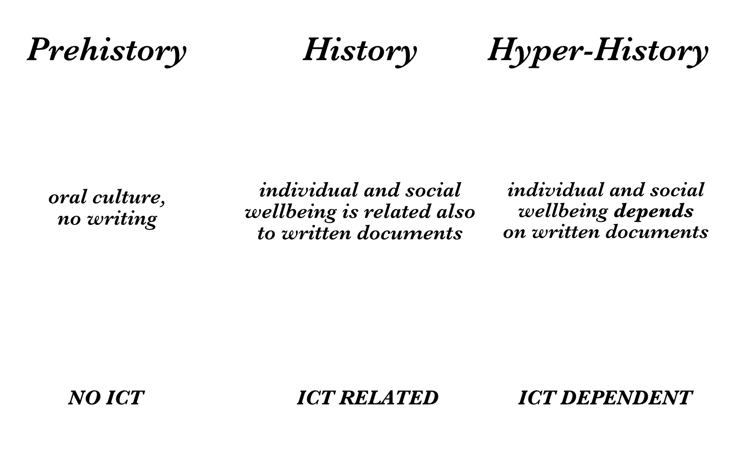
As shown in Fig. 1.1, we are currently living in a Hyper-Hystory age, and written documents are all around and dominate our lives, mostly in their digital form. Emails, agreements, database records representing both the money in our account or the date of our next check-up, passwords for entering the majority of services that make our life a 21th century life, with access to social media, streaming and e-commerce websites. Our digital commodities require us to type something on our computers in order to access them, but the footprints of this actions are always stored in somebody else’s computer: we are constantly generating data that feeds the internet algorithms that will, in order, feed us back with content. The key concept I want to underline here is that we’re not generating data that people will later look into, no, this is data for machines usage (deep learning algorithms, just to make an example). No human being would have the slightliest chance of getting an understanding of all of this ‘raw’ data - this is the perfect task for a machine, instead.
As Floridi says, it all began with barcodes:
Fig.1.2 - Barcode example image, original source: en.wikipedia.org
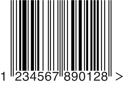
The image in Fig. 1.2 is not meant for you.
A barcode is not meant to be understood by a human - it just needs to be parsed by another machine. The fact is that our hyper-historical world is not just full of data, it is full of data aimed at devices, not humans. The majority of data currently transmitted around in our digital world serves this purpose.
The USB stick in your laptop talks serially, byte after byte, to your pc, the same pc that will do a WPA2 handshake with your modem in order to later use the HTTP protocol and connect to another computer from a totally different part of the globe and make requests to exchange the information you were originally looking for (most of the time, a fluffy kitten gif ).
All of this ocean of data exchanges is always happening transparently to us, but I think that it is important to sometime render this layer opaque, because it reminds us of one important underlying process, the “Datafication” of our world.
A barcode label attached to the pasta package you’re buying doesn’t describe how pasta feels when it’s well cooked, or gives tips on a few recipes to try with it, it does not clarify the object, it just reduces it in order to be described to another machine that will then know its price.
Not much of a surprise here, a barcode is not a place for feelings or emotions, but the same human temptation of “summarising” reality, trying to put barcode labels on it, happens quite often when the online edition of your journal publishes an infographic on the latest trending topic.
We are used to build technology that reduces the world to our needs, and sometimes the same process used to build technology is used by ourselves to understand the world.
One of the reasons for that shift is that the same professionals in possess of technology related skills are responsible for both accessing and manipulating the data and later communicating it to the public. Those mythological figures are currently called by the industry “Data Scientists”. It is my personal belief that in addition to those technology-statistical trained individuals the industry needs people with design, visualisation and communication skills, able to maintain the subtleties of reality while presenting the result of their researches… I think we may then call these professionals “Data Humanists” (see Maeda’s definition of Human Technologist (3) ) :
Fig.1.3 - On the ‘human technologist’, all rights reserved to John Maeda

To give you some practical examples, at the beginning of this month Italy witnessed the elections for the renewal of the Parliament representatives, and with that, a lot of visualisations appeared in online magazines in order to describe the general feelings of the Italian population.
The majority of the resulting images were showing that Italy has a clear distinction between South and North, with the Nord citizens voting mostly for the Lega party and the South for the Five star movement.
Examples of what I’m talking about can be viewed online here (4) and here (5) .
Now, I’m not saying that a polarisation of votes hasn't happened - I just want to highlight that in all of those visualisations data was portrayed in order to follow a specific agenda or belief, and just like we do with barcodes, the maps were not visualising the complexity of the studied object, but abstracting its complexity and reducing it to bars and colours with the purpose of supporting an headline.
I’m not saying that abstraction thanks to data is not possible, I just want to pinpoint that it may not be possible: if the link from data to knowledge comes too abruptly, then it’s probably time to get more cautious about the assumptions we’re reading, and there are chances that some kind of data manipulation is happening.
In order to analyse this link in an appropriate way, the following image will be our conceptual base:
Fig.1.4 - The DIKW pyramid
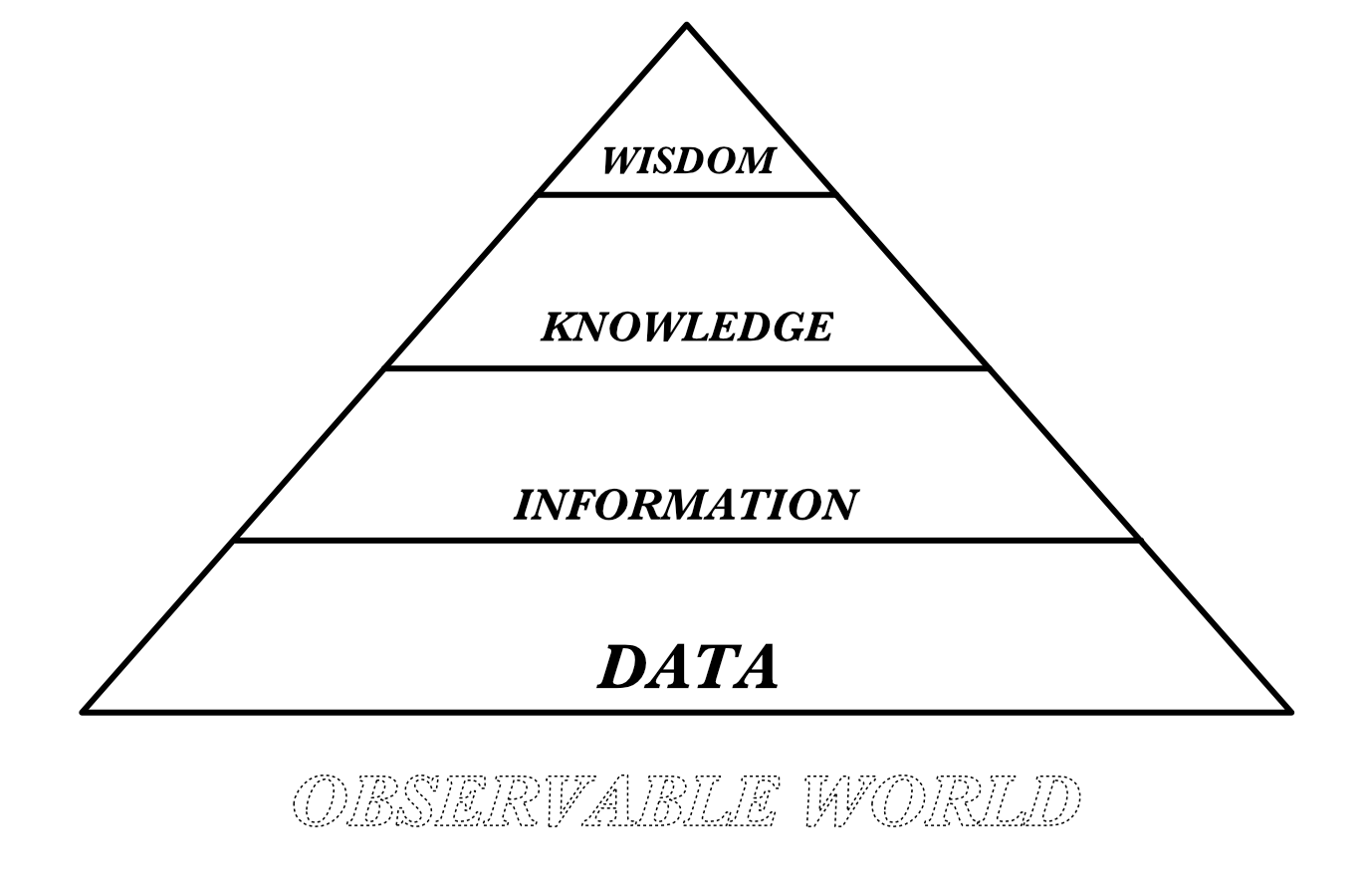
This slightly modified version of the DIKW hierarchy shows the 4 classic components and adds an underlying one, the observable world, as a remainder that data is generated from the slice of the world that can be observed, measured, and quantified. This of course does not represents the totality of the world. Another important aspect that this visual model helps to emphasize is that since data is an observation, it largely depends on the tool which we’re using to observe. According to popular wisdom, we could also say that “if you have a hammer everything looks like a nail” : if you have at your disposal quantitative measuring tools, you will see everything as an object with some quantities to measure. Another interesting addition to this gist is to be found in the introductory chapter of the book “Raw data is an oxymoron” (6) :
“Despite the ubiquity of the phrase Raw Data - over seventeen million hits on Google as of this writing - we think a few moments of reflection will be enough to see its self contradiction, to see, as Bowker suggest, that data are always already “cooked” and never entirely “raw”.
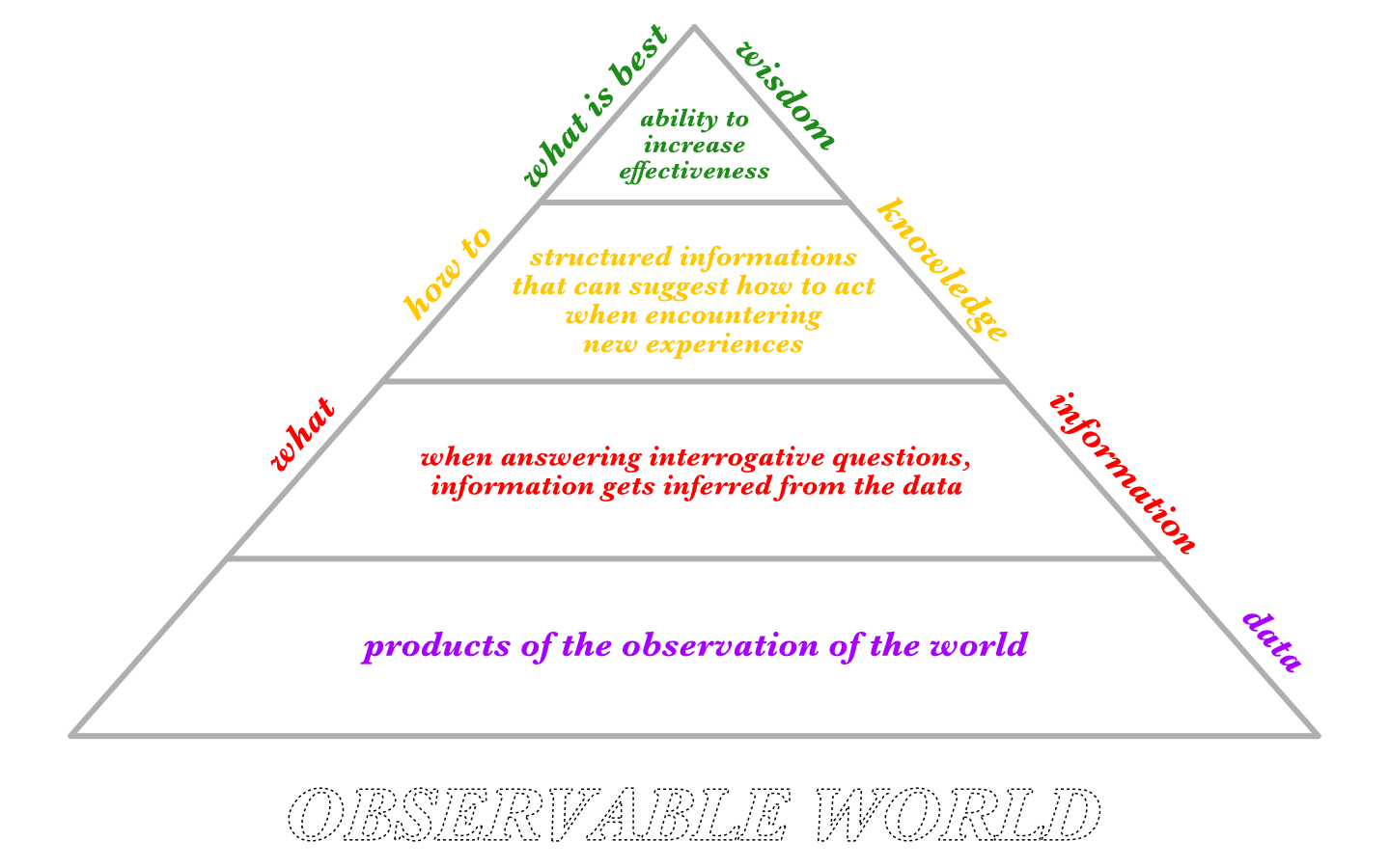
Now that we explored the underlying substrate on which data ‘feeds’, we can then move to the 4 classic components of this model, which I choose to outline in this annotated image:
Fig.1.5 - The DIKW pyramid with notes
Another important aspect from Floridi’s philosophy that will help us gain a better understanding about our relationship with digital data is the concept of transdiegetic.
Once again, my preference in explaining things visually will be reflected in the next diagram:
Fig. 1.6 - Diagram representing the transdiegetic
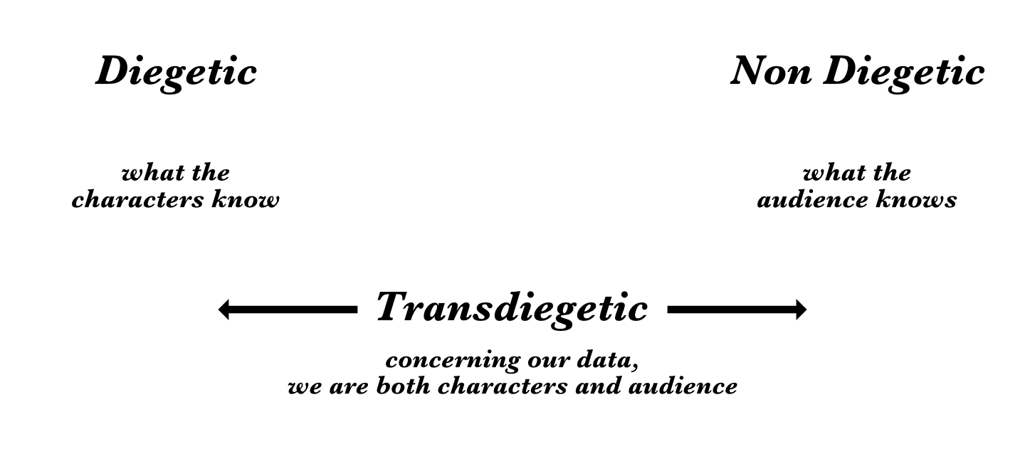
Taking inspiration from the cinematography language, Floridi borrows the terms Diegetic and Non Diegetic in order to explain the current state of knowledge of the characters and the audience regarding a situation. Referring to the infosphere, Transdiegetic simply means that we continuously shift from a diegetic to a non diegetic point of view: we are currently creating the data and accessing it; just like in a video-game, we are the players so we know what the player knows, but we can also access data about us, which gives us the audience perspective, and finally we can edit this data by changing our behaviour. Think of any fitness tracking apps available for our smartphones, the key of their success resides in the interactive model they give you, in the transdiegetic point of view that enables you to both examine and modify your habits.
This process of information retrieval and exchange is what really makes us humans: we are informational entities with a constant need to share information with the other entities - mostly humans, but as we’ve seen this is going to change soon - populating our environment. The rise and shine of the social networks in the internet era helps us to understand this latent desire : they create aggregates of people and satisfy their need to share informations about common interests.
This is why issues related to digital privacy are deeply connected with the overarching field of this research: if we are informational entities, we should have full power over which informations we do and do not choose to share, and with whom.
A look into the observable world for analysis and resolutions
Now that I outlined my main conceptual framework, I feel more comfortable in further analysing some examples from our world so that I can illustrate how data visualisation can fall short or it can be prove to be a successful tool in unveiling the invisible.
One brilliant example comes from the personal experience of my friend Amit Segall, which suggested that I should look into the traffic lights that secretly dominate the majority of our food packages. If you live in the UK, you have probably seen some of them:
Fig.2.1, 2.2, 2.3 - Traffic lights on food packaging
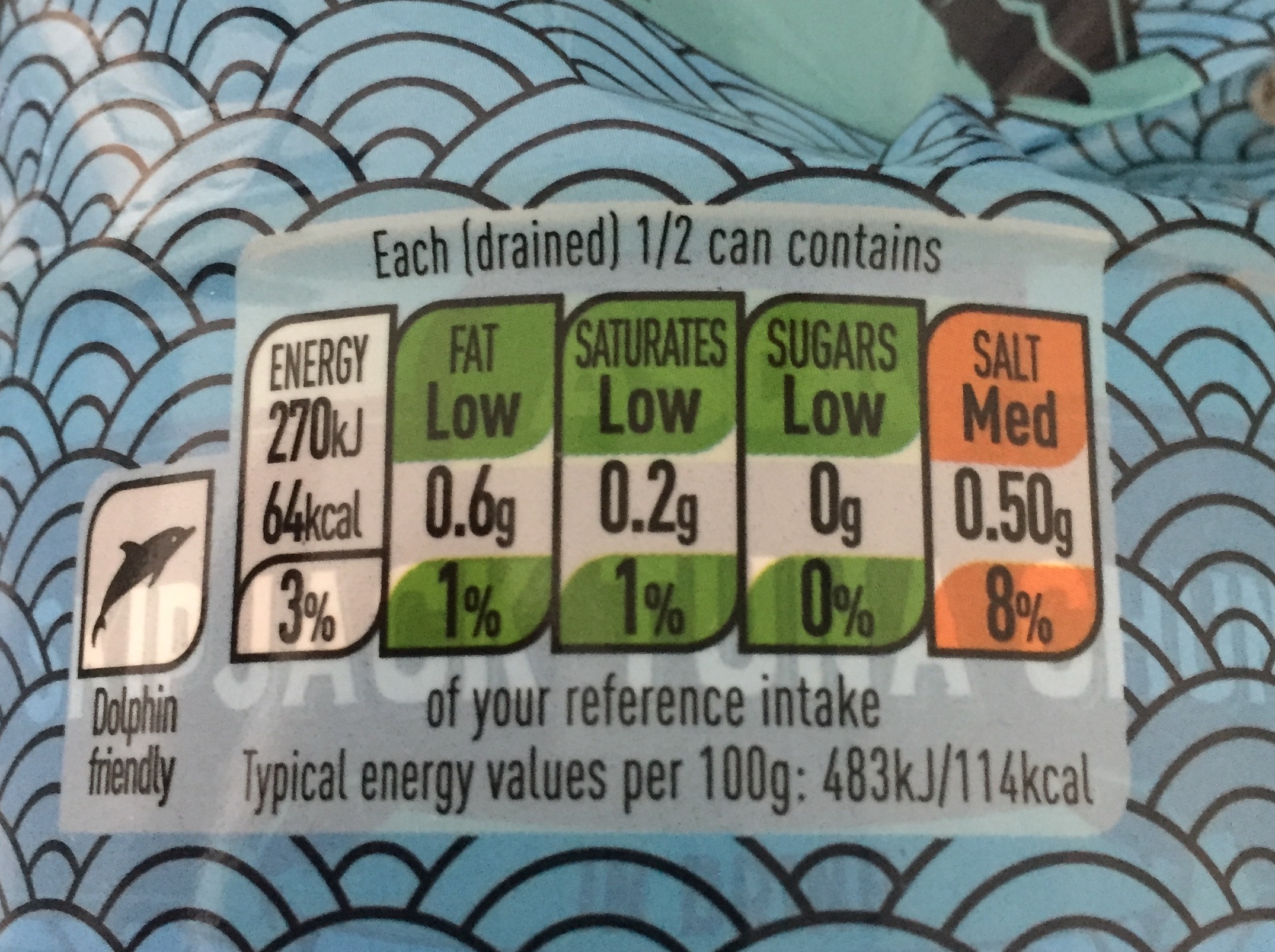
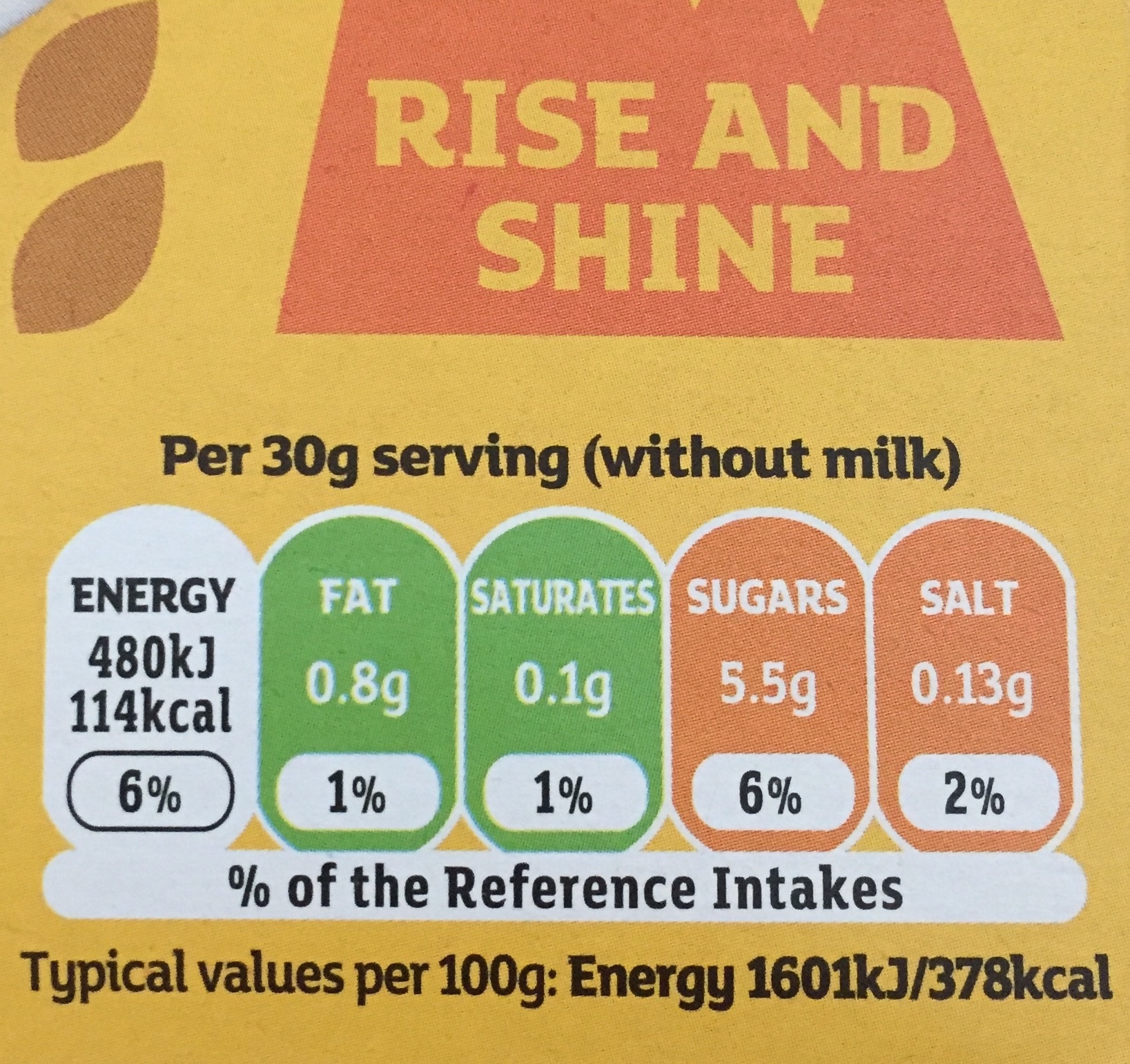
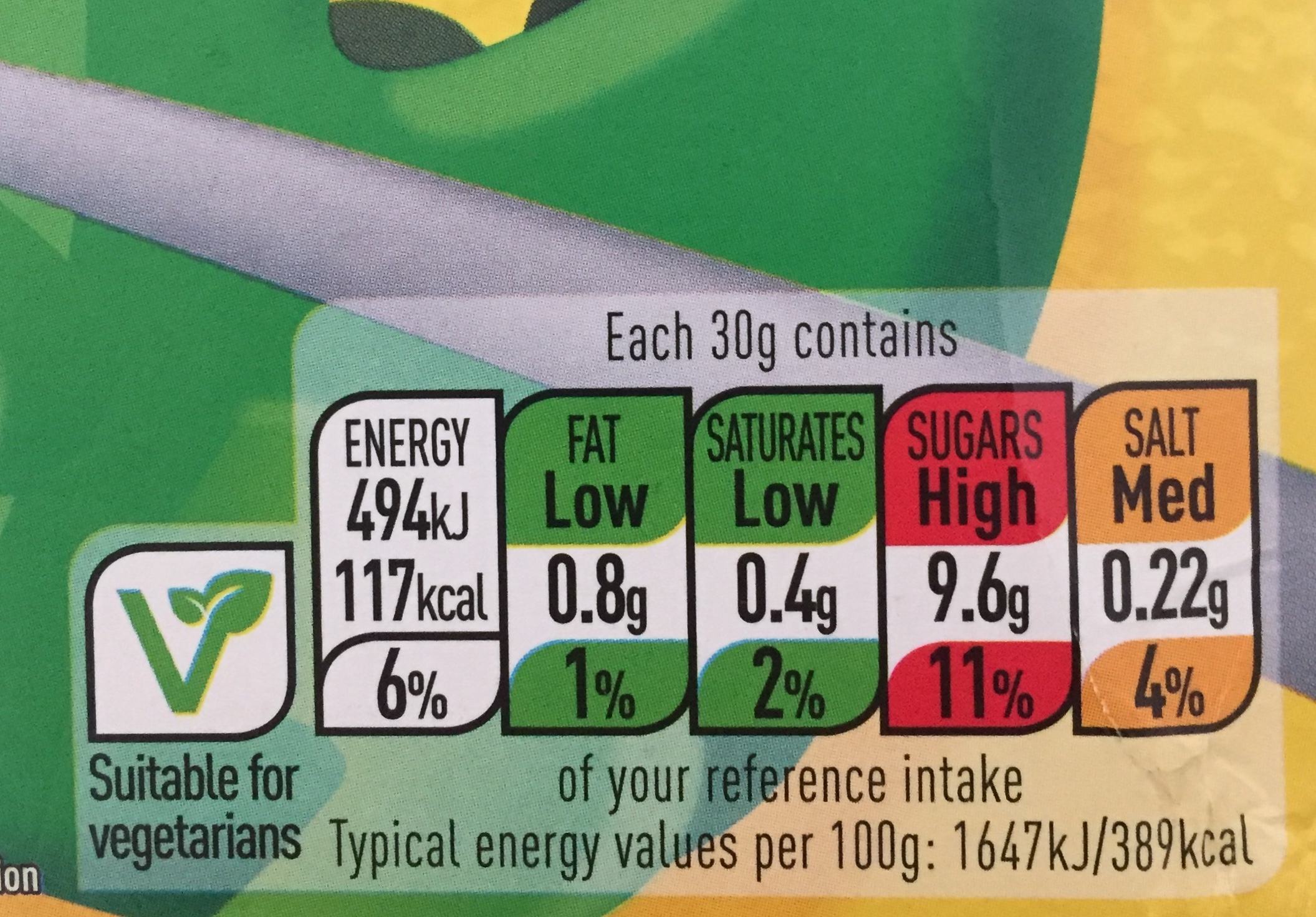
Those label summarise the essential nutritional properties with a classic green is good red is bad colour hierarchy. Amit told me that his wife really takes into account those little pictographs when shopping for food and I personally don’t find it hard to believe him, since according to this article (7) Coca-Cola, Cadbury and United Biscuits have refused to sign up to this unified scheme (fear of dealing with too much red?) . Those images are not complete nutritional advices and they lack any context about the person who is going to buy them, yet the iconic simplification through which they inform their content is very effective in terms of human psychology; if you didn’t ever notice them, my guess is that starting from now they will start to pop up to your eyes more frequently.
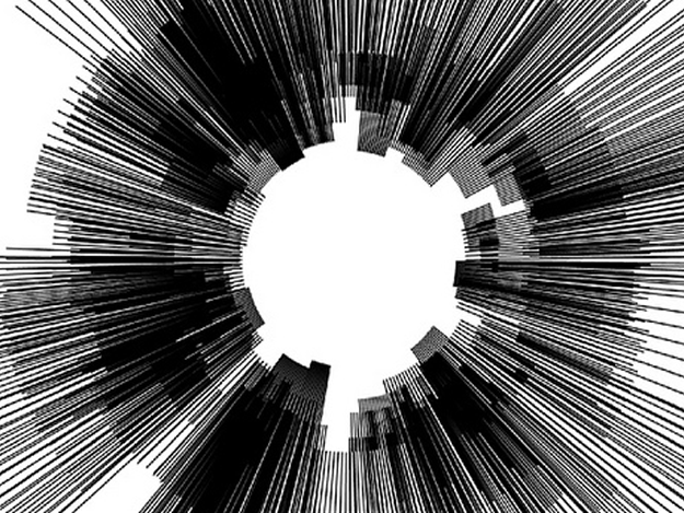
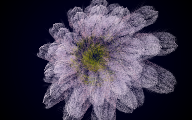
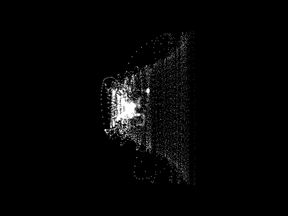
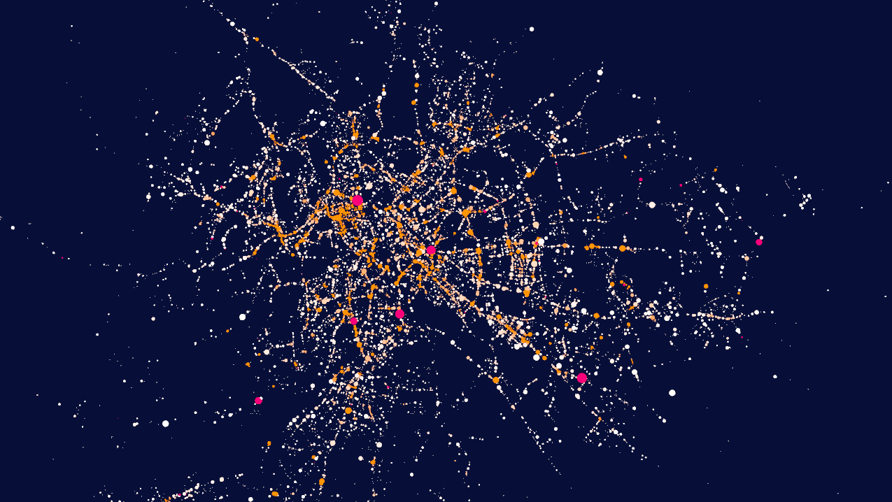
Moving more away from the iconic world towards the search for a digital realism, I want to present you with one recent data-viz work of mine in which I had to face some major challenges related to the truthfulness and realism of the information I was communicating.The following images are extracts from different work in progress renderings of my visualisation of car crashes in the city of Rome (IT). The structure of the source dataset used in the following images is the same, but they exhibit three totally different tones, conveyed by a different choice of the perspective, colour palette and symbolic reduction employed, even though they share a common ground thanks to the use of a georeferenced approach.
Fig.2.4, 2.5 - Early stages of the car crashes visualisation
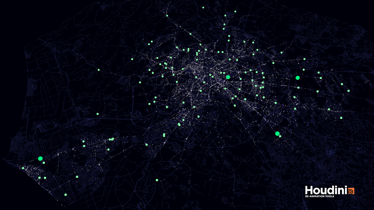
Fig.2.6 - Advanced stage of the visualisation
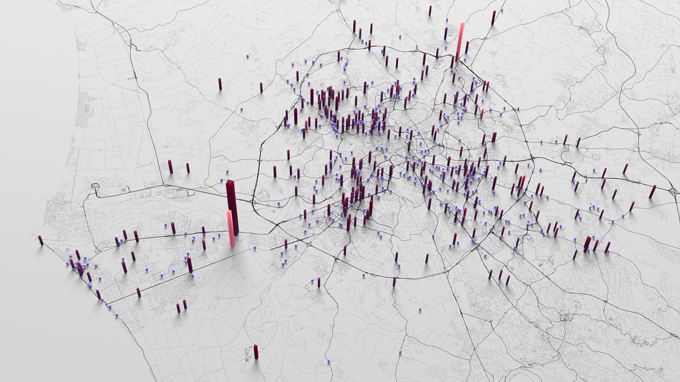
Fig.2.7 - Final image, one month of the 5 visualised (March 2017).
Orange bars represent casualties, red are injured, purple are crashes without injuries.
Higher bars stands for a higher number of people involved.
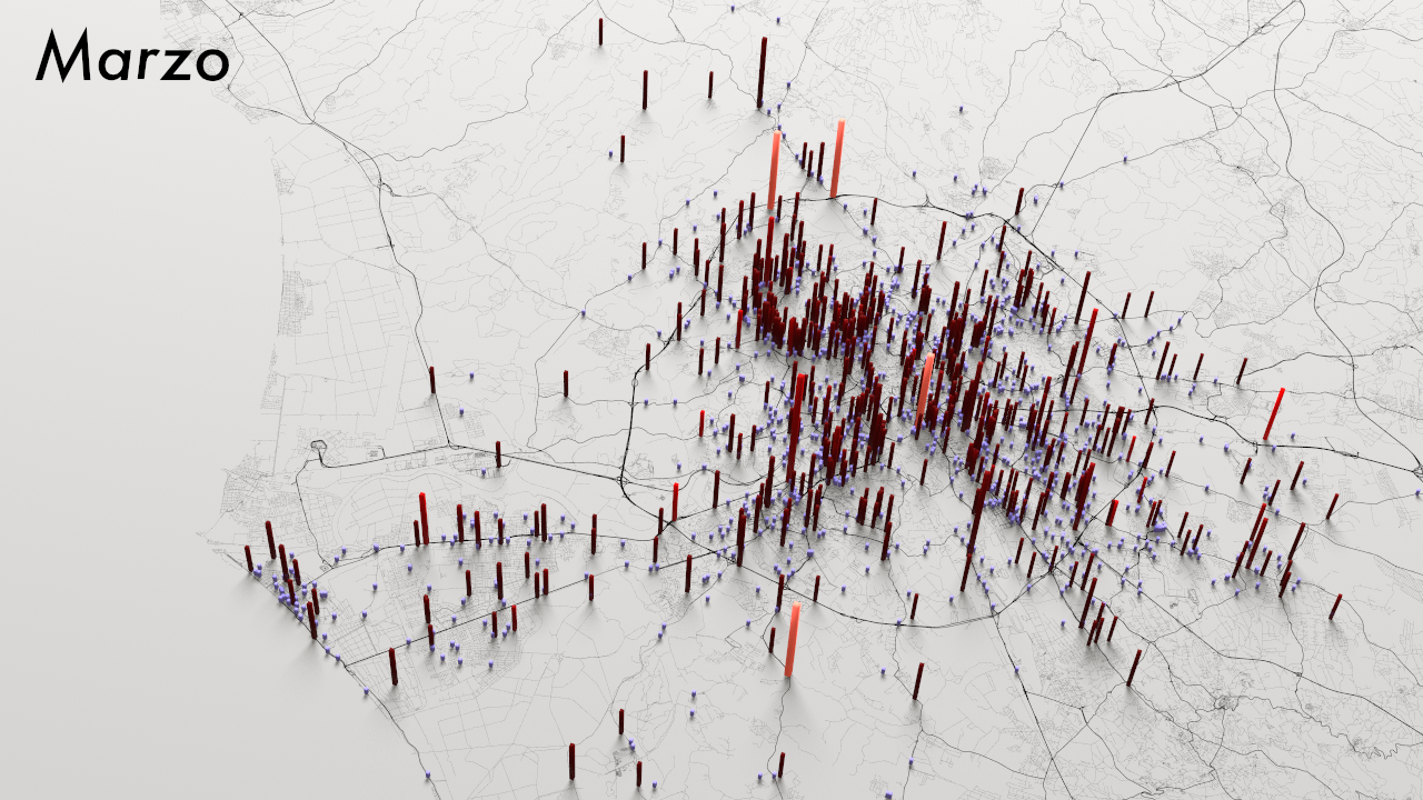
As you can see, in the end I opted for a less intriguing, more aseptic image that - I feel - more clearly depicts the distribution of crashes and the number of people involved.
While the final image, compared to the previous ones, can appear less striking due to a a variety of elements (colour contrast among all), I personally believe it makes a much better job in terms of describing the full reality of the crashes.
For most of the tasks, a static image can be an already valid tool for a visual exploration, but this time I also decided to explore the temporal dimension of the crashes and I challenged myself to create an animated version of one month of data so to discover how the crashes unfold with the passing of time.
You can see the result here (8).
I’m showing you my process because I hope that by witnessing the variety of outputs that can be generated from a common source dataset we can start to be more critical regarding how data scientists and data journalists choose to reduce the world for us.
In the hyper-historical world in which we currently live, we cannot leave the control of information only to tech-skilled individuals, we need artists and designer to help depict the subtleties of our digital environments. In addition to that, I believe that as digital citizens we should have a transdiegetic approach to all of our data, and for this approach to be successful we should emancipate ourselves by both teaching everyone the most basic techniques to manipulate data and by making the tools of the trade more accessible - just as writing a digital document is a skill approachable by everybody, we need to have the same degree of confidence when accessing our data.
I do believe that - as Floridi also states in his talks - we are at a primitive stage concerning the management of privacy and gathering of our personal data. If I can you leave you with an optimistic note concerning the cultural development of this field, I do hope that people from the future will look at us and laugh about our rudimental handling of those issues.
To further expand our understanding of these emerging topics, we should also investigate other kind of symbolisms other than the ones that are commonly used in our digital world, leaving behind pie charts, bar charts, histograms, radar charts and alluvial diagrams.
I personally believe that for a digital realism to be possible, we should go beyond those limited representation and engage with our audience by creating our own visual languages fit to the current issue we want to investigate.
Graphs, icons and infographics never tell us anything new, instead, we just use them to tell something for us.
No objective truth is possible by the means of any kind of graph, since they can only exhibit a certain degree of adherence to reality.
Once again, there’s no such thing as raw data.
Notes
1. Wittgenstein, Ludwig, Charles Kay Ogden, and Bertrand Russell. Tractatus Logico- philosophicus. Mineola, NY: Dover Publ., 1999.
2. Segnavie. “Luciano Floridi - Onlife: essere umani nell’era digitale”. Online video clip. Accessed on 28 March 2018. <https://www.youtube.com/watch?v=Ciy0RyNhT- s&t=1002s>
3. Maeda, John. Humanist Technologist. 10 Feb. 2018. Online web page. Accessed on 28 March 2018. <https://maeda.pm/2018/02/10/humanist-technologist/>
4. Corriere della Sera. “Risultati elezioni politiche 2018: Camera”. 06 Mar. 2018. Online web page. Accessed on 28 March 2018. <http://www.corriere.it/elezioni-2018/risultati- politiche/camera.shtml>
5. Financial Times. “Italian election shines harsh light on economic divide”. Online web page. Accessed on 27 Mar. 2018. <https://www.ft.com/content/d11902f6-2062-11e8- a895-1ba1f72c2c11?segmentId=6132a895-e068-7ddc-4cec-a1abfa5c8378>
6. Gitelman, Lisa. "Raw Data" Is an Oxymoron. Cambridge, MA: MIT Press, 2013.
7. The Guardian. “Food packaging 'traffic lights' to signal healthy choices on salt, fat and sugar.” 19 Jun. 2013. Online web page. Accessed on 28 March 2018. <https:// www.theguardian.com/society/2013/jun/19/traffic-light-health-labels-food>
8. Vimeo. “Through the streets of Rome - August”. 26 Sep. 2017. Online video clip. Accessed on 28 Mar. 2018. <https://vimeo.com/235647995>