
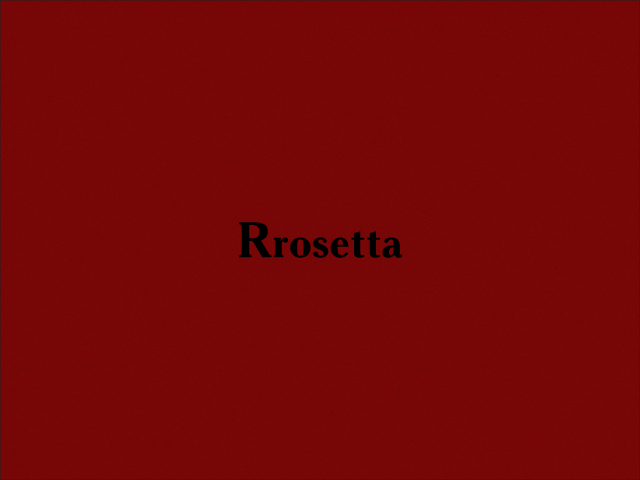
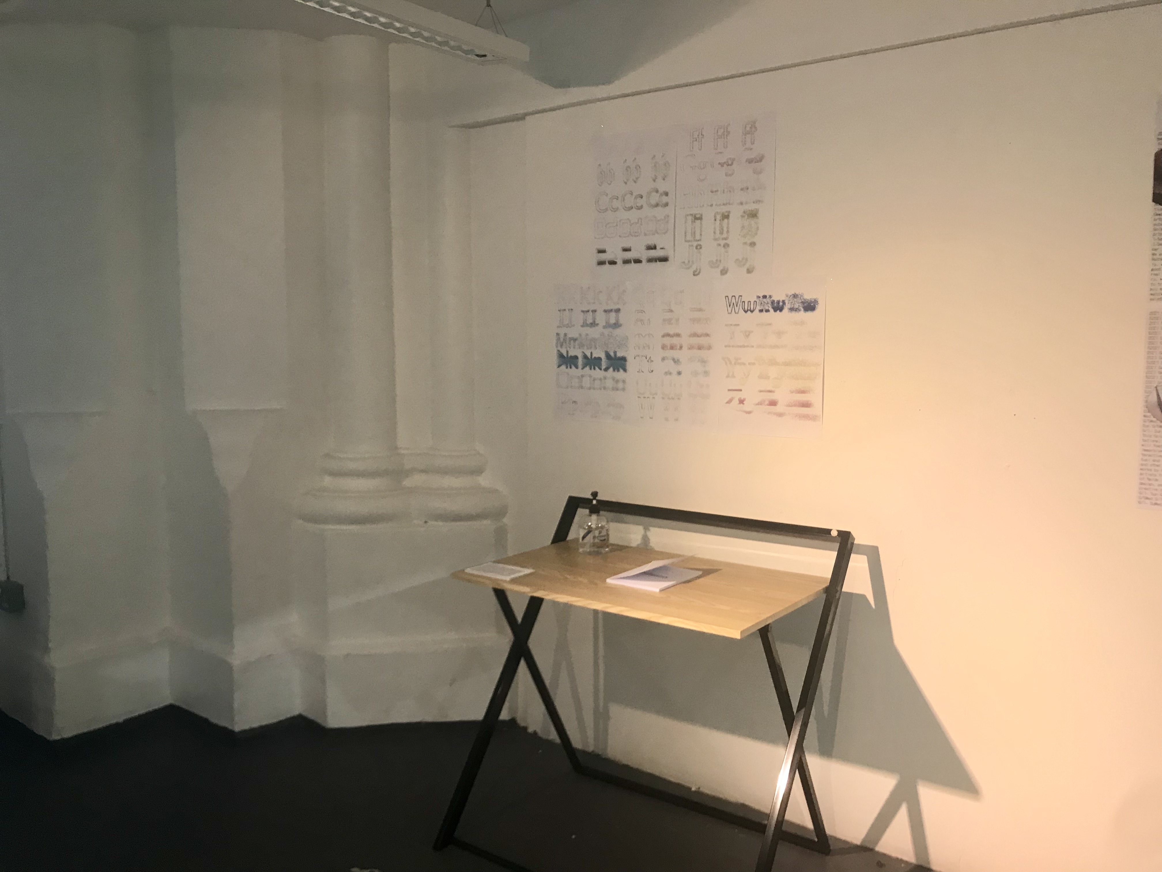
Maneo
Maneo (latin for remain, await or wait) is a visual report of graphic experiences based on an algorithm that was applied to typography. The sketch was made to explore firstly the wider potential of typography made possible through computational arts and secondly the dynamics of expectation (letters) and unexpectation (particles).
produced by: Renato Correa de Sampaio
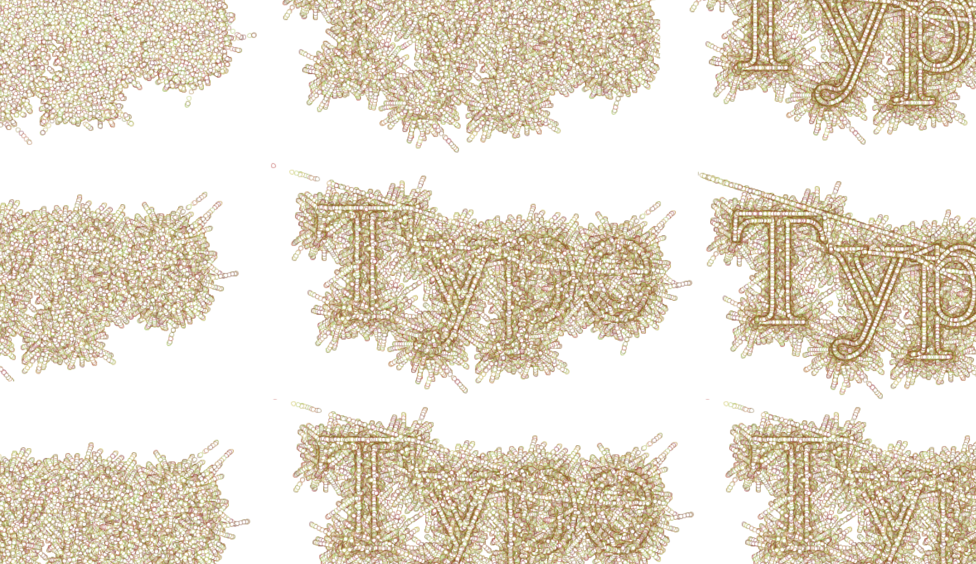
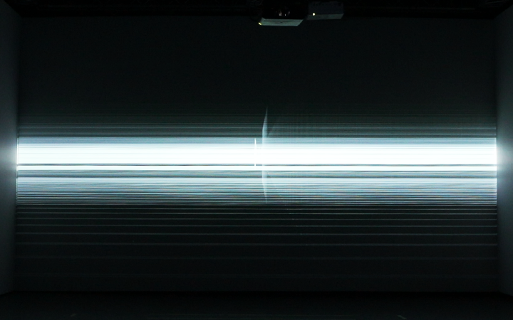
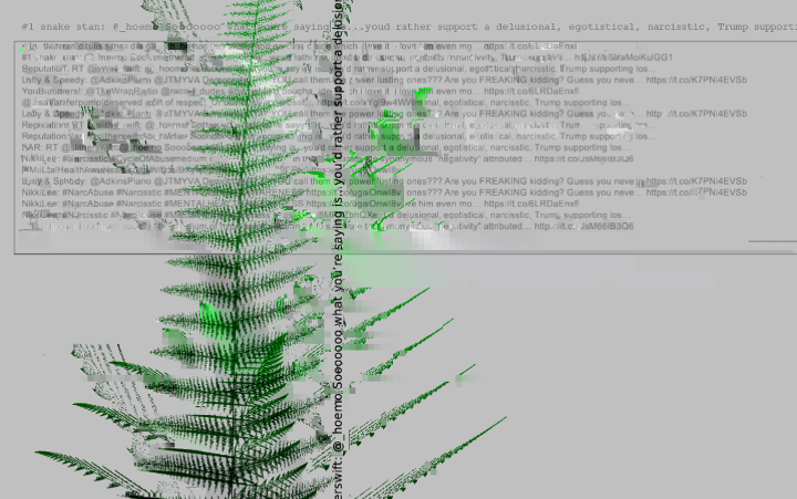
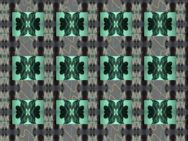
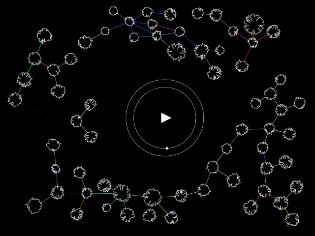
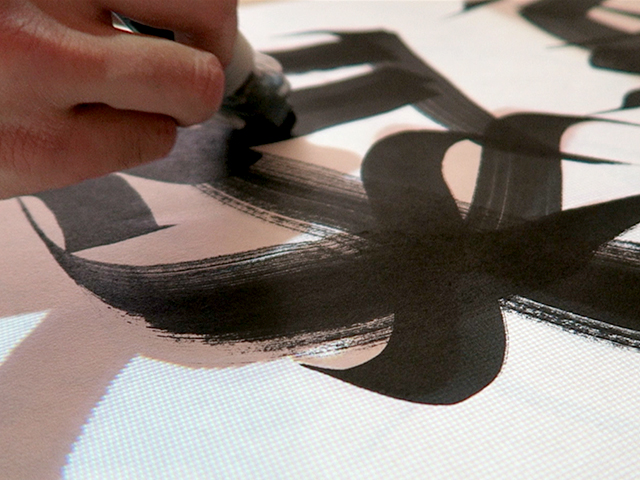
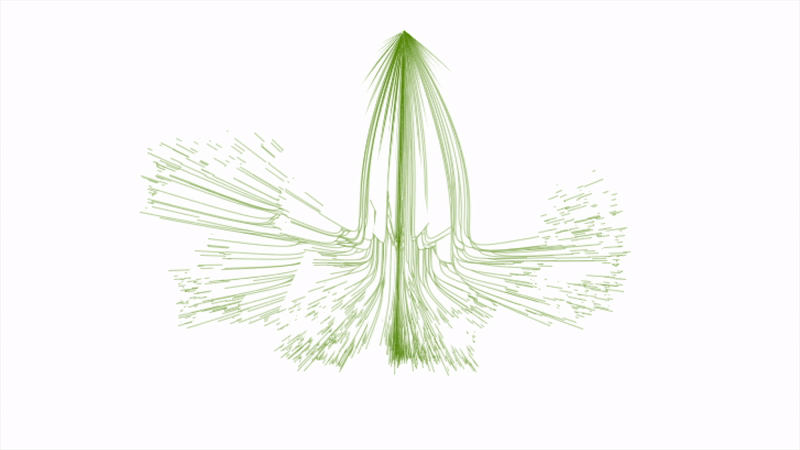
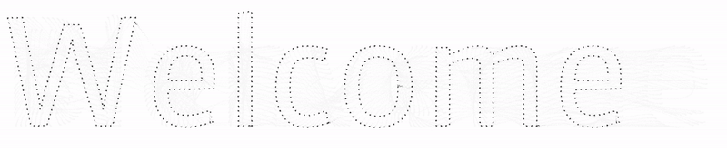
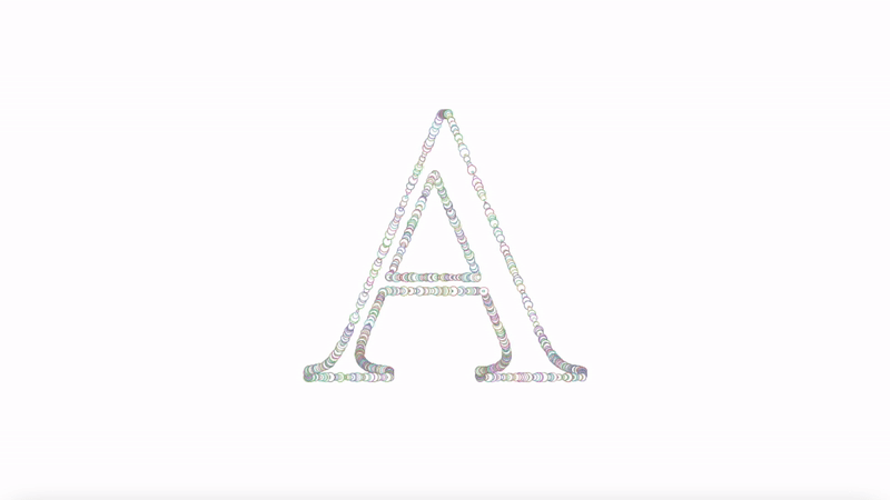
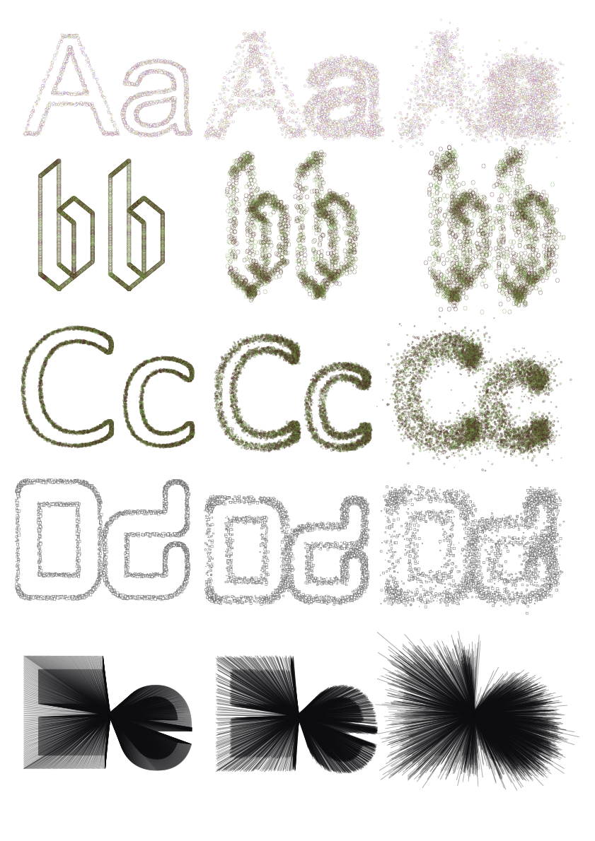
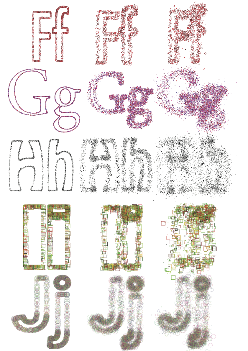
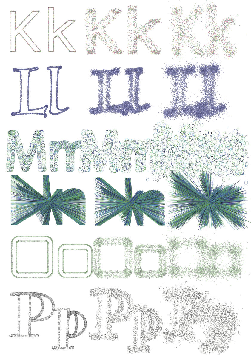
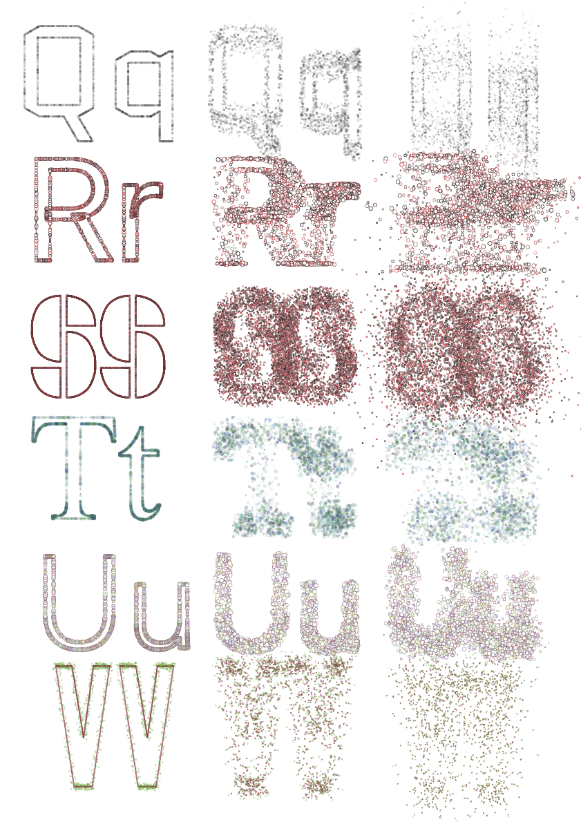
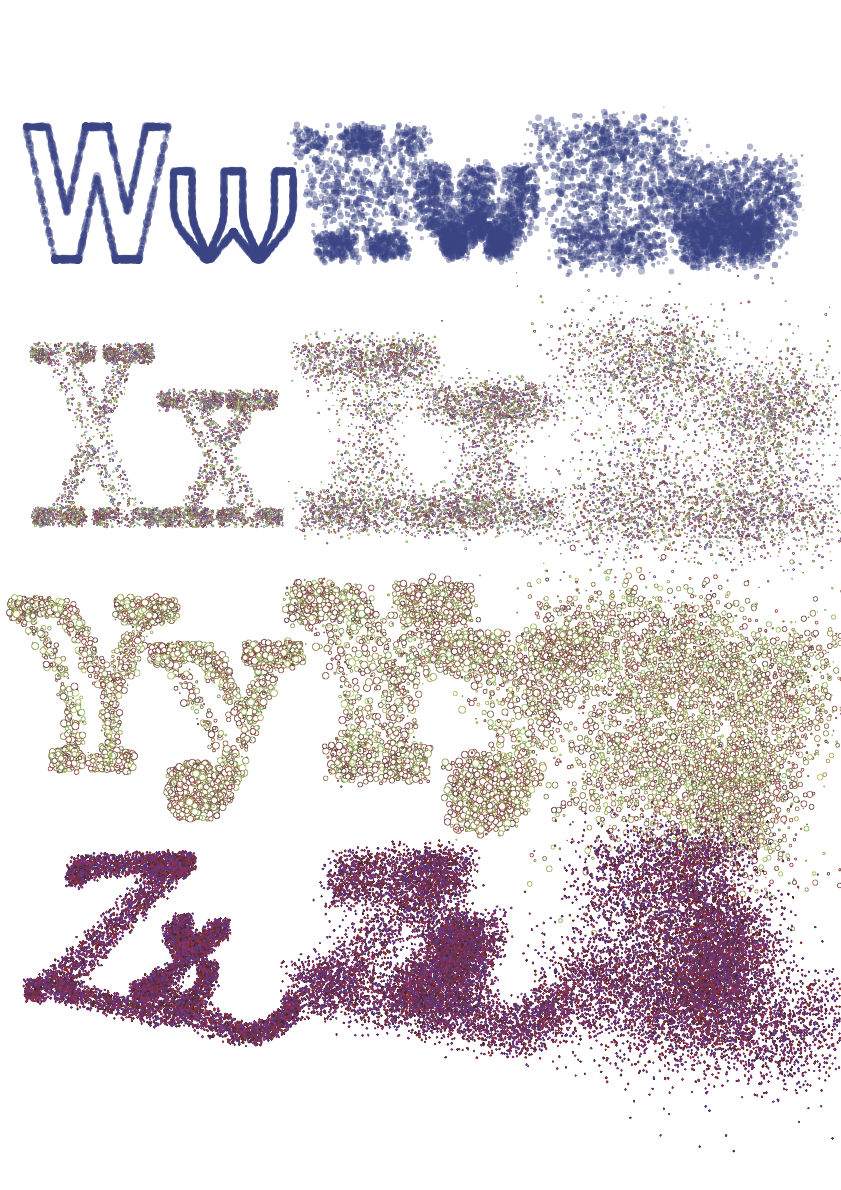
Maneo was created using the Processing language and consists of various parameters that handle the visual output of the sketch. Letter forms are dissolved into a multitude of points which can be replaced with any shape and be animated, thus inviting the audience to take part in what looks like an artistic journey into the microscopic world. The chosen format of the project is not coincidental. Having a background in graphic design with typography as a speciality, I wanted this project to be consistent with the way typographers work instead of wanting to get a purely digital outcome. Although type designers and typographers use computers much nowadays, the look of the final product on a printed surface will always affect their decision making at the end. I wanted the project to stick to the practice of typography by using a traditional format to display the results of the experiment.
Introduction
In 1992, Dutch type designer Erik van Blokland designed the FF Beowolf typeface. It had a huge impact on the discipline of type design because of its advanced features, involving alternate characters each time a letter is typed ; each letter typed with FF Beowolf were never identical. In 2011, it was added to the MoMA Architecture and Design Collection in New York. It is a brilliant example of how type and code can change the way we see type design and typography in the 21st century. It would seem as if FF Beowolf was based on the premise that a type doesn’t have to be clean and ready, but that it can be an experiment and that the process is never truly finished. It is obvious that as new technologies emerge, new designs become increasingly experimental. This is the case for Zachary Lieberman’s IQ Font, which is a collaboration project with typographers in which letterforms were made using the movement of a sport car. As someone who is looking forward to a graphic design (and perhaps a type design) career, I see my project as embedded in this trend of using the dynamics of code and type to create powerful visual outputs.
Concept and background research
My intentions were to make this project to be a re-interpretation of typography and what it can be. Typography has sometimes been viewed in artistic circles as the designer's will to take control over what he produces, not being bound to any set of rules telling him how he should work. However, computational arts have opened the door for a newly invented practice which questions the very notion that design is about having control over one's work. Indeed, computational artists have shown what unpredictable results can come out of the computer screen. How about loosing control over typography? How about giving a life to our work by giving it a sense of unpredictability? The contradiction between predictability and unpredictability fascinated me at the point I decided to use this as the dynamic that would drive my project.
The starting point was a class in Creative Coding 1 where our teacher recommended the book TYPE + CODE Processing for Designers by Yeohyun Ahn and Viviana Cordova. It contained all sorts of tips and methods to apply creative coding together to typography. One other thing that sparked my interest was the algorithm class in Creative Coding 2. I was interested by the behaviour one could provoke with lots of small elements that make one coherent ensemble. From these two ideas I started to explore some of the possible typographic variations inside my processing sketch which would then be compiled into a book. It immerses the audience into a fine-looking micro-verse of what imaginable possibilities and trajectories the sketch has to offer. This is highlighted by the fact that every exported PDF is different each time we run the sketch. I wanted to give a new look at fonts, as if they had a life of their own, to make them look organic in an unconventional way.
Technical
I wanted this project to have a printable piece of artwork as well as a digital animation. In the making of my project, I tried to implement my ideas trying out various programming languages, starting with OpenFrameworks. I went through Processing and P5.js as well to see which one would be more suitable for the project. I found Processing to be the most efficient platform to allow repetitive visual experiment. In the same time I was researching about designers and creative coders who had already played with type on processing.
To make this project possible, I used my initial sketch from my final project for the ‘Programming for artists and designers’ module. After finishing the module, I started to increasingly play with Processing, self-teaching new technics I didn’t use or learn in the module. With the help of some libraries, especially the Geomerative library, I managed to have the outline of the letters divided into a multitude of points which can then be replaced with whatever shape I want. These shapes can have different sizes each time they spawn. Each time I ran the sketch, they kept the basic parameters while displaying variations in transparency, stroke weight and size. This added an organic dimension to the project, almost as if we had lost control over letters.
From there, I had to research the kinds of computer algorithms I would implement in my sketch to visualise my concept. This demanded continuous experimentation before reaching finalisation. I also had the goal of being able to read, understand, write the code I would use for this project. To help myself, made good use of the resources displayed in Casey Reas and Fry, Ben Fry’s Processing: A Programming Handbook for Visual Designers, as well as Yu Zhang and Funk’s Coding Art: The Four Steps to Creative Programming with the Processing Language. It became clear to me that I would need to focus on the behavioural changes of the shapes imbedded on the letters’ outline. As typography in creative coding is quite a small niche, there were very few examples and resources available online, despite the ones that already existed. Some of these resources were available only on Processing 2. At one point I found myself stuck in using coding resources that was relatively limited for what I wanted to achieve. To make good use of them, I had to update some of the arguments that were used back then.
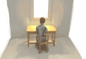
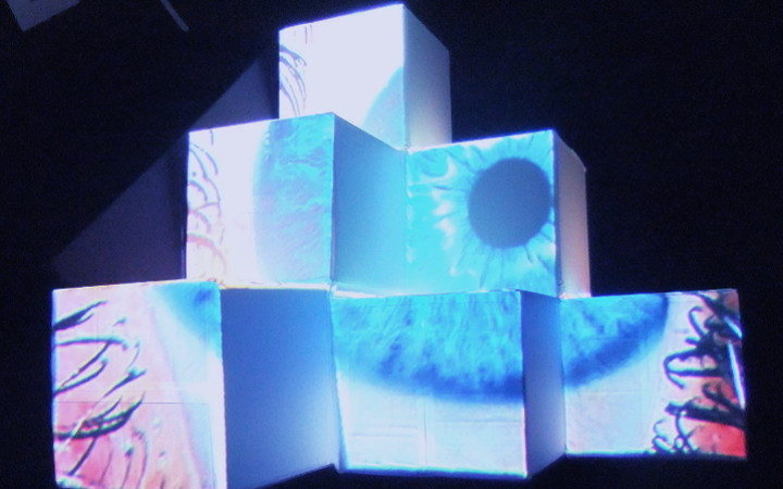
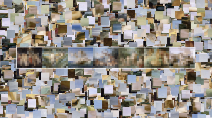
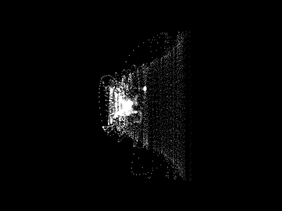
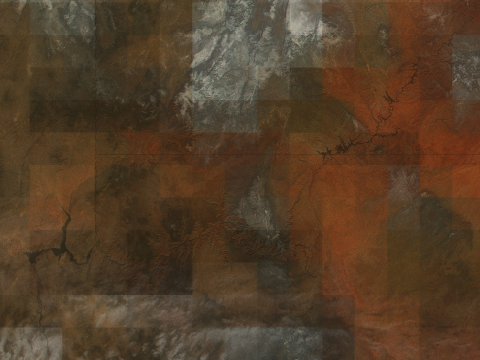
Experimenting with bezier drawing the letter form
Experimenting with points moving from one string letter to another
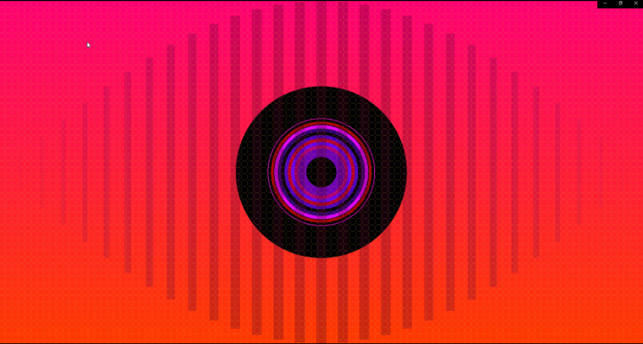
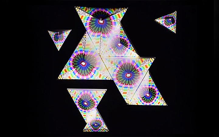
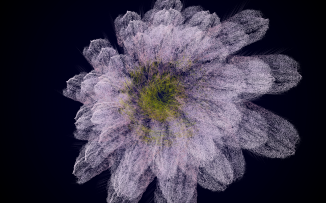
Final experiment outcome
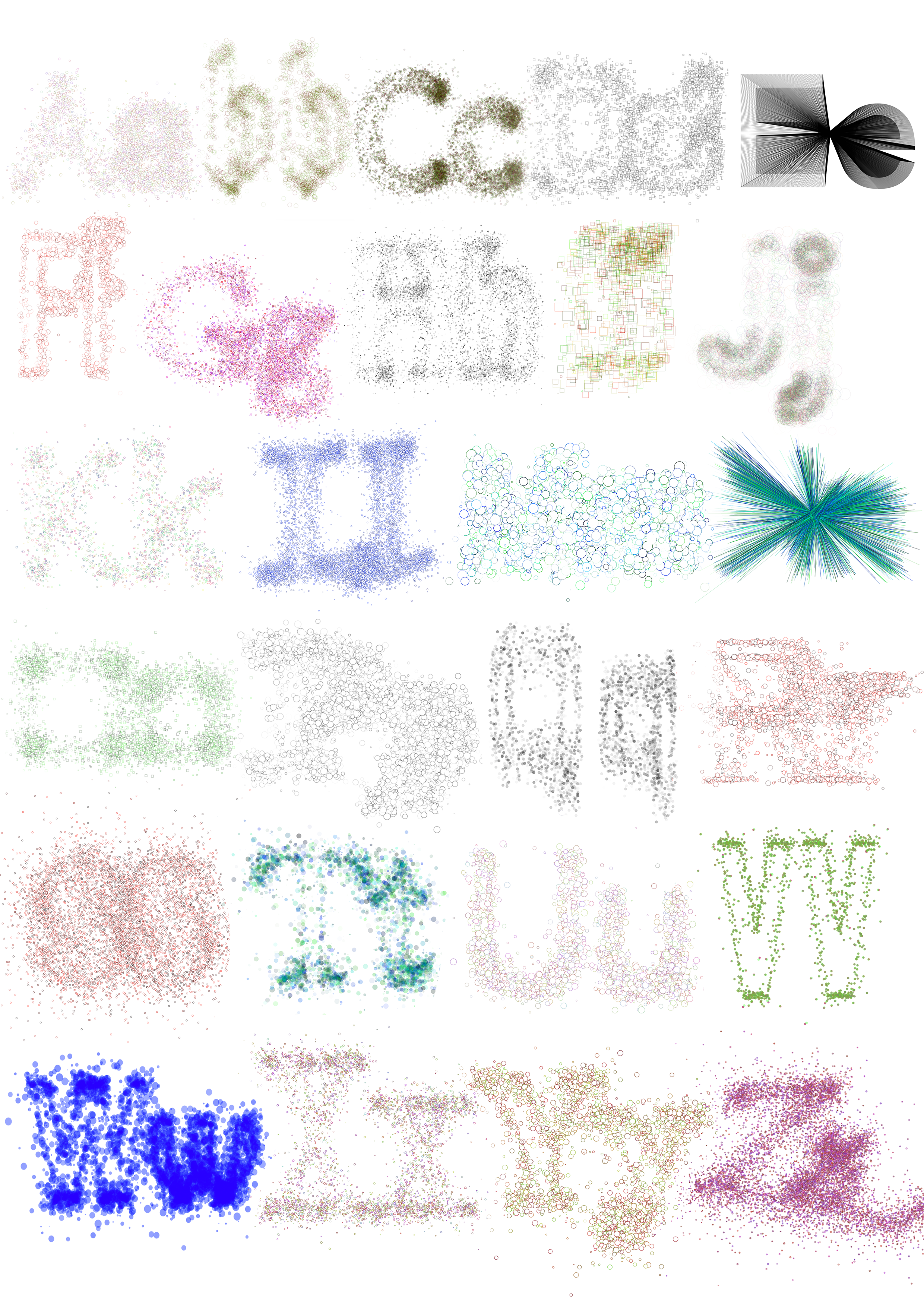
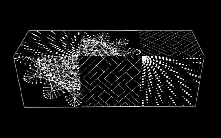
Making variations of letters, shapes, fonts and particle behaviour inside the sketch.
Future development
Obviously there is a lot that could be added to this project. So many more variations could be created to make a wider and more complete extension of the same sketch. I intend to continue develop this sketch in the way the particles behave to forms letterforms. I will certainly try to program new behavioural patterns for the particles to move and implement new algorithms into the sketch.
Self evaluation
Overall, I am satisfied with the outcome of the project. I was able to expand on my processing coding skills in a way I had never dared to try before. I believe this was the fruit of many efforts to expand on what I had learned in an attempt to make something interesting and good-looking. I learned a great deal on how to create complex parameters to achieve what I wanted visually. I saw this project as a continuation of my typographic practice as a future graphic designer, and so I am confident in the knowledge I gained in order to use it for future client work. In terms of the physical outcome of the artwork in the midst of the exhibition however, I was quite disappointed at the ridiculously limited number of copies I was able to produce. I feel that the project deserved a much more better format than it initially received. I hope that this project will help me build a professional portfolio of typography. I hope to expand on what I achieved with this project and create more variations that I can compile in a proper book.
References and inspiration
Casey Reas (from 2001) Available at: https://reas.com/
Lieberman, Z. (2009), Toyota IQ Font. Available at: https:// cartype.com/pages/4163/toyota_iq_font
Marxer, R. (2006) Caligraft. Available at: https://digitalartarchive.siggraph.org/artwork/ricard-marxer-pinon-caligraft/
Reinheimer, I. (2010) Irratio. Available at: http://generative-typografie.de/generativetypografie/irratio/
Unger, G. (2018) Theory of Type Design
Van Blokland, E. and Just Van Rossum, J. (1992) FF Beowolf. Available at: https://www.fontshop.com/families/ff-beow- olf
Victionary, (2019), On the Road to Variable: The Flexible Future of Typography. Edited and Designed by TwoPoints. net
Williams, S. and Henrik Kubel, H. (2015) Type: New Perspec- tives in Typography
Yeohyun, A. (2005) TYPE + CODE I, II, & III
http://yeoahn.com/typecode/index.html
Ressources
Gross, B. (2012) Generative Design, sketch P_3_2_1_01. Available at: http://www.generative-gestaltung. de/1/P_3_2_1_01
Marxer, R. (2013) Geomerative. Available at: http://www.ricardmarxer.com/geomerative/ and https://github.com/rikrd/geomerative
PDF library (Processing). Available at: https://processing.org/reference/libraries/pdf/index.html
RandomBook.pde. Available at: https://github.com/processing/processing/blob/master/java/libraries/pdf/examples/RandomBook/RandomBook.pde
Reas, C. and Fry, B. (2014) Processing: A Programming Handbook for Visual Designers, Second Edition
TYPECACHE, “Foundries in the World”. Available at: https://typecache.com/
Typefacts, “Fonts & Foundries", available at: https://typefacts.com/en/links/fonts
Type Foundries Archive. Available at: https://type-foundries-archive.com/
Yeohyun, A. and Cordova, V. (2009) Type + Code: Processing For Designers. Available at: https://issuu.com/jpagecorri- gan/docs/type-code_yeohyun-ahn
Yu Zhang, Y. and Funk, M. (2021) Coding Art: The Four Steps to Creative Programming with the Processing Language