


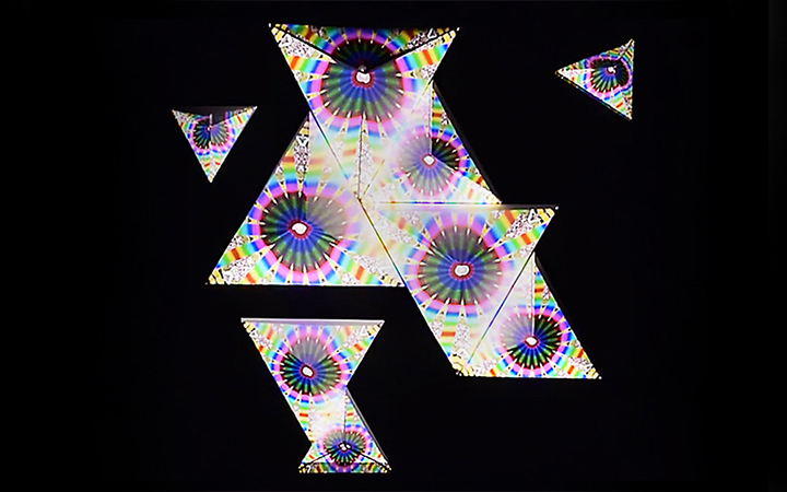
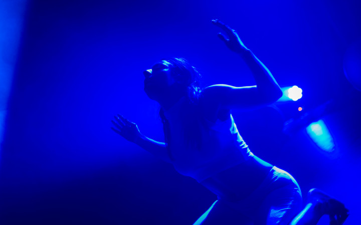
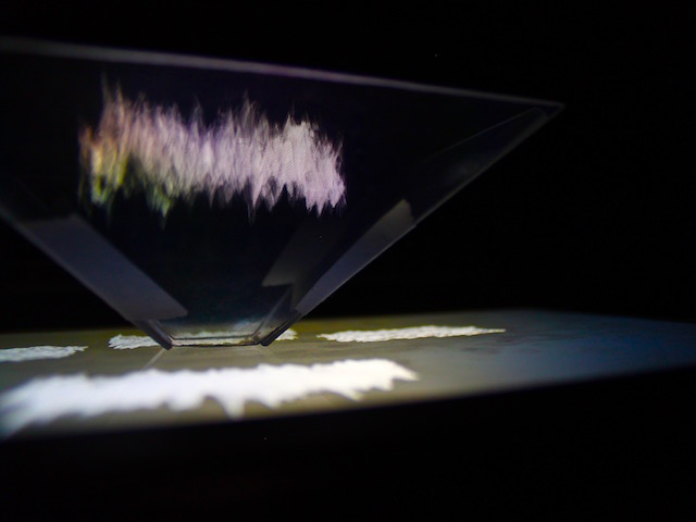

Line to texture
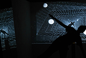
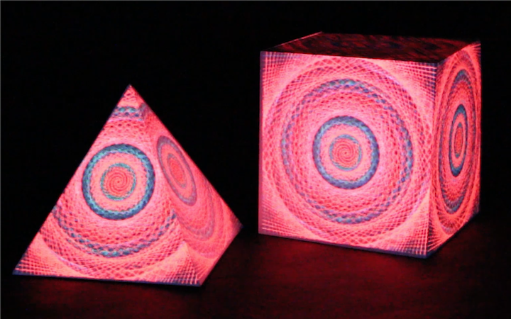
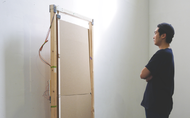
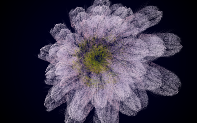
Line to texture is a projection mapping piece focused on exploring formal aspects of generative graphics. I was drawn to the Olga set shape [1], because I liked how it resembled traditional flat sheet of paper while at the same time introduced unexpected dynamic between sides in space. It was also a practical choice. Using Olga kit meant that our group wouldn't have to make a shape from scratch, which is something I knew I could not commit enough time for.
produced by: Anna Alfut
Technical context
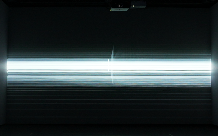
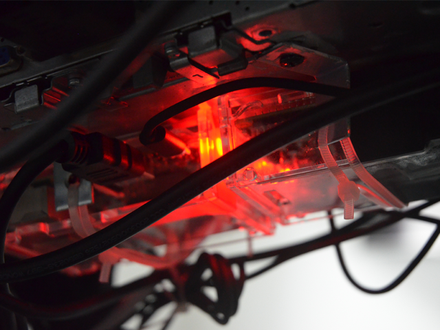
This was my first projection mapping project. All graphics are coded in C++ in openFrameworks. I used ofxPiMapper open source projection mapping tool to align surfaces and assign sketches to them. Final piece was exhibited during the Goldsmiths’ Computation Arts midterm pop-up exhibition at the St James Hatcham’s building.
In the past, the production that made huge impression on me was visualisation and mapping for Amon Tobin’s ISAM tour [2]. I find the modular aspect of the installation inspiring. How it transforms the underlying shape into flat canvas and fragmented structure with alternating designs. Even in a very simple mapping I worked on I could use some of the same principles. It was also an interesting experience to re-watch the concert with more knowledge about projection mapping.

Design and planning
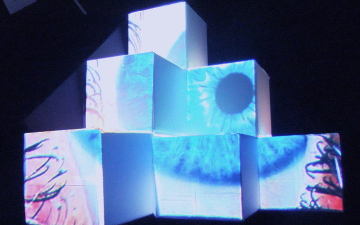
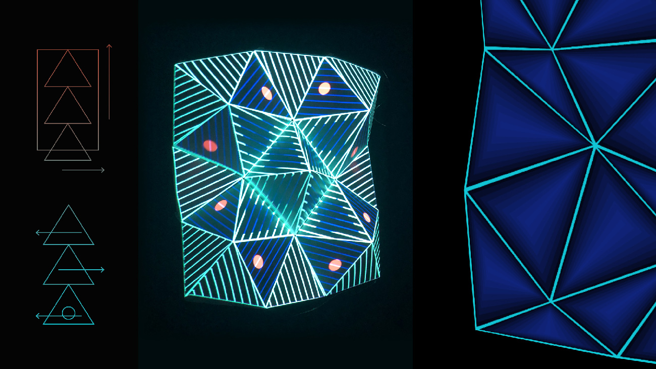
Conceptually the biggest challenge was the triangular shape of Olga kit module. Having worked with mainly rectangular sketches before, the way I had to think about the transitions and drawable geometry was more complicated. This constraint forced me to think through designs that were different to those previously done in class. I wanted to use tessellation and repetition; it was natural fit for the underlying structure.
Initially I also planned to use character design. At the early stage of design, I was self-referencing past work that focused on patterns, symmetry as well as character. Eventually I gave up this idea as I was unable to preview the projection on the shape up until late during the setup time, and I did not want to risk unforeseen distortions.
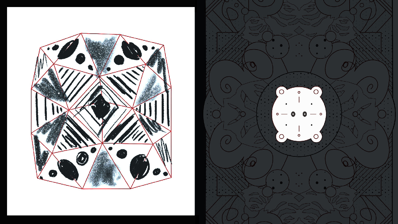
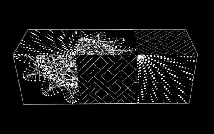
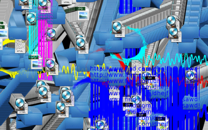
To create three distinct animations, I set myself guidelines to explore in each stage different aspects of generative graphics: geometry, graphical expression and illustration & narrative. I did not try to keep theme continuity between each part. The only constraint I followed was a consistent color palette across each scene.

Part 1 - geometry
As mentioned above, the triangular surfaces proved to be challenging. I decided to embrace it and hack my way through it. I was inspired by the approach of one of the previous year’s student [3], and how she used triangular grid to control the illusion of continuity between shapes.
I decided to also use triangular grid to manage animation sequencing. I used animated masks that revealed underlying graphics and then further cropped sketches to project only relevant parts on neighboring surfaces. This created the cascading effect I wanted to achieve. I used the same setup in another scene to differentiate graphics without having to create multiple sketches.
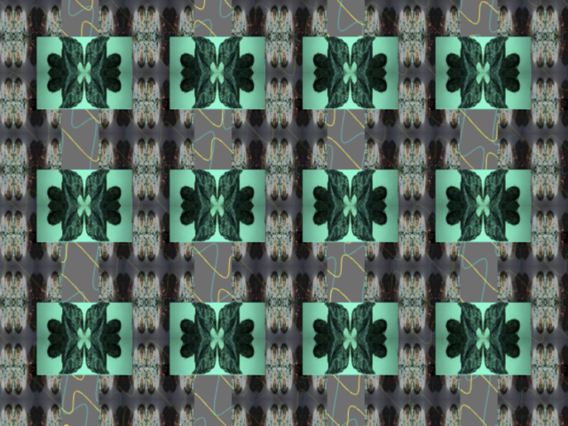
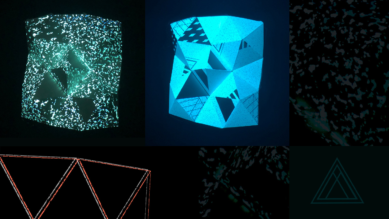
Part 2 - graphical expression
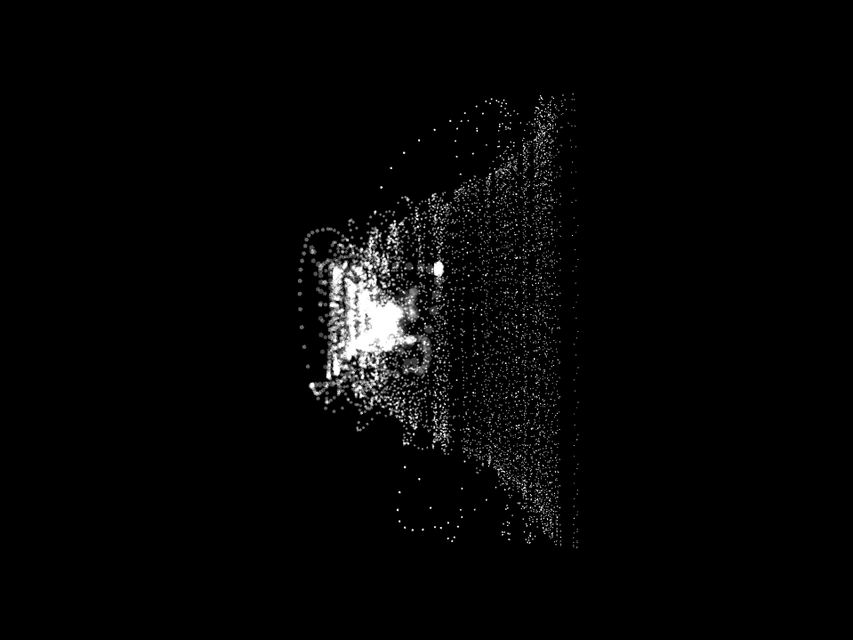
For this part I used the graphic treatment that I developed while working on the group project for Theory module [4]. In both places I am animating radiuses of randomly placed circles, here I am also slowly increasing their scale until the entire surface is covered to make way for new scene.
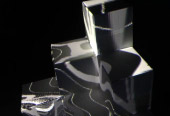
This inky mood resonated with me and I wanted to add more freestyle elements to it. At first, I was importing png graphics into different FBOs and played with their arrangements in the context of all surfaces. I liked how they got randomly cropped. When I was happy with the composition, I re-drew graphics in code. All variants are objects of the same class. While I was working in this way, I thought of collages by Kurt Schwitters [5] and David Carson [6].
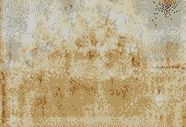
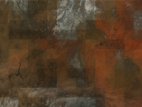
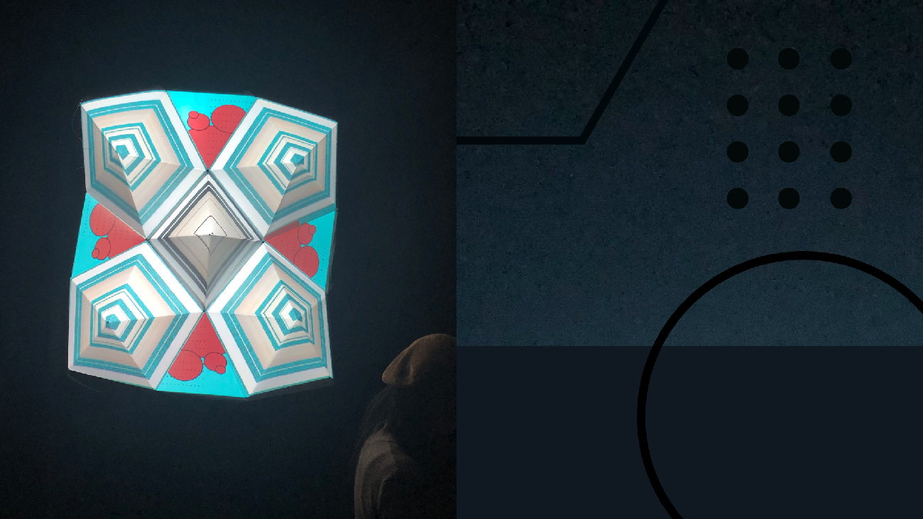
Part 3 - illustration & narrative
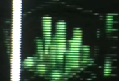
For the final part I played with textures and simple geometry to display them on. Textures added more depth to the surfaces and gave it a feel of more standard-illustrated piece. I did not set off with a clear idea of what I wanted to achieve but at the end I placed shapes and colours in a way that would reference playing card in heart suit.
Reflection and future development
It was good for practice and skills development to explore different aspects of generative graphics, but I think that the project could have been more coherent if I focused on one theme across all parts. I would like to develop the middle - 'inky' part. It resonates with me regardless of medium it originated in. I think this approach would re-focus me more on code in finding new ways to sample the same images.
During this project work it was also interesting to realize that I was planning the transitions and scenes more like I would have planned a classic movie with specified timings. Even though I could feel this dissonance, that this might not be the best approach, I could not step away from it yet.
It was challenging and rewarding work. Going forward I would like to work on projects that consider the space they are displayed in and invite interaction from the viewers.
References
1. Olga set page https://heavym.net/en/olgakit/presentation
2. xitelite page about the project: https://xitelabs.com/portfolio/amon-tobin/#1511741167275-d3686743-8859
Amon Tobin - ISAM, full show on YouTube https://www.youtube.com/watch?v=uh85lplBqdU
3. Clemence Debaig 'Stuck inside' projection mapping project http://doc.gold.ac.uk/compartsblog/index.php/work/stuck-inside/
4. 'A Susuration From The Future' http://doc.gold.ac.uk/compartsblog/index.php/work/a-susurration-from-the-future/
5. Kurt Schwitters' collages examples https://www.pinterest.co.uk/scrapbox9/kurt-schwitters/
6. David Carson's collages examples https://www.pinterest.co.uk/InoshiroDesign/david-carson/