


Generative Typography: A Story of Circles
A processing sketch exploring different variations of letter forms and recording them in a PDF file.
produced by: Renato Correa de Sampaio
Introduction
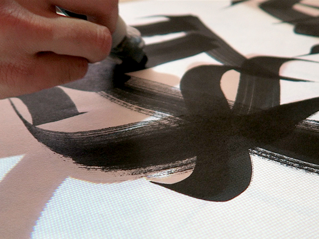
As a 'typophile', I always had an interest in typography since I started to study graphic design. Sometimes it would play a significant role in my decision making while studying my degree and making projects. So it was important to me that this sketch would cover the theme of typography. I have learned a great deal about generative design while carrying out this brief. The outcome is very speculative and I attend to develop it further.
Concept and background
Typography has sometimes been viewed in artistic circles as the designer's will to take control over what he produces, not being bound to any set of rules telling him how he should work. However, computational arts have opened the door for a newly invented practice which questions the very notion that design is about having control over one's work. Indeed, computational artists have shown what unpredictable results can come out of the computer screen. How about loosing control over typography? How about giving a life to our work by giving it a sense of unpredictability?
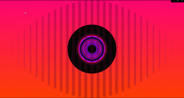
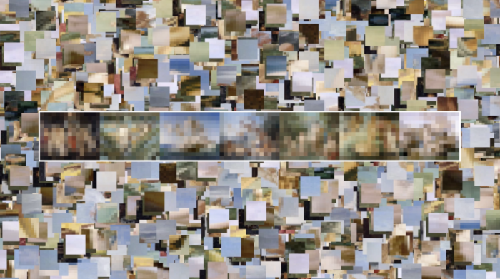
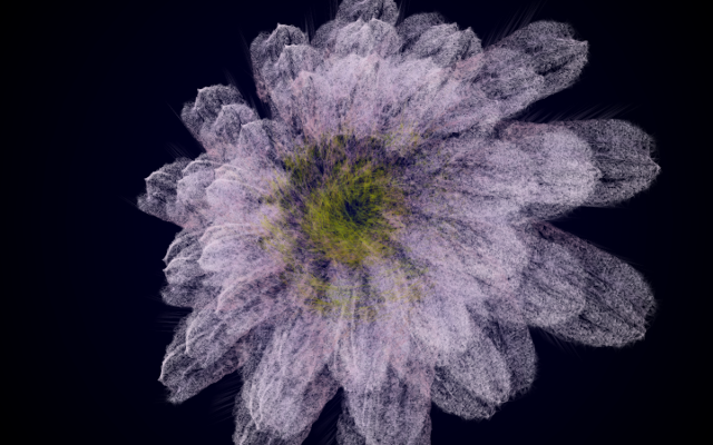
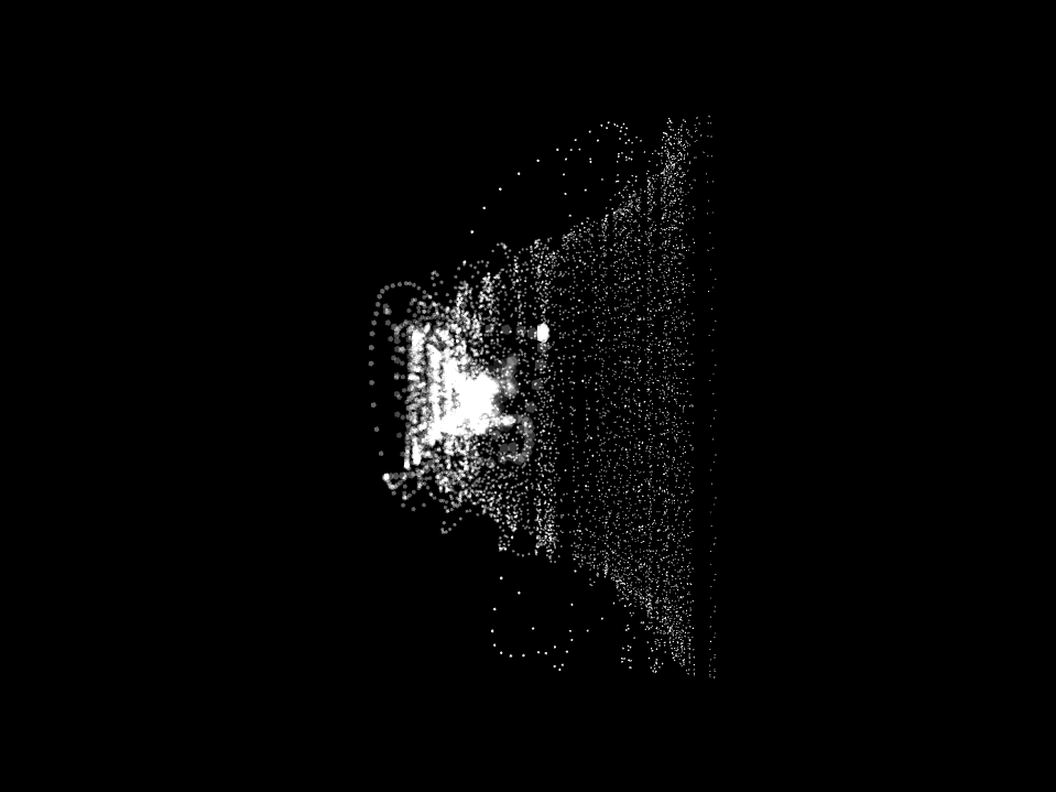
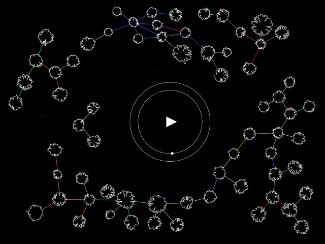
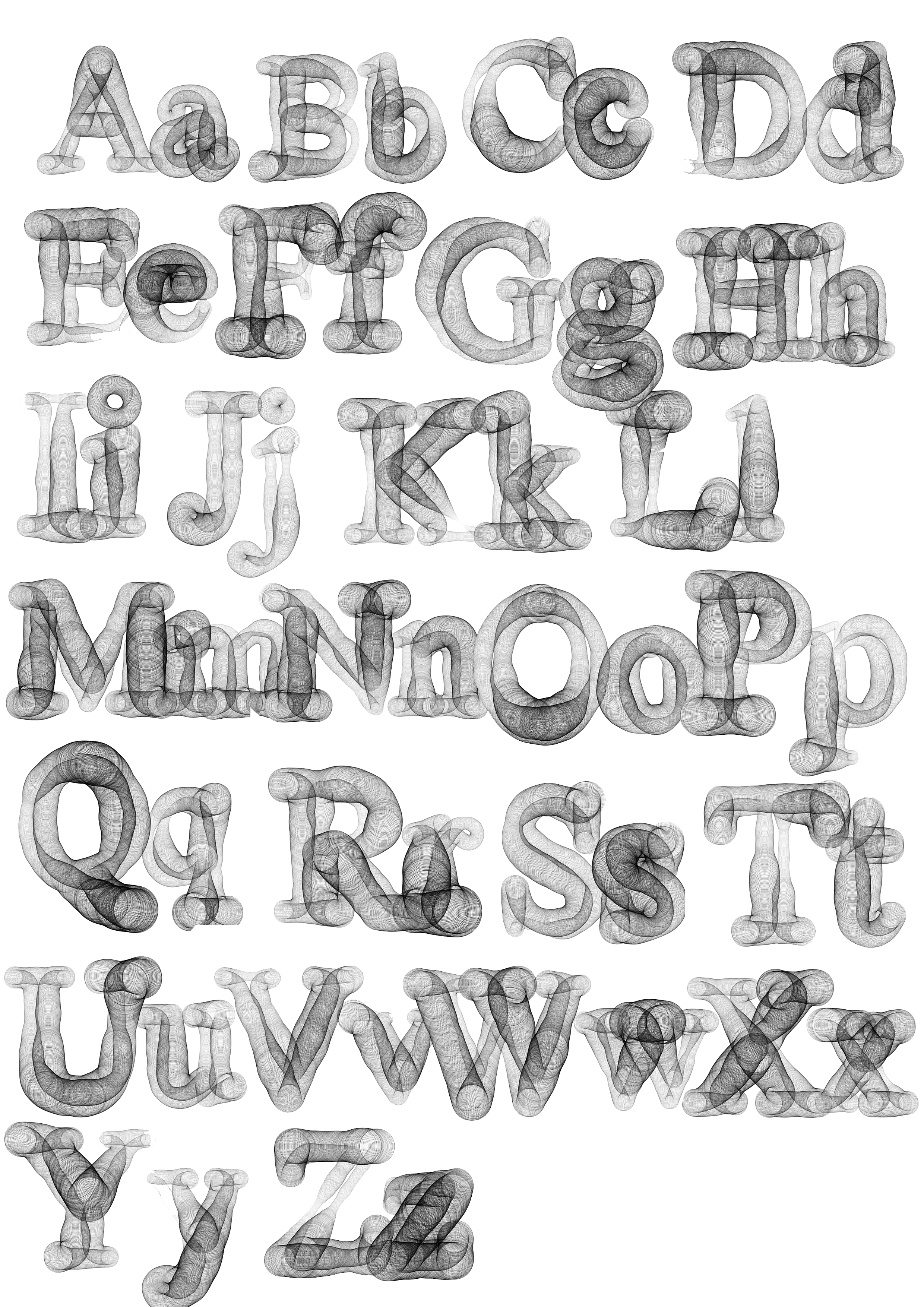
In this project I explore some of the possible typographic variations inside my processing sketch which are then compiled into a book. It immerses the audience into an abstract story of what imaginable possibilities and trajectories the sketch has to offer. This is highlighted by the fact that every exported PDF is different each time we run the sketch. To some, this may remind of the organic way of how life trajectories differ though they begin with similar or almost homogenised parameters. Authors write stories, which are then transcribed into texts, which are rendered using fonts. Fonts themselves have a story to tell : they express a specific pace, tone and emotion to the reader. This projects attempts to give a new look at fonts, as if they had a life on their own. The outline of the letters has been divided into a multitude of ellipses. These ellipses change size while succeeding themselves. Using perlin noise, the transition between one ellipse to another looks natural and gradual. Each time we run the sketch, they will keep the basic parameters while displaying variations in transparency, stroke weight and size. This adds an organic dimension to the project, almost as if we had lost control over letters.
How to use
Run the sketch. Wait until the PDF is generated. This should take up to 3 minutes.
Enjoy your newly generated booklet!
Further development
This project has many imperfections and deserves further improvement. Specially on the part of perlin noise controlling the parameters and giving the the transations between each shapes of the letter a smooth look. During this time I will use the time I have to look at the sketch again and refining it so that it becomes suitable for showcase purposes. The project also opens doors for experimentation with different kinds of shapes, color, display and application. It would be interesting to upload this sketch to other people and see what different ideas come out of that.
References
Generative Design by Benedikt Gross, sketch P_3_2_1_01.
http://www.generative-gestaltung.de/1/P_3_2_1_01
RandomBook.pde
https://github.com/processing/processing/blob/master/java/libraries/pdf/examples/RandomBook/RandomBook.pde
Type + Code: Processing For Designers (2009) by Yeohyun Ahn and Viviana Cordova
https://issuu.com/jpagecorrigan/docs/type-code_yeohyun-ahn