I'm here
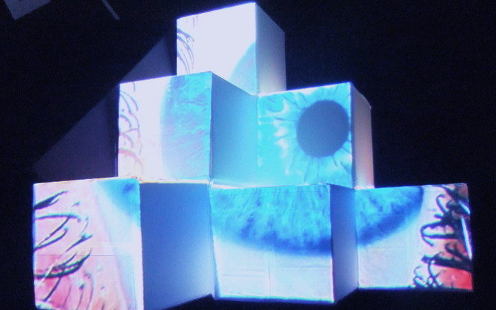
I'm here is a playful generative piece exploring the tech-induced shift of our relationship to place.
produced by: Ninon Ardisson
Concept and background research
Over the past decade, our perception of location and place has been influenced by countless technological developments. the advent of social medias and consequential mass virtual "check-ins" in places worldwide through Facebook, instagram or Foursquare create an ever-growing reflective network of virtual and traceable interlacing paths. Those location points symbolise moments in time and generate individual maps of a new nature, which gradually blur the line between cyber and solid space.
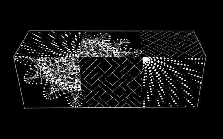
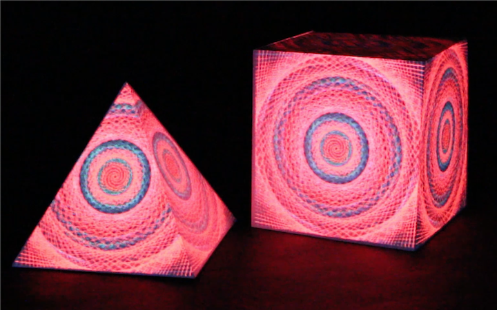
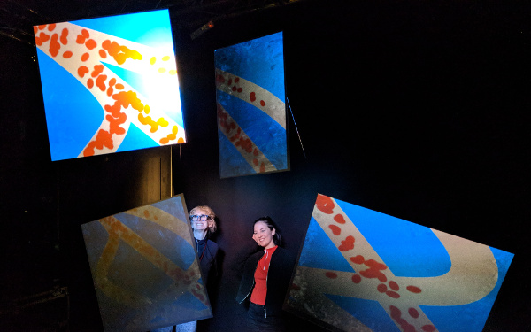
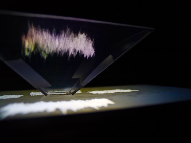
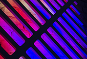
In I'm here, the rapidly breeding words bouncing around within the cubes facets illustrate this development, leaving flashy trails as proof of their presence behind them, ultimately creating a weaved, multicoloured geometric shape. A digital, temporal embroidery where passing time is a thread joining together successive locations to produce an iterative map rooted in the virtual and instantaneous.
The work responds specifically to the cubical surface on which it is designed to be mapped on. This structure outlines the solid, humanely comprehensible finite space of the cube versus the infinite, unfathomable space of the virtual. A bright pink 'I'm here' first appears, after which follows 'and here', 'hellooo', 'here too' and 'ok bye' in various vivid pastel colours, and at regular intervals. Over two and a half minutes, the cubes gradually become covered with the bouncing words and their artificial coloured tails printed throughout their random journey. This last point taps into the notion of constant update and indelible data collection, so present in the virtual environment and especially when tackling social media and virtual location tools.
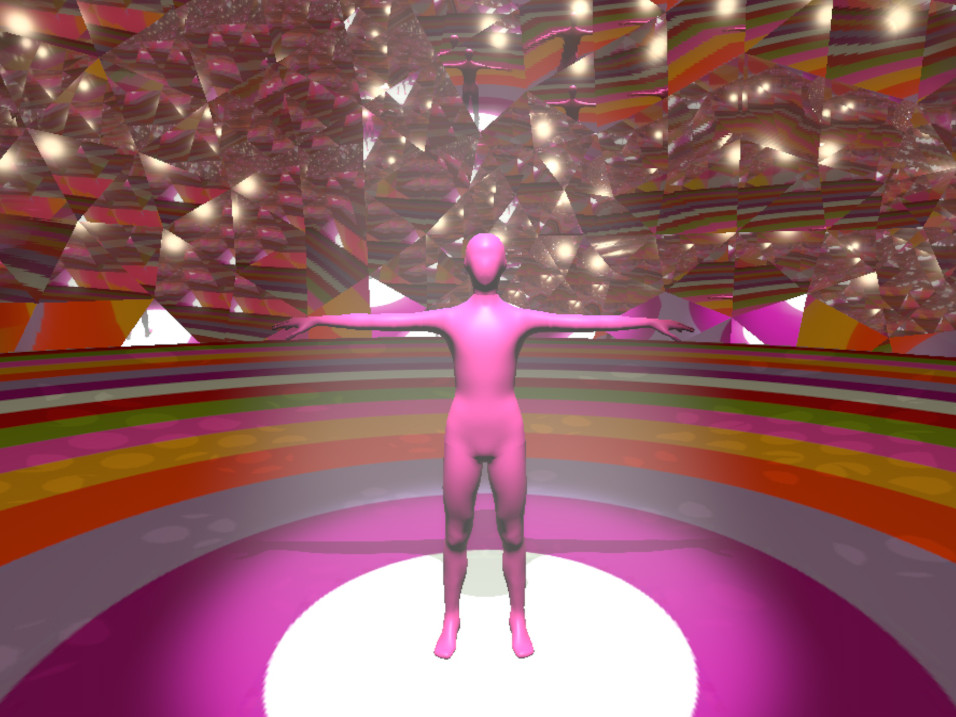
Visually, this work is strongly influenced by 1980s popular culture. I'm here is a playful piece which embraces a resolutely kitsch aesthetic, hence referencing pop culture icons such as Miami Vice or MTV Channel. The piece openly rides the current retrophiliac wave, diving deep into our fascination for everything vintage, especially 1980s sugary pop graphics. Like all things kitsch, I'm here primarily appeals to the viewer's sentimentality.
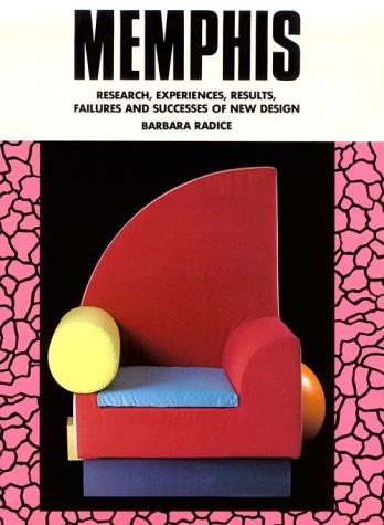
This aesthetic is essentially rooted in the legacy of the postmodernist Memphis design movement (1981-1988, Milan, Italy). The Memphis group, founded by Ettore Sottsass, layed out the foundations for what was to become the iconic visual identity of the 1980s: bright colours, bold shapes, overall kitsch vibes; it was accurately described by Bertrand Pellegrin in the San Francisco Chronicle as " A shotgun wedding between Bauhaus and Fisher-Price". Memphis visual overload of acidulated colours and patterns even made Sottsass himself declare that "Memphis is like candy, too much can make you sick". I intended to replicate this feeling in I'm here, as the work is similarly connected to popular culture- visually and conceptually. It was therefore relevant for me to mirror those tacky influences, mimicking our nostalgic pop culture- hence abusing current cultural markers of millenial imagery (ie Millenial pink).
Technical
I'm here is a mapped projection, coded in C++ within OpeenFrameworks. Programming this animation made sense to me, mainly because of its iterative, generative nature- which was calling for the possibility of randomisation- so that the projections of I'm here are different each time.
The code is fairly straightforward, and consists of an initial list of locations held in vectors, initialised in a for loop randomising those locations. I also set a timer, in order to establish the timing and order in which the words would be drawn onto the surface of the cubes, after which their location would constantly be updated. Each words have their pastel colour overlayed on top of a dark navy blue colour, so that their trails are more definite, and that the desired graphic effect is obtained.
The effect created by the overlay of colours and subsequent trailing was based on the assumption that the auto backcground refresh would be set on false. However, since it had to be constantly cleared in ofxpimapper, the graphics and background had to be adjusted in order to accomodate this unexpected issue. By changing the background from black to white, and by overlaying a very low opacity rectangle on the top, a compatible version which I was happy with was produced.
Future development
In term of detailing the work visually, I would like to develop the choreography of the words further, and experiment with it more.
On a more general note, I would very much want this piece to eventually work according to a realtime collection of location data feeding back into the projection and influencing the placement of the words. It would push the work conceptually, and link it fully to this notion of a shifting sense of place.
Self evaluation
The path to completing this fairly simple piece was an arduous one. I originally set out to write a piece of code that proved to be way above my level, and the piece that I finally presented is a stripped back version of that original endeavour. However, I am aware that there is still a lot of room for improvement; Changing and removing a lot of elements at the end of the project for the sake of making it actually function makes me feel like I did not challenge myself enough technically. I think the general issue was one of poor time management and unrealistic task planning. I would say my main error was to not break down problems enough. However, I'm really pleased with the general visual and conceptual direction of the piece, and making it work for the pop up feels like a big achievement.
References
The code from I'm here is based on the bouncing ball exercise from WCC, and Lewis Lepton's explanation of timers in openframeworks.

