


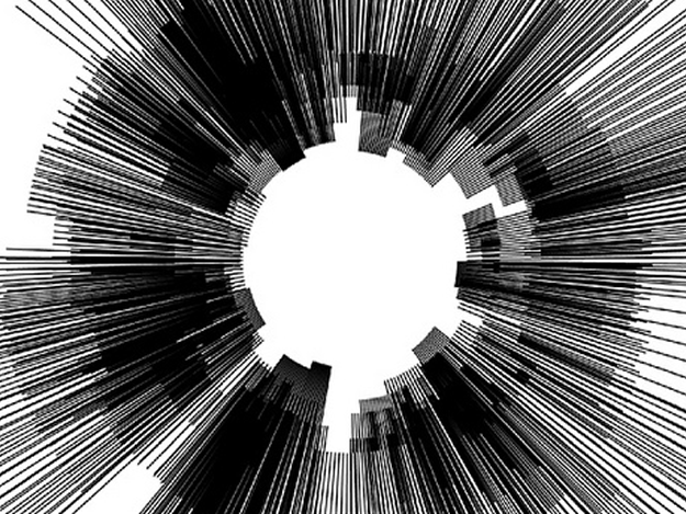


Kafka On The Shore: A Visualisation
A visualisation of Haruki Murakami's 2002 novel, "Kafka On The Shore", or rather, a visualisation of each individual word in the novel in the order of how many times it appears.
produced by: Elias Berkhout
Introduction
Our final task for the first term of Programming For Artists was to tell a visual story, with the main rule being that, regardless of process, it had to result in a single image which could be printed for display at a pop up exhibition to show the work created alongside that from the other MA Computational Arts modules.
Concept and background research
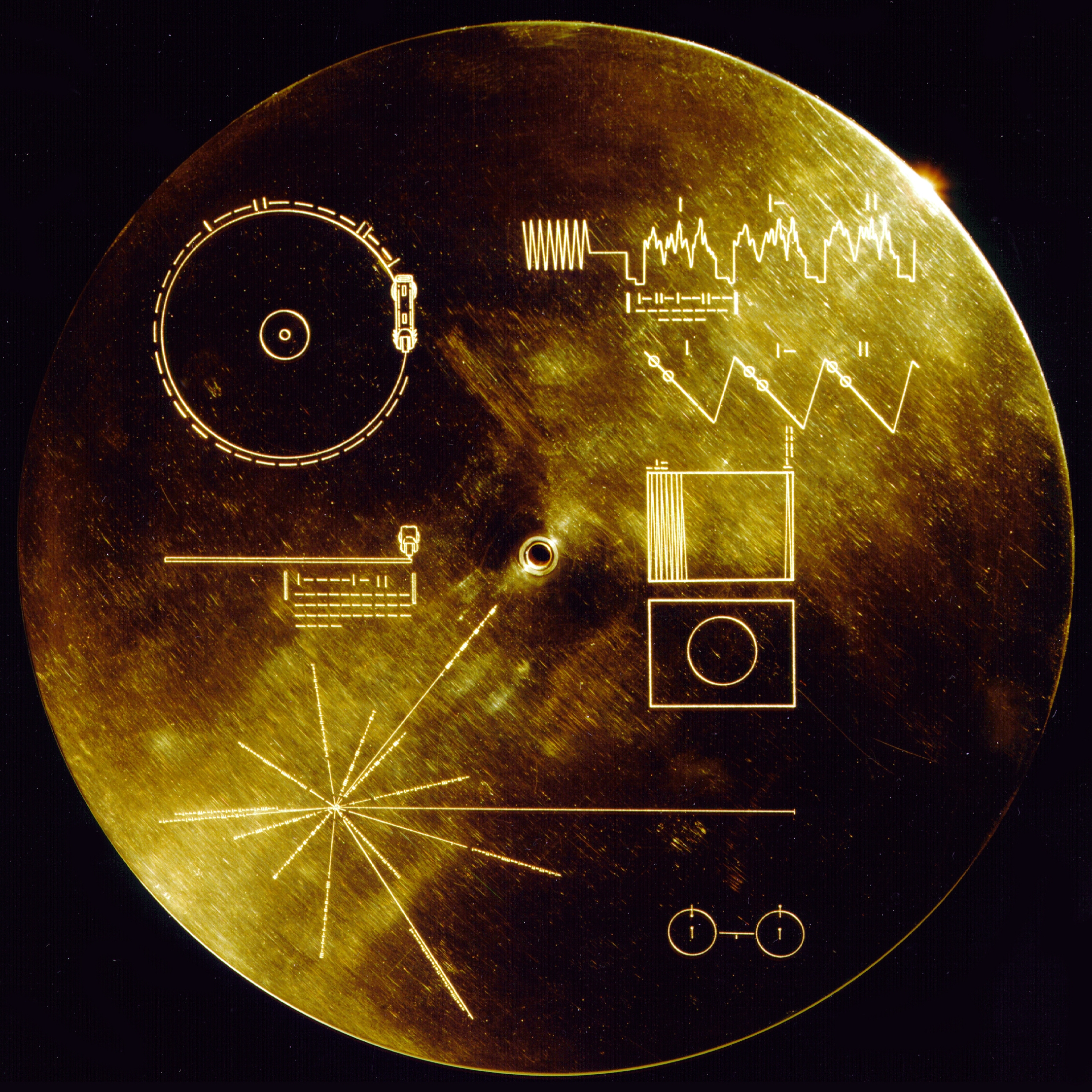
After being quite happy with some work I had submitted earlier in the term for a homework assignment creating a visual dictionary, I decided that I would like to pursue visualisation of text once again, and delve deeper into the design I had touched on in that project, which reminded me of the imagery included on the Voyager Space Mission's gold disc.
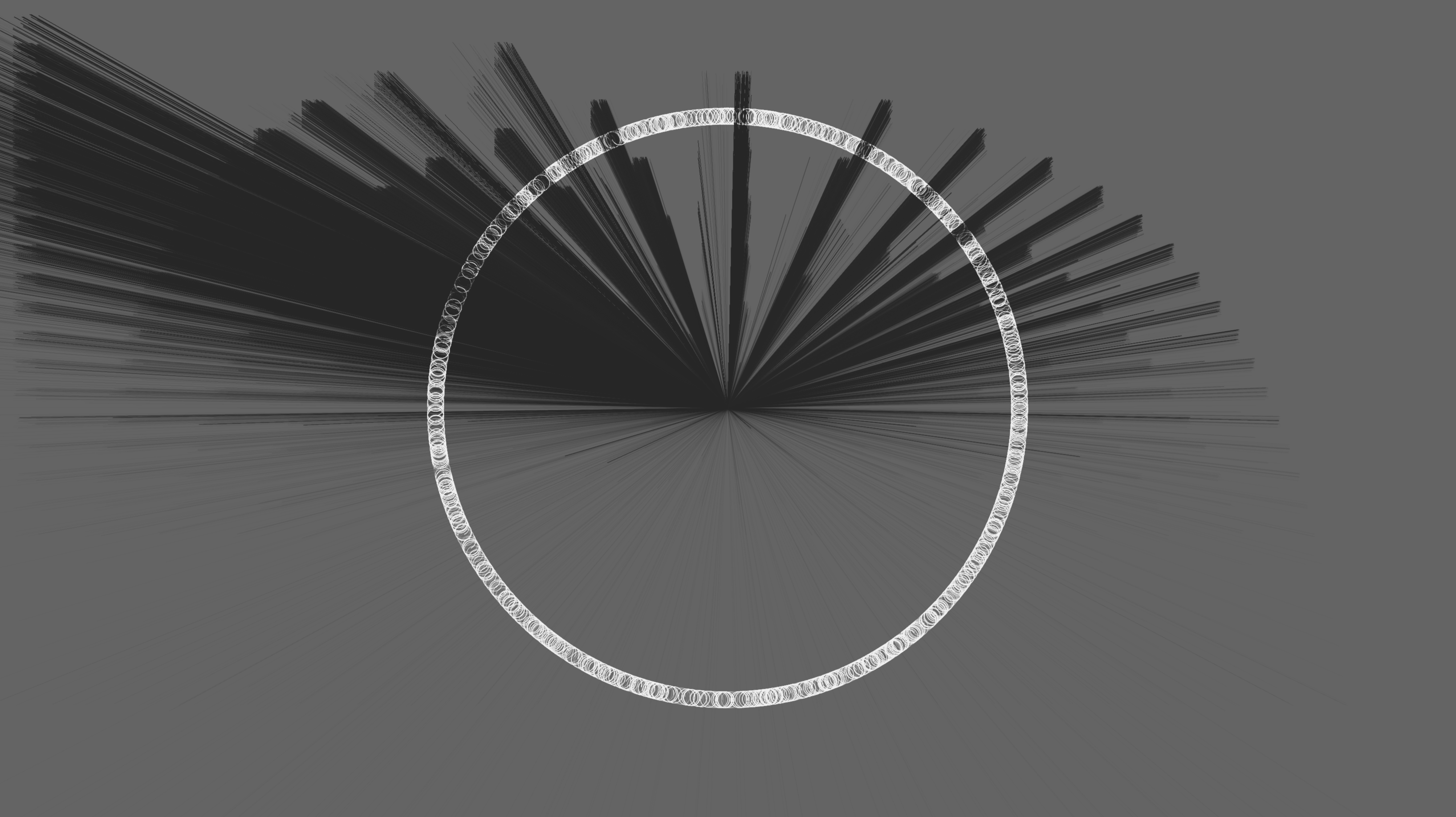
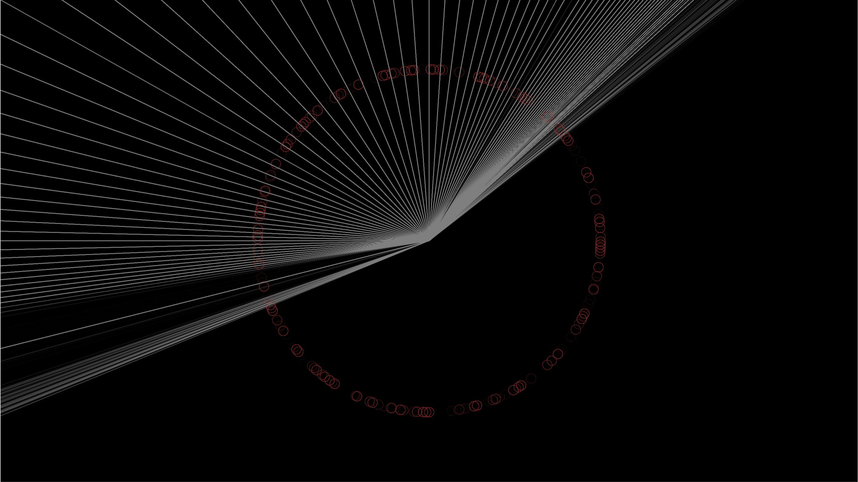
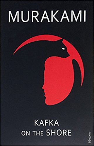
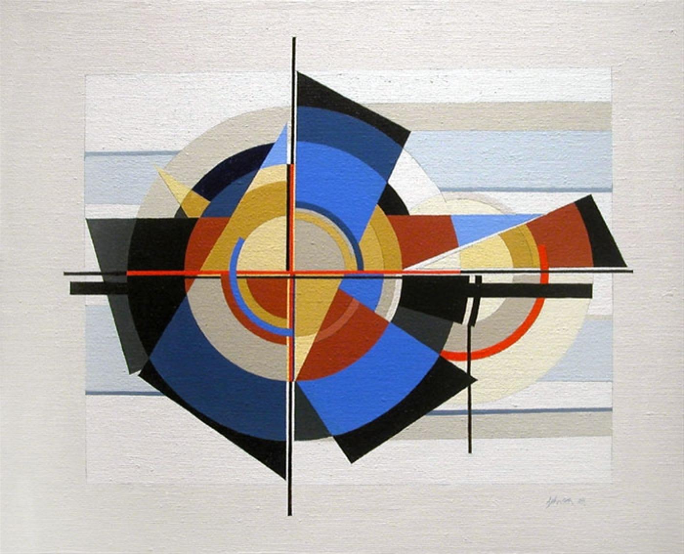
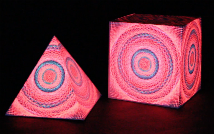
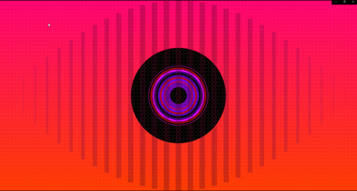
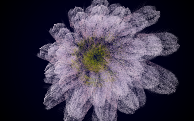
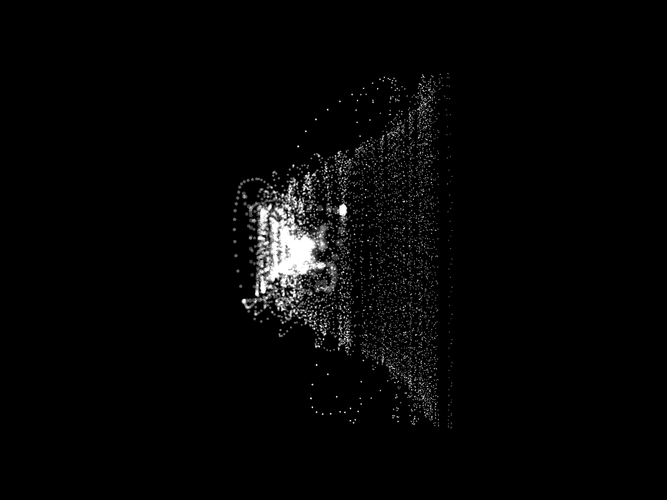
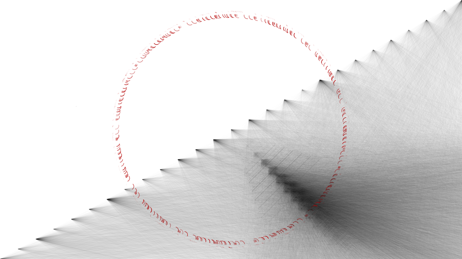
The first text that came to mind was Haruki Murakami’s 2002 novel, "Kafka On The Shore", which I read a number of years ago. The book has stuck with me since then, and I thought it’d be an interesting text to visualise. I experimented with different colour combinations but settled on those that were on the cover of the edition I read. I deliberately avoided looking at the cover until after I had submitted the work, but the circle in the centre of the canvas is surprisingly similar, and I ultimately decided that the texture in and around the bottom right quadrant of the circle came stood out more on a white background with black lines than a black background with white lines. The passing similarity to the Japanese flag was completely unintentional, but to me is a nicely coincidental parallel.
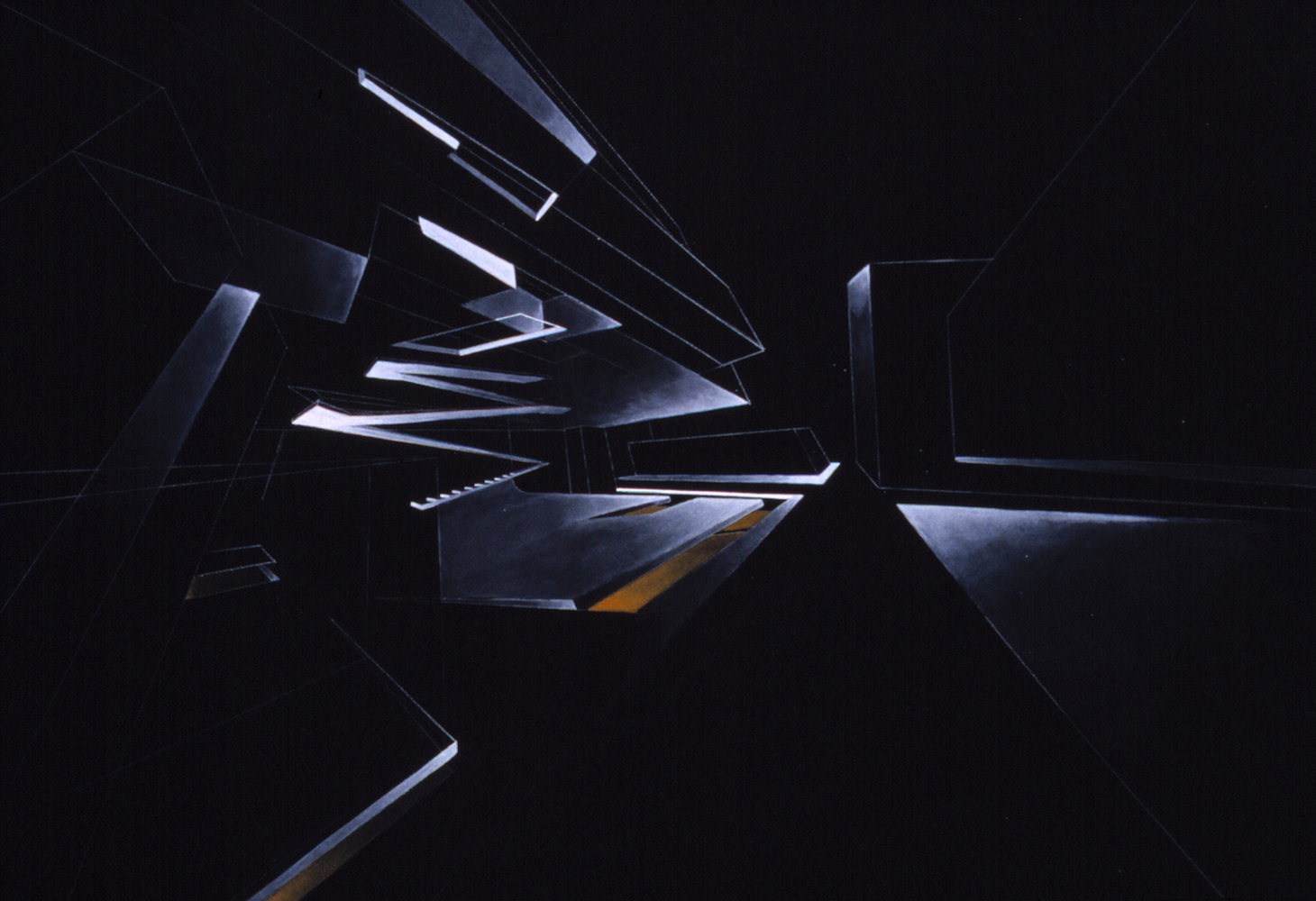
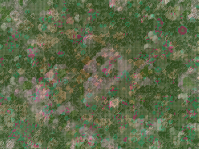
The imagery of the final work was inspired by the work of computational artists such as Manfred Mohr as well as work inspired by the constructivist movement by artists such as Zaha Hadid and George Johnson.
Technical
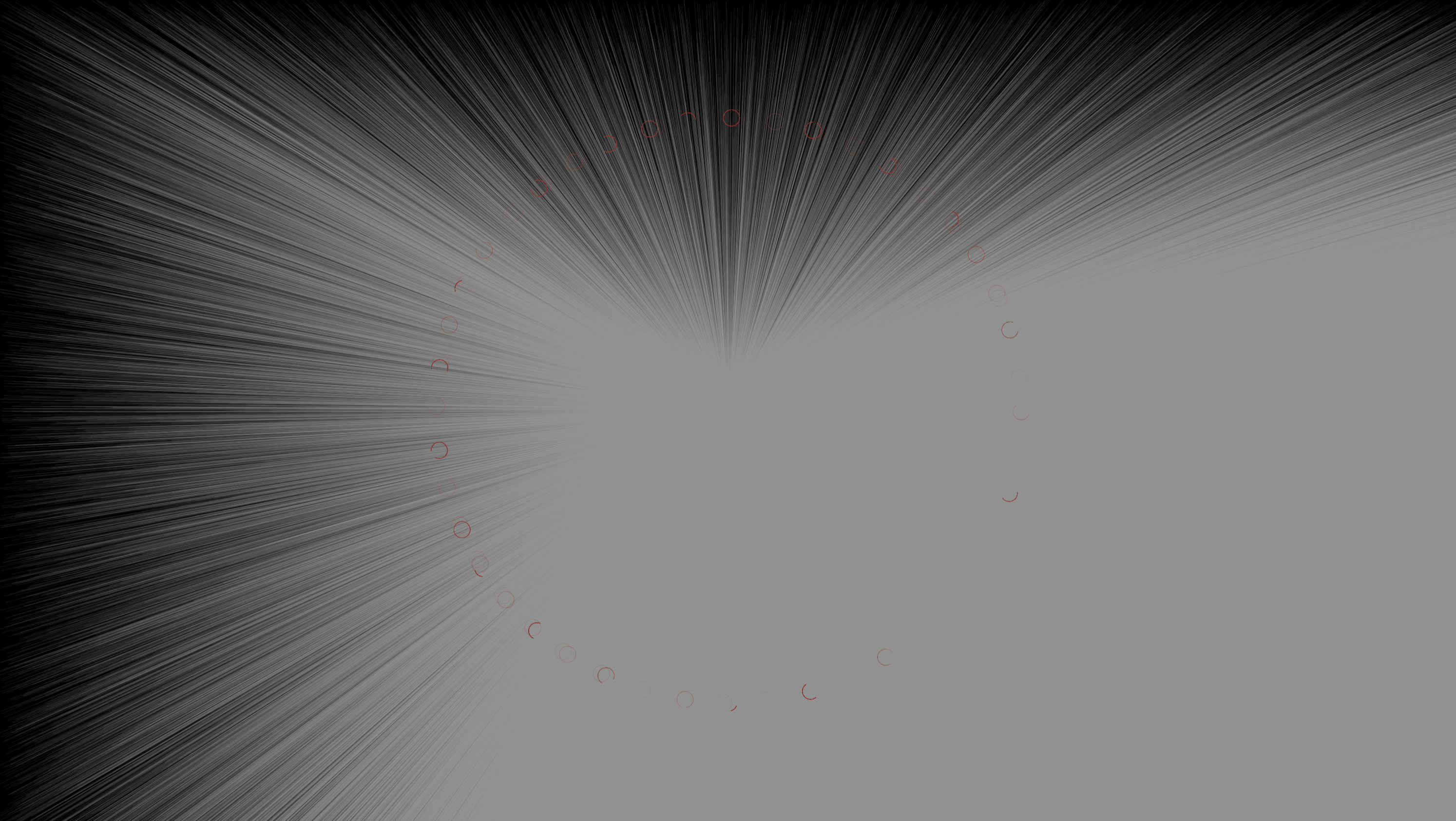
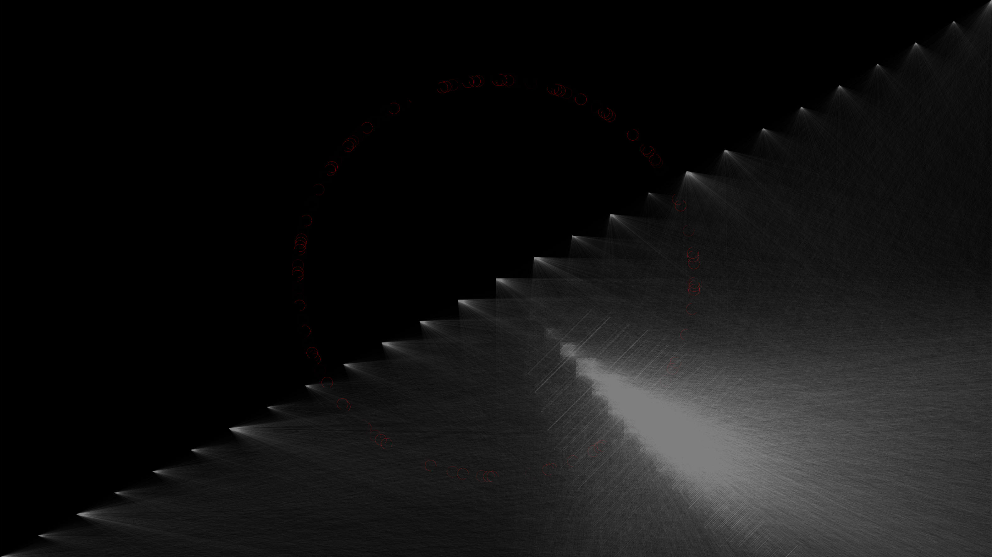
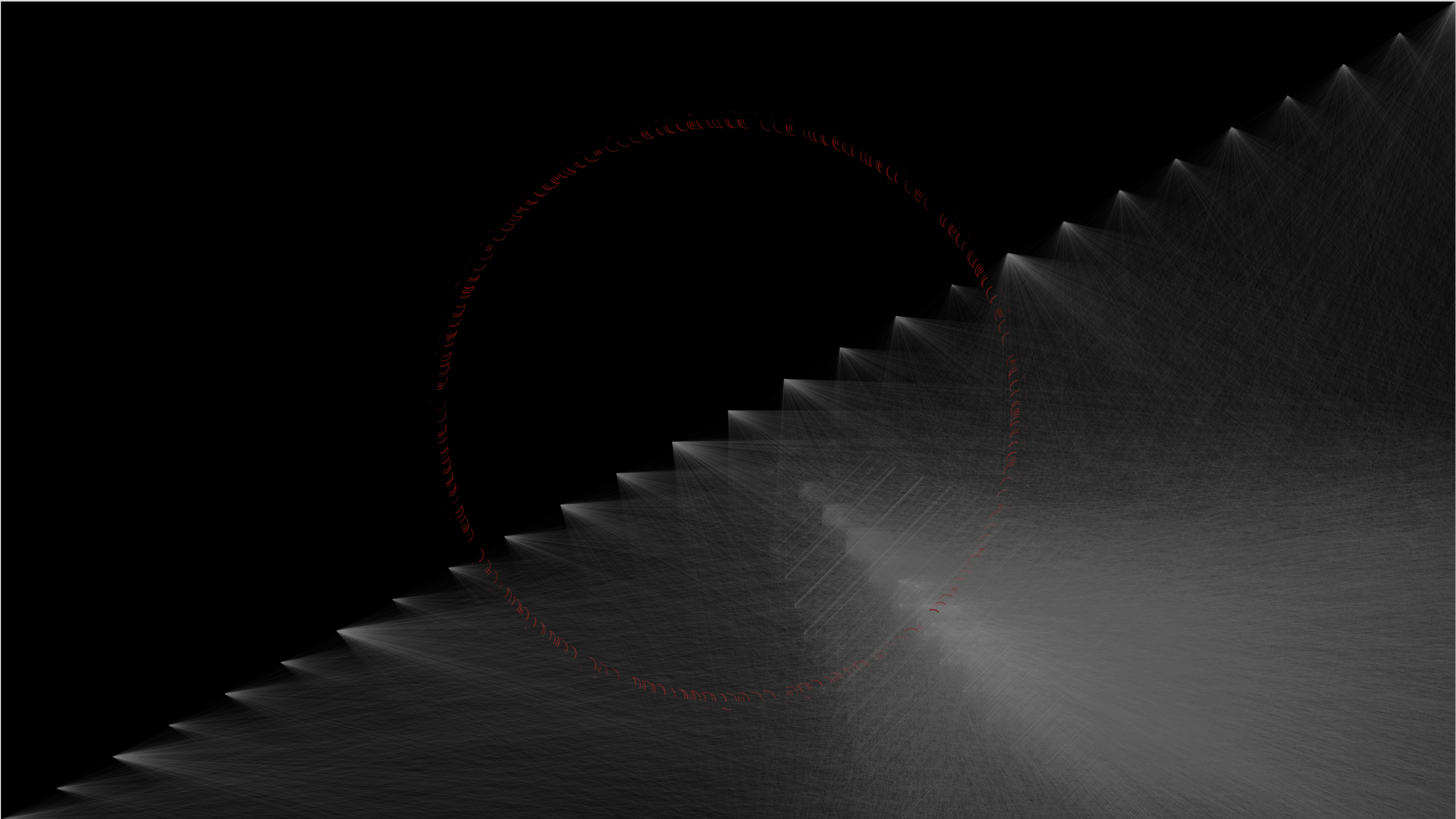
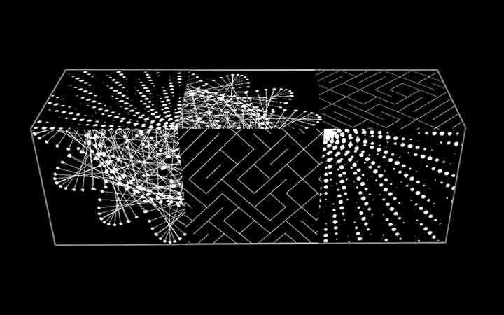
Lior’s template for the visual dictionary we completed during the term provided a very different effect to what I was looking for, so the first steps for me were going into the code and changing it to read every word in a text, not simply the first word on each line as the visual dictionary example had. I also did not want to draw individual shapes in cells as I thought it was too similar to some of the Manfred Mohr examples we had seen earlier in the term, so I experimented with drawing the shapes for each word on top of one another, as if the entire canvas was one cell. I found that the length of the novel, at over 160,000 words, was drawing too much to the canvas, so instead of visualising the novel word by word, my project is actually a visualisation of each word in the novel, with the words only being drawn once each, in the order of how many times they appear in the novel. This means that “the”, “a” and “to” are the first words to be visualised in the print, as they are the most common words in the novel, appearing 8697, 4807 and 4552 times, respectively. The location of the lines is determined by the length of each word and the distance between the letters contained within that word, with its transparency and stroke weight altered by the number of times it appears in the text. The length of the arcs drawn is also altered by the length of the word in question and how many times it appears in the text. Daniel Shiffman's tutorial on word counting was invaluable to me, as it taught me how to import a .txt file, divide the imported lines into one enormous string of words and then separate that into the individual words and record the number of times they appear in the text.
Future development
I would like to experiment with ways to incorporate other data gleaned from the text into the visual language of the work, and also utilise more randomness to create a series of related but unique works, all visualising the same content.
Self evaluation
I am very proud of the final print I presented at the pop up exhibition and unbelievably happy that it was selected to be shown at the Expanding Systems show at the APT Gallery in Deptford.
I really struggled to know when to stop with this work and could have gone on tweaking numbers here and there in perpetuity, however, I think the final product is a happy medium between complex technological processes and knowing when enough is enough. I would have liked to be a bit more explicit about how elements of the data impact elements of the image, but I think part of what makes it effective and provides the intricate textural part of the work is the randomness of the lines and the shapes they make when they intersect.
References
Daniel Shiffman, Word Counting Processing Tutorial: https://www.youtube.com/watch?v=JRlqDsuK3Is
Visual inspiration from Zaha Hadid, George Johnson & more shown in the gallery below.