


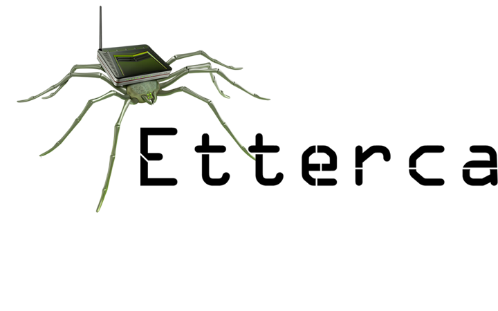


Not My Type
This project contains a text which discusses the artistic practice of typography and type design, its history, its dynamic. The artifact embeded attempts to explore the use of type design in computational arts.
produced by: Renato Correa de Sampaio
Introduction
This paper discusses the artistic practice in typography and type design, its history, its dynamic and evolution. I expose the dramatic industrial changes that brought forth the over-specialisation of the discipline and the coming-back of a poetic-like discipline made possible through computational arts. Digital means of creation allow practitioners to take back control of the process of their work and create experimental, unfinished yet interesting products. I will explore the different ways in which computational arts allows artists to take back control over their practices, and how it relates to the antic notion of the artist who is and should be polyvalent. To use generative principles as the basis of the product of art is an act of rediscovering our lost nature as poets gazing at “what could be” or “what should be”. I will demonstrate this by looking at a range of theorists as well as practical examples of artworks which open the possibilities to think of typography differently. I am also addressing the alienation that derived from industrial specialisation and conclude on the wider possibilities made possible with computational arts.
1. A timelapse
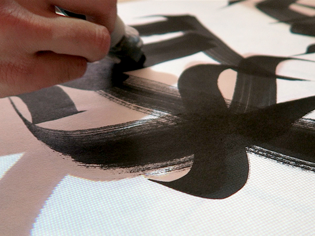
Back in the time of antiquity, the function of type designer was flawed. The Etruscans had developed the basis of the latin alphabet we now use. However, it was the Venetians who were responsible for our current way of writing. Lettering was an ancient craft, and each country had developed its own technic, prior to its circumstances. In Ancient Rome, there were skilled workers, charged of carving letters on official buildings. The basis of what would become the Latin alphabet and the fonts in use throughout the centuries resulted merely from the carving on stone, the nail and the hammer. The brush in china gave birth to Mandarin, the pen Arabic and the stylus Hebrew. What we know today as “fonts” did not properly exist in those days, but only unique writing style proper to each worker’s skills.
It was not until Johannes Gutenberg had invented the first manual printing press that came a need to produce fonts. The pre-industrial pace at which the Protestant Reformation produced its pamphlets and later its Bibles required the making and use of typefaces. Their given role was to enact different tones to the press. Printers would start to create the first moveable typefaces in the form of engraving letter sets. From the 16th century the notion of type designer and typographer became two very distinct disciplines ; while the type designer would create the bricks (letters) with which to write, the typographer would play with the bricks. These became the art of making letters and the other one the artistic use of typefaces. In the early 20th century, we witnessed the movement being accelerated by specialised providers to create what would become fonts. Type design was born. However, as computational means of creation were made possible, the distinction between the two has vanished; artists found themselves as the type designers and the typographers in the same time. Computational arts has become the mean to blend the two disciplines into one. Those who made the bricks could also play with them. This is made more evident through recent works of practitioners who’ve used computers to express their art.
2. On industrial alienation
In Marx’s work, we can find four main forms of alienation, which, according to Marx, result from the economic system : the first is the alienation from the product of the worker’s labour. The division between a maker and its creation is an aspect of over-specialisation which he criticises. The second, is the alienation from the labour process, which is being pushed by external forces, almost out of control of the worker’s will; the worker is forced to accept the task of his job, pushed by environmental conditions that is out of his control. The third is the alienation from human nature itself, and the fourth is the social alienation caused by the three prior ones ; he is regarded as a stranger separated from the group, that is determined by his activity[1,2]. This was probably borrowed from the biblical notion of “outcast”[3]. If we were to make a parallel, today, there is still the notion of “outcast”, perhaps different in appearance but still remaining. It is that very notion on which Marx puts emphasis on. For Hegel, from whom Marx takes his argument for his materialist dialectics, alienation is bound to the questions surrounding our inner being, or spirit, and is concerned with the self, while Marx described a material alienation, one that is embedded into a system with political and economic consequences. For him, objectification is one of the characteristics of labour and alienation is the result coming from the capitalist system. If the works of Marx have proved themselves to be wrong about a great number of things concerning the solutions to the problems raised by a capitalistic society, his reflections on alienation still stand the test of time.
Most dialectical thinkers agree that in a society based on class struggle, the worker is doomed to be spoiled of his work, either by a hierarchy or by the very tools he uses. In his issue titled Mind Machines, Sascha Engel argues that industrial machinery was and still is an undeniably alienating force. Under capitalism, the individual is sacrificed so that the technic might progress (Murchland[4]). This, according to Engel, creates a cycle of ever-increased alienation, inseparable to the machine. In the art world, there are two ways this issue is approached: First, artists and practitioners attempt to understand machines as individual entities. They claim to observe the “capricious individuality of machines in their everyday existence” (Engel). Second, they see the machine as a mean of emancipation and a door opened for broader possibilities. The former is perhaps true to the discipline of visual arts. The latter is the true for the design disciplines, and for the type design discipline as well.
Adam Smith’s “Wealth of Nations” argues that economic specialisation would be beneficial for countries in a surging industrialised era. The division of labor was made the cornerstone for an efficient and stable economy, where specialisation allows the making of many products in record-limited time. The idea was at work in most Western countries but was not at its peak before the invention of Taylorism and Fordism. Although the idea of economic specialisation is still rampant these days, it is also increasingly becoming outdated in a 21st century world.
As the role of digital tools in enterprise becomes increasingly important, we witness economic transformation in all levels of industries, but the case is specially true for creative enterprise. We are reaching a point where digital means become indistinguishable from the worker’s intentions. The machine (work process) and the work result (product) also converge and become part of the final result. This has become apparent in type design and other art disciplines which I will expose in the next chapter.
3. The dynamic between type and code
Erik van Blokland (born in 1967) works as a type designer and typographer in The Hague, Netherlands. Blokland is famous for his collaborations with programmers such as Just Van Rossum, whose brother Guido Van Rossum invented the Python coding language. One of his collaborations involved making experiments, one of them being the FF Beowolf typeface. FF Beowolf is a typeface designed in 1992 and was made for display. It is known for its advanced features, involving alternate characters each time a letter is typed. In 2011, it was added to the MoMA Architecture and Design Collection in New York. It is a brilliant example of how type and code can change the way we see type design and typography in the 21st century. It would seem as if FF Beowolf was based on the premise that a type doesn’t have to be clean and ready, but that it can be an experiment and that the process is never truly finished. It is obvious that new projects become increasingly experimental. This is the case for Zachary Lieberman’s IQ Font. It is a collaboration project with typographers in which letterforms were made using the movement of a sport car. Dr. Martin Lorenz, both a designer and a teacher, argues that the tools which are used to design fonts cannot be separated from the result anymore. He adds that we should therefore be more aware of our tools, and perhaps invent new ones. This is coherent with the historical processes of making letters, which finds its root in the two most basic tools: the hammer and nail (Rome). The utility and aesthetic given to fonts was indeed inseparable from the tools used in order to design them. Many designers are conscious of this, and therefore make efforts to break barriers and open the door for more possibilities. Designer and lecturer Yeohyun Ahn exposes the possibilities that coding offers to typography in her book Type + Code: Processing For Designers. The book explores the aesthetic of typography driven by code, with an emphasis on the programming language Processing. The book had a huge impact on the type designers’ niche and graphic designers in the world. Today, the book continues to inspire modern days designers.
Typography is based on the discipline of arranging letters in a given space. Writing systems are themselves some sort of code, which, in turn, become imbedded in a coded system. Considering this while witnessing these emerging practices in the art world, we cannot help but realise a common pattern. Now, code is being widely used as an experimenting tool for many artists and designers. However, rather than creating final outcomes, they instead intentionally create very flexible systems that become sometimes unpredictable. These help to produce complex, yet, interesting outcomes.
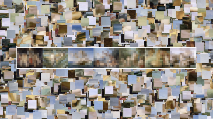
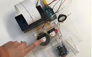
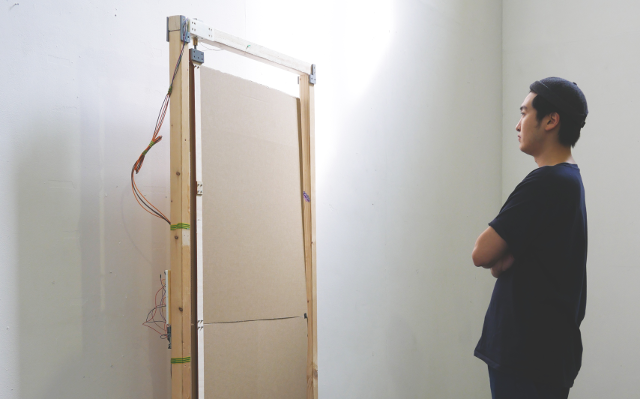
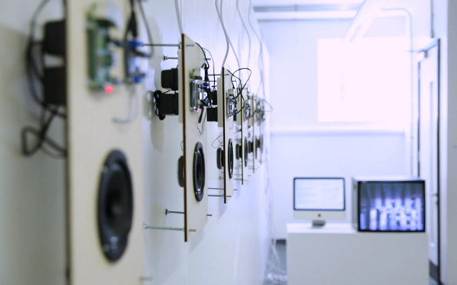
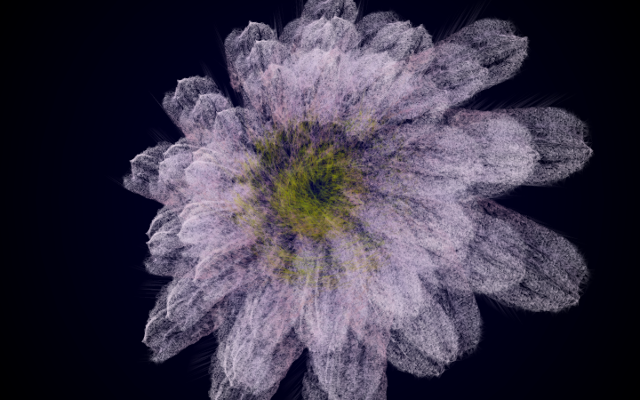
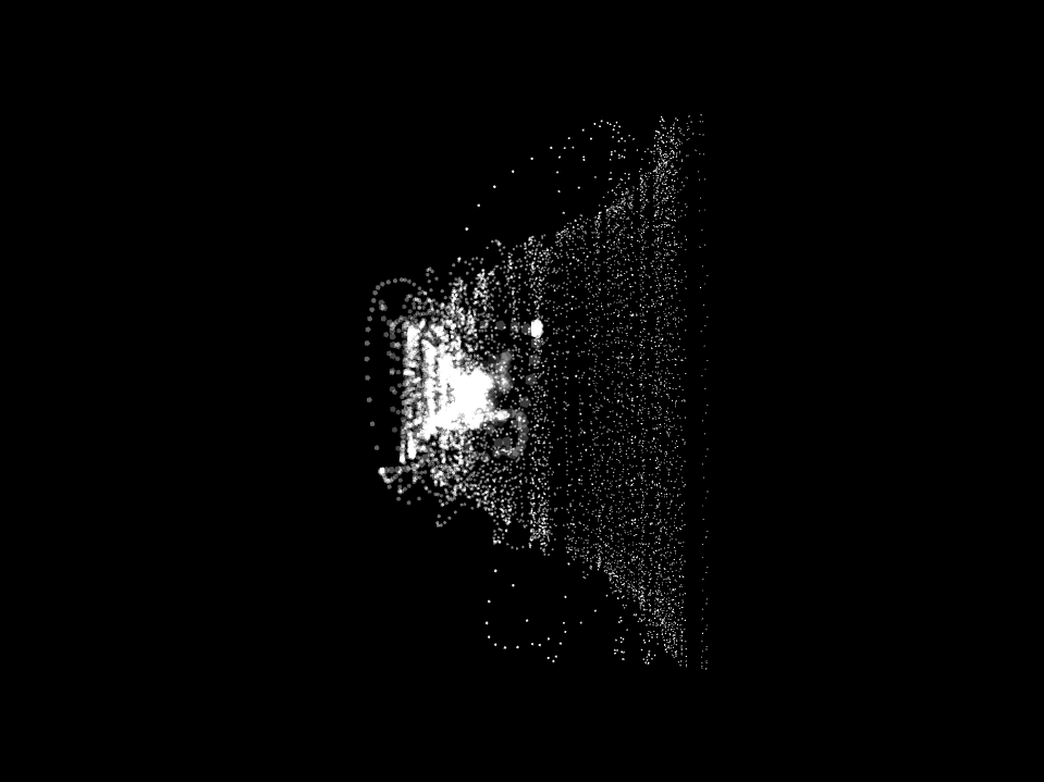
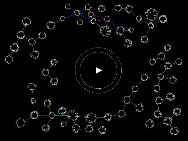
4. The artifact
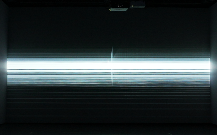
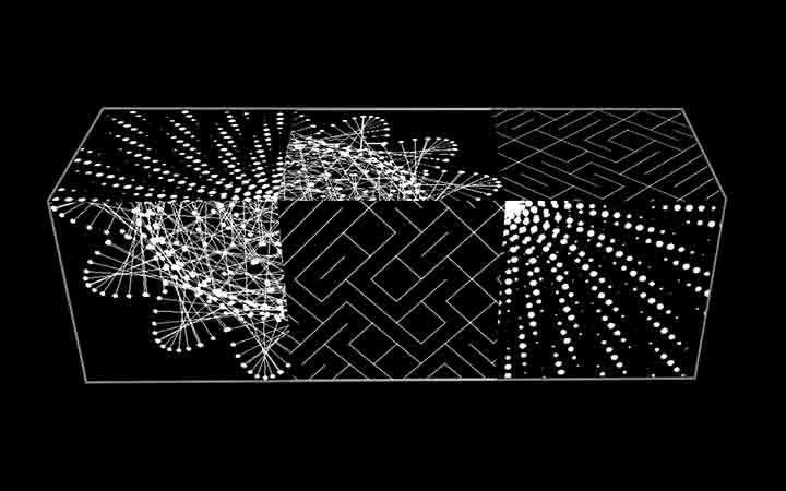
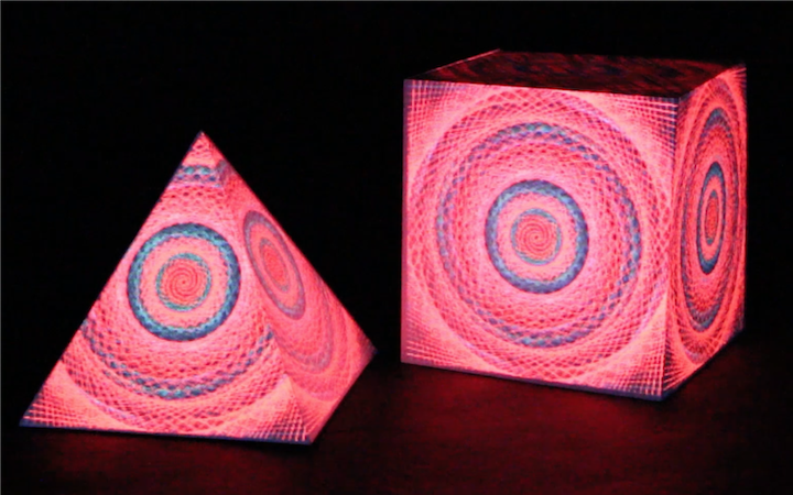
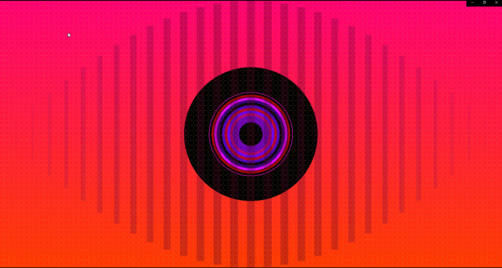
The PDE file attached to this paper is a processing code in which I explore some of the possible typographic variations which are then compiled into a book. Every exported PDF is different each time we run the sketch. This projects attempts to give a new look at fonts, as if they had a life on their own. The outline of the letters has been divided into a multitude of shapes. These shapes change size while succeeding themselves. Using perlin noise, the transition between one ellipse to another looks natural and gradual. Each time we run the sketch, they will keep the basic parameters while displaying variations in transparency, stroke weight and size. This adds an organic dimension to the project, almost as if we had lost control over the letters. In the logical continuation of what has been done in the discipline of type design, the project is generated by itself, using some algorithms which then determine the form and shape of the final result.
Conclusion
It is obvious that we cannot exactly predict how the future of work will look like. One can only speculate so from what has already been made. But it is correct to suppose that one can assume that what computational means of creation will bring forth new kinds of artistic approaches. What Walter Benjamin started to predict in his book, the Word of art in the age of mechanical reproduction, modern means of creating films and artworks will in sum create a new kind of artists, whose work is part of a broader experiment with himself and the audience. Computational arts in the field of graphic design and especially type design will continue to create complex, yet, interesting and unique outcomes. The audience evolves in order to deal with what is unplanned, unexpected and not part of the canon and seeks to create a relationship with the artist through his work. This part of unexpectedness is perhaps what the audience tries to find when visualising an artwork nowadays, and perhaps computational arts have the means to do that.
Notes
1. “Multiple disorders such as loss of self, anxiety states, an- omie, depersonalization, rootlessness, and meaninglessness, isolation, and lack of community” (Bernard Murchland, The Age of Alienation, Random House: New York, 1971, p. 4)
2. “At the present time, in all the social science, the various synonyms of alienation have a foremost place in the studies of human relations. Investigation of the ‘unattached, the ‘mar- ginal’, the ‘obsessive’, the ‘normless’ and the ‘isolated’ individ- ual all testify to the central place occupied by the hypothesis of alienation in contemporary social science.” (Robert Nisbet)
3. In the synoptic Gospels of the New Testament there is the notion of “outcasts” mentioned several times to designate the lepers, tax collectors, prostitutes and other sinners. Society often views and treats outcasts as “degraded people”, “thrust out of society”.
4. “I have been led to detect the distinctive modern flavour of our experience of alienation in the transitional period of the late Middle Ages and Renaissance. A key is to be found in the rise of atomistic nominalism and the subsequent pulveriza- tion of being.” (Bernard Murchland)
References
Benjamin, W. (1935) The Work of Art in the Age of Mechani- cal Reproduction
Engel, S. (2019), Minding Machines from Fast Capitalism, Volume 16, Issue 2. Available at: https://fastcapitalism. journal.library.uta.edu › article
Gross, B. (2012) Generative Design, sketch P_3_2_1_01. Available at: http://www.generative-gestaltung. de/1/P_3_2_1_01
Jacquard, A. (1997) A Little Philosophy for the Use of Non-Philosophers
Knuth, D. (1968), The Art of Computer Program- ming (TAOCP). XX Edition
Lieberman, Z. (2009), Toyota IQ Font. Available at: https:// cartype.com/pages/4163/toyota_iq_font
Marx, K. (1932), Economic and Philosophic Manuscripts of 1844, First Manuscript
Murchland, B. (1971), The Age of Alienation, Random House: New York, p. 4
Nisbet, R. (1986), Conservatism: Dream and Reality
Smith, A. (1776) The Wealth of Nations
Unger, G. (2018) Theory of Type Design
Van Blokland, E. and Just Van Rossum, J. (1992) FF Beowolf. Available at: https://www.fontshop.com/families/ff-beow- olf
Van Rossum, M. (1997), ‘A new test of legibility’, Quaere- ndo, vol. 27, no. 2, pp. 141-147. Available at: https:// www.pure.ed.ac.uk/ws/files/8079349/217041.pdf#:~:- text=MARK%20VAN%20ROSSUM%20A%20new%20 test%20of%20legibility,than%20traditional%20tests.%20 It%20has%20been%20used%20to
Victionary, (2019), On the Road to Variable: The Flexible Fu- ture of Typography. Edited and Designed by TwoPoints. net
Williams, S. and Henrik Kubel, H. (2015) Type: New Perspec- tives in Typography
Yeohyun, A. and Cordova, V. (2009) Type + Code: Processing For Designers. Available at: https://issuu.com/jpagecorri- gan/docs/type-code_yeohyun-ahn